| Image |
Comment |
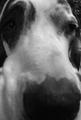
| 01/30/2003 03:50:52 PM |
Puppy's Noseby cassberComment: I know as a member of the critique club I am suppose to enlighten the photographers with words of wisdom. But you got me here...My take on the picture is the dog is looking for a place to piss. i.e. a sign post. If so, where is the post? As far as the picture is concerned, I do like the close up shot. This is something I encourage my students to do all the time. Only if their camera can handle the image. A macro lens was need here, if you don't have one it is worth the money to purchase one. I'm not familiar with your Minolta but if it is not an SLR Digital a macro should come with the camera. If so use it. JG |
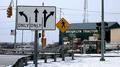
| 01/30/2003 03:39:54 PM |
Street Signby STEINRComment: "Signs, signs, every where a sign, don't do this, don't do that can't you read the signs". Excuse me if I didn't quote the words to the song properly but that is what popped into my head when I saw your pic. Very good composition, and your choice of Fstop was very important to making this image work. The clarity, colors, the way the lines all work together, and shapes and forms make for a nice all around picture. What is missing is creativity. That something that seperates your work from a winner. The only thing I could suggest is to shoot from a different angle instead of head on. Not knowing the situation or what any other angle might look like, I'm only guessing. Better luck next challenge. JG |
 Photographer found comment helpful. Photographer found comment helpful. |
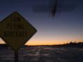
| 01/30/2003 03:30:58 PM |
Low Flight at Nightby av8orboyComment: I am intrigued by the use of your aperture setting, ISO, and shutter speed. This combination tells me you meant to have the plane blurred, and keep the good depth of field.This would have worked very well if the sign had not been so dark...Depending on the situation you were in...you might have tried setting the head lights of your car on the sign. If you meant to have the sign dark, to add to the illusion of night, the idea was good but the outcome just didn't work. The composition of your pic was very good and the sunset really works well. It would be interesting to see what would the picture might have looked like if the sign was better lit. JG |
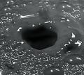
| 01/30/2003 03:18:39 PM |
Milk Holeby dimitriiComment: I have to admit that I agree with many of the other people who have commented on your picture and I have to ask " What is it?" The color looks nothing like milk, the glare of light that you used totally distracts from the image, and to have the hole in the middle of the picture goes against all the rules of composition. I appreciate the fact you used 1/1000 of a second to stop the action works well, but there is nothing to indicate what caused the hole. If the title indicates that it is to be compared to a "Black Hole" in the universe then shouldn't something be sucked into it. Enough of the crushing of your self image. Let's hope that all your other efforts are 10's and this one set back can be attributed to mother nature... or something. JG |
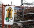
| 01/30/2003 02:41:50 PM |
OMG!! Caution: Above!!!by AntithesisComment: I have been teaching photography for over 15 years and have critiqued thousands of pictures in competitions and student work. After studying your photograph and the information provided I need to ask...Are you sure you shot this picture at F4.0? An F stop of this size will normally give you a very shallow depth of field. Your photograph has great depth of field which usually indicates an F stop of F22 or higher. Back to the picture...Not being able to read the sign the image intrigued me to look at the whole picture to see what it might be saying. The picture has many lines going in all directions, which is disturbing to the eye. In this case there is just to much going on and all the construction work distracts from the sign. Yet, you need the constuction to explain the sign. So basically you were caught between a rock and a hard spot. The color, focus, and angle all work for you,and you deserved the score if not even higher. Keep up the good work. John Gill |
| Photographer found comment helpful. |
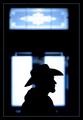
| 01/29/2003 05:40:21 PM |
Stetson Silhouetteby GordonComment: The sharp contrast of the Stetson vs the hazyness of the door just doesn't work for me. Also the centering of the person lacks the creativity that was available. JG |
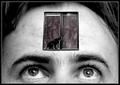
| 01/29/2003 05:36:46 PM |
Open Mindedby lisaeComment: Just my opinion but the cat is just a little too much. The idea is a good one. Good luck. JG |
| 01/29/2003 05:33:44 PM |
Little Sisterby karmatComment: Good picture and I'm glad someone was not afraid to put a person into their image. I think that makes the photo more appealing. The lighting on your sisters face is a little harsh. A little post editing to tone that down might have helped. (8) |
| Photographer found comment helpful. |
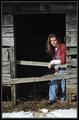
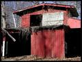
| 01/29/2003 05:29:54 PM |
Abandoned Shedby BAMartinComment: Nice lighting with some interesting shadows, The image begs to be photographed but the straight on shot takes away from any creativity that might have been available. (6) JG |
| Photographer found comment helpful. |
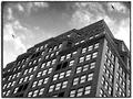
| 01/29/2003 05:27:38 PM |
New York Windowsby dimitriiComment: Good cropping, the birds help with the image but overall pic lacks the creativity that this challenge offered. (6)JG |
| Photographer found comment helpful. |
Home -
Challenges -
Community -
League -
Photos -
Cameras -
Lenses -
Learn -
Help -
Terms of Use -
Privacy -
Top ^
DPChallenge, and website content and design, Copyright © 2001-2025 Challenging Technologies, LLC.
All digital photo copyrights belong to the photographers and may not be used without permission.
Current Server Time: 04/09/2025 12:52:41 PM EDT.