| Image |
Comment |
| 10/03/2006 09:10:13 AM |
Regal Roseby KayBEEBComment: Fantastic! I love these shots. I am perfecting my skill at these as well. I can imagine people will not like the border, but I think it adds. There are too many DPCers with no instinct for creativity and bold visuals. Great exposure and lighting. 9 |
| 10/03/2006 09:07:21 AM |
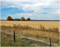
Middle Americaby tfarrell23Comment: I think this image has great potential. I also think that a little different perspective could have boosted this. Typical landscapes are wide-angle and this does not seem to be wide enough. I like that you included the fence in the foreground, that is the first element in a good landscape. The placement of the house in the frame is a little off, not quite following the rule of thirds. I also would like to see a little more saturation of the colors to get a little more punch. I also wish the mountains were larger.
My advice is for you to go back out and shoot again. This time wait for sunset. The light just before the sunset will color your frame better and make it a lot more interesting. Second, I would go a little wider and place the house at the top third of the frame on the left-hand side. Use the rest of the frame for negative space or include another element to help draw the eye from the fence to the house.
For this image: very nice exposure and great concept, just needs a little fine-tuning. |
 Photographer found comment helpful. Photographer found comment helpful. |
| 09/07/2006 09:39:17 AM |
|
| Photographer found comment helpful. |
| 09/07/2006 08:39:34 AM |
Shadows and Eyesby vprndsgComment: I would like to see the right (subject's left) eye in focus...just because it is illuminated and the detail in the iris will show up. |
| Photographer found comment helpful. |
| 09/07/2006 08:37:38 AM |
Shooting a Starby docpjvComment: nice candid. Try cropping out the bottom a little more to get rid of the green leaf. |
| Photographer found comment helpful. |
| 09/07/2006 08:36:02 AM |
Coorongby aussieannieComment: Technically, the subject is a little too far to the right - but I won't hold it against you. :) Nice concept. I would like to see this again with a lower sun...the sunset colors could really break this image out and make it very appealing. |
| Photographer found comment helpful. |
| 09/07/2006 08:33:58 AM |
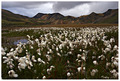
Cottongrassby GautiComment: Nice landscape. I can't tell if there is motion blur in the foreground or if that is just the appearance of the cotton. A faster shutter speed would obviously have solved the motion blur.
Next, try adding more contrast to the sky to get the clouds to really stand out. Also, add more saturation and contrast to get the grass and mountains to be more vivid.
I think this is a great image and can be greatly improved with some of Bear_Music's editing techniques. |
| Photographer found comment helpful. |
| 09/07/2006 08:27:27 AM |
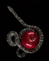
Original Sin by smykComment: Neat concept. I would like to see it a little brighter (the apple that is). |
| Photographer found comment helpful. |
| 09/07/2006 08:25:21 AM |
|
| Photographer found comment helpful. |
| 09/07/2006 08:24:52 AM |
A Friend on Shoreby grainman9Comment: I would like to see a tighter crop. Don't worry about the bird...I would like to see more detail of the surf! great picture none-the-less. |
Home -
Challenges -
Community -
League -
Photos -
Cameras -
Lenses -
Learn -
Help -
Terms of Use -
Privacy -
Top ^
DPChallenge, and website content and design, Copyright © 2001-2025 Challenging Technologies, LLC.
All digital photo copyrights belong to the photographers and may not be used without permission.
Current Server Time: 04/07/2025 06:23:56 AM EDT.