| Image |
Comment |
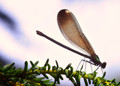
| 07/08/2014 07:21:53 AM |
damsel by skewsmeComment: Lovely detailed capture of the wings, especially. |
 Photographer found comment helpful. Photographer found comment helpful. |
| 07/08/2014 07:21:15 AM |
Leaving Homeby enikoComment: Great expression on the dog's face and love the reflection in the window. |
| Photographer found comment helpful. |
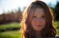
| 07/08/2014 07:20:33 AM |
Frankieby flahermaComment: I like the composition but would like to have seen a little more light on her face from a reflector, say. |
| Photographer found comment helpful. |
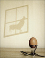
| 02/22/2006 06:31:55 AM |
Forlorn Hopeby sjohnstonComment: Thanks to all who took the time to vote and especially those who provided feedback. The idea was to represent how our dreams and hopes for ourselves or for the next generation can be undone by external forces or people (how many wanted to drive a fire engine for example?).
My own criticisms of the image include:
1. Horizon is not level - tried this several times in photoshop but never quite got it
2. Too much grain - taken at ISO 400 in a fairly dark room (I am sadly lacking even desk lamps!). Might have been clearer at 200 with a longer exposure.
3. Crop on spoon too tight - needed to remove my own shadow from the frame where I am holding the picture frame (window) via a piece of sewing thread. |
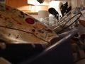
| 02/17/2006 04:18:48 AM |
The Constant Battleby SomethingNewComment: I suppose the clutter is intended to add to the overall sense of slovenliness but is too distracting and the dish, whcih appears should be the main focal point, is lost to the bright area in the background. |
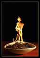
| 02/17/2006 04:17:04 AM |
The Guardian! by Ecce_SignumComment: The shape of the flame does indeed look like some cloaked figure and the overall idea is good and well executed. I would probably liked more light on the coins and the border is a bit too distracting for me. |
| Photographer found comment helpful. |
| 02/17/2006 04:14:59 AM |
|
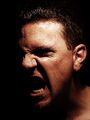
| 02/17/2006 04:05:24 AM |
Wrath Self Portraitby GIS_boyComment: Well done capturing the expression. There are a few other similar shots of which one stands out; I think there may have been a little too much contrast between the light and dark areas on yours for my taste. Perhaps a second muted light to the left-hand side would have balanced it out more. |
| Photographer found comment helpful. |
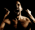
| 02/16/2006 11:36:19 PM |
WRATHby AlexSaberiComment: There seem to have been a few similar ideas going around, but for me you're effort is the best, with good strong side lighting. Might have toned down the sepia slightly. |
| Photographer found comment helpful. |
| 02/16/2006 11:34:23 PM |
MONEY 2 BURN (GREED)by dippydazComment: Nice simple concept and exposure and focus are good - perhaps a little more light on the front of the twenty(?) |
| Photographer found comment helpful. |
Home -
Challenges -
Community -
League -
Photos -
Cameras -
Lenses -
Learn -
Help -
Terms of Use -
Privacy -
Top ^
DPChallenge, and website content and design, Copyright © 2001-2025 Challenging Technologies, LLC.
All digital photo copyrights belong to the photographers and may not be used without permission.
Current Server Time: 04/09/2025 12:45:52 AM EDT.