| Image |
Comment |
| 04/29/2006 08:29:26 AM |
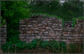
Lumberjackby Little KingComment: Good idea here, but it took me too long to find him. The brightness of the greenery mixed with the darkness of the stone and shadows are too overwhelming to really take notice to the main subject for me. |
 Photographer found comment helpful. Photographer found comment helpful. |
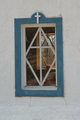
| 04/29/2006 08:27:28 AM |
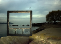
outside the boxby tateComment: Just got back from Fla. the day this challenge was due, and all I thought about was the 3 old window frames like this one that I had sitting in my gararge. Didn't have time to make it happen, but glad someone did...and did a damned good job of it at that! One of my fav's!! Great job!! "10" from me. |
| Photographer found comment helpful. |
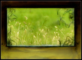
| 04/29/2006 08:25:57 AM |
Medieval Viewby loveComment: Really like this shot. I would have loved to see a little bump in saturation on the grasses surrounding your subject, that to me, would separate the desat of the foreground. Love the window shooting from and the total concept overall. 7 |
| Photographer found comment helpful. |
| 04/29/2006 08:23:09 AM |
1/2 a Manby moviemanComment: Like the crop, the title and the black and white concept, however, the blownout background is a bit too distracting for me. The cut out wood, writing on the wall are important in this shot, yet, I'm too drawn away from those points. |
| Photographer found comment helpful. |
| 04/29/2006 08:20:15 AM |
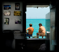
On the Deckby CutterComment: This works for me!!! The awsome conotrast of the inside vs. the outside really brings this to light! Wish i were there. 8 |
| Photographer found comment helpful. |
| 04/29/2006 08:18:34 AM |
Light on the other sideby stanm2Comment: I like this shot, however, IMO, I would have made the straightening points on the sides and not the bottom. The angle is a little distracting, and ,maybe a closer crop on the bottom. |
| Photographer found comment helpful. |
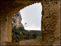
| 04/29/2006 08:16:55 AM |
|
| Photographer found comment helpful. |
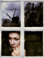
| 04/29/2006 08:14:38 AM |
World Beyondby elsapoComment: Nice color mix. The actual framing of this really puts it together for me. the darkness at the top stands out, just as the subject at the bottom. Very nice composition. 8 |
| Photographer found comment helpful. |
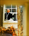
| 04/29/2006 08:13:14 AM |
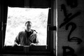
Silencio by kiwinessComment: One of my fav's so far. The age of the window, the expression, the reflections, and the hint of darkness really pull together as a nice photo to look at. 10 |
| Photographer found comment helpful. |
| 04/29/2006 08:11:35 AM |
Lonely treeby alexgarciaComment: Very nice use of color and tones. Really like the concept and the crop on this one. At first, I found myself looking for a bluer sky other than just the whiteness, howevr, after looking at it a few times, I think that it is part of what makes the it al;l come together. |
| Photographer found comment helpful. |