|
|
|
Showing 101 - 110 of ~133 |
| Image |
Comment |
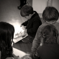
| 05/10/2006 08:35:10 PM | Never alone with a book...by xianartComment: From the CTP MkII
First Impression: What's with all the kids in the foreground? What are they doing for the shot? 5, because of those pesky kids.
Composition: 5. The foreground elements take a lot of attention from the subject. A tighter crop would've done your subject justice.
Subject: Your subject's a kid. Reading a book. You should've showed a lot more of just that, and a lot less of what it's not.
Technical: 6. Tonalities are fine, but a little bumping up of the contrast wouldn't hurt.
Summary: This is Candid, not Photojournalism. It doesn't have to speak volumes to be appreciated as one. Crop the hell out of it and it's a great photo.
Disclaimer: The following crits are personal opinions, not photographic dogmas. Please see them as suggestions, not claims of mastery nor a show of hauteur.;pMessage edited by author 2006-05-14 22:52:31. |  Photographer found comment helpful. Photographer found comment helpful. |
| 05/10/2006 07:47:53 PM | Morning Gloryby yankoComment: From the CTP MkII
First Impression: Niiice. 7 or 8.
Composition: 9. A tighter crop wouldn't've worked for me as much as this one. It's fine as it is.
Subject: 10. As far as I'm concerned, it rocks in this department.
Technical: 8. A little more saturation, I guess. Then again, maybe not.
Improvement: Sorry. Don't think there's something that could be added in this regard. At least not from me.;p
Summary: It's not a photo that can be appreciated in one glance. One has to linger for a bit to really see this photo's merits. Congrats on your personal best.
Disclaimer: The following crits are personal opinions, not photographic dogmas. Please see them as suggestions, not claims of mastery nor a show of hauteur.;pMessage edited by author 2006-05-11 06:25:12. | | Photographer found comment helpful. |
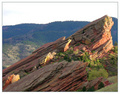
| 05/09/2006 09:34:22 PM | Backlit Under Cloudsby RebeccaComment: From the CTP MkII
First Impression: 5. Dang, this photo's hard to crit. It's a nice shot, mind you, but looks raw. Nothing that a little PP won't fix, but still...
Composition: 5. The rock's okay but the background's bugging me. I don't think it does justice to the rock thing. Methinks you should've tried shooting from a higher or lower angle, so as not to "cut" the rock lip.
Subject: 5. Like my comment above, the rock's doing just great. It's the sky this time. Never shoot bald skies. DPCfolk don't like bald skies.
Technical: 5. This is where you failed, I guess. Subjects with dynamic range are pretty hard to shoot. Still, some PP like some contrast masking, selective saturation and desaturation, some levels and curves, and you're good to go.
Summary: Your photo's got a lot of potential. But a reshoot would be better.;p
Disclaimer: The following crits are personal opinions, not photographic dogmas. Please see them as suggestions, not claims of mastery nor a show of hauteur.;pMessage edited by author 2006-05-10 01:35:46. | | Photographer found comment helpful. |
| 05/08/2006 10:25:59 PM | ~ Rhythm ~by yankoComment: From the CTP MkII
Disclaimer: The following crits are personal opinions, not photographic dogmas. Please see them as suggestions, not claims of mastery nor a show of hauteur.;p
First Impression: Hookay, 5. The first thing that got to me (and I apologize for having to say this) was the sloppy application of selective desat. That, even more than the model (great-looking girl that she is), caught my attention, um, forcefully I guess.
Composition: 6. it's nice that you gave the subject "looking room" but methinks there's a bit too much black space for "looking". Cropping off just a wee bit from the right could make the shot better, IMO.
Subject: 6 or 7. The girl's great to look at so I guess that's all there is to it.;p
Technical: 4 or 5 because the color and desat spills make me uncomfortable. As a "fan" of selective desat, I would've preferred a more careful selection so as to avoid these color and desat spills. And I guess leaving a bit of color (say 15% to 40%) would've sufficed.
Improvement: As I have stated above, a wee bit of cropping from the right and a more careful application of selective desat would've worked wonders for it.
Summary: Dude, 6+ isn't so bad... it's even at the top 20s. So "Grrr" no more, okay? Okay.;p Message edited by author 2006-05-29 00:40:41. | | Photographer found comment helpful. |
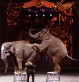
| 05/08/2006 09:49:18 PM | The Circus in townby DigiFotoBuddyComment: From the CTP MkII
Disclaimer: The following crits are personal opinions, not photographic dogmas. Please see them as suggestions, not claims of mastery nor a show of hauteur.;p
First Impression: Haha, amusing.:) 6, disregarding the technicals, because it amuses me to no end.
Composition: 5. A wider crop, which would've showed more of the ring, would've worked for me. Didn't like that you clipped the ringmaster's feet and the whole thing feels a bit too heavy at the right.
Subject: 9. Because it's fun.
Technical: 5 or 6. The less than stellar focus has done you in, IMO. I'm not sure I like the light disparity between the subject and the background but it's nothing a little selective desat won't fix.
Improvement: Recompose to the left and below, some burning and dodging, and a bit of color tweaking, I guess.
Summary: It's not that hard to imagine seeing it in a small town daily and it does jolly one up so good work. I'm a number too short on screws in the head so please do not be offended.;p
| | Photographer found comment helpful. |
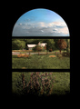
| 05/08/2006 09:22:14 PM | The old House by the Seaby GunnsiComment: From the CTP MkII
Disclaimer: The following crits are personal opinions, not photographic dogmas. Please see them as suggestions, not claims of mastery nor a show of hauteur.;p
First Impression: Dang, this is nice. 6 because the colors're flat and a bit washed out BUT given the right PP, it could hold its ground up there with the big guys.
Composition: 8 here. Because it WORKS. And I know YOU know why it works so no more from me on this regard.
Subject: 6. Not really a fan of this genre, but I think you did good with it.
Technical: 5. Colors are bland and exposure's a bit under. But really, it's nothing a little PP couldn't fix.
Improvement: Nothing (from me) with regards to the shot, a wee bit of dodging and burning and bumping up contrast and saturating AAAND some sharpening for PP.
Summary: It's a good shot, really, with the potential of being a great shot. With proper PP, that is. Aaaaand I'm a number too short on screws in the head so please do not be offended.;p | | Photographer found comment helpful. |
| 05/08/2006 09:09:53 PM | Palistinians go to Work in West Bank and Gaza againby GunnsiComment: From the CTP MkII
Disclaimer: The following crits are personal opinions, not photographic dogmas. Please see them as suggestions, not claims of mastery nor a show of hauteur.;p
First Impression: Whoa, 6. It's pretty powerful. With proper pp, it could very well be on the front page of a daily, IMO.
Composition: 6 or 7. Composition's fine with me, even with the tilted horizon (or whatever that is:p).
Subject: 8. Because social realism rocks.
Technical: 5. This is where you screwed up, pare. I don't know if it's too much NI or the JPEG compression but the fuzziness really bugs me. Which was too bad because I liked the almost duotone look of your photo.
Improvement: I guess a little sharpening or a bit more contrast would do the photo a lot more justice.
Summary: I, for one, liked your photo. The less than stellar output is no fault of your photographic abilities, but of your pp skillz. Also, I'm a number too short on screws in the head so please do not be offended.;p
| | Photographer found comment helpful. |
| 05/08/2006 07:40:41 PM | Snohomish Invitational GU-13 Finalsby margiemuComment: From the CTP MkII
Disclaimer: The following crits are personal opinions, not photographic dogmas. Please see them as suggestions, not claims of mastery nor a show of hauteur.;p
First Impression: Wow, girlie football. However, a 4 from me (sorry...-_-") as the colors are a bit washed out and the shot lacks punch.
Composition: 5. The action's nice, but the background's too distracting it takes a lot from the shot. Hey, at least the ball's there.
Subject: 6. Girlie soccer's cool, but I'm not too wild over it. You got the action, which MAKES the shot, so that's cool. Digressing, the chick in red looks a wee bit like a dude, IMO. Sorry...
Technical: 4. Focus is a bit off, coloure a bit washed out, exposure a bit over-, um, exposed, and, well, the whole thing's a bit flat -- which you, however, could improve with pp. Well, a lot of pp.
Improvement: Recompose, maybe from another lateral and/or higher angle. Also, a lot of pp: a wee bit of dodging and burning, levels maybe or curves, saturate, and sharpen.
Summary: I hope I didn't sound too harsh. It's a good shot... it only needs some refinement. I'm a number too short on screws in the head so please do not be offended.;p Message edited by author 2006-05-08 23:41:52. | | Photographer found comment helpful. |
| 05/08/2006 06:39:43 PM | E-71 wins again the World Championship of Windsurfby alexgarciaComment: From the CTP MkII
Disclaimer: The following crits are personal opinions, not photographic dogmas. Please see them as suggestions, not claims of mastery nor a show of hauteur.;p
First Impression: 6 or 7, for visual appeal. Also, I can imagine it appearing alongside a windsurf article.
Composition: 4 or 5, because there's too much space behind the sails and too little in front of and above them.
Subject: 6, 'cuz windsurfing rocks. Not a fan of half-naked men images so I'm fine with having them behind the sails(j/k). It would've been another issue had they been doing acrobatics and shit.;p
Technical: 6. I'd say it's a spot-on exposure, if not very very slightly underexposed. The vibrant colors add a lot to the visual appeal. I, however, find the water a tad too green, the sky a tad too flat, and the yellow in the sails a tad too saturated. But that's just me.;)
Improvement: Re-compose to the right and below, tweak the colors, and have explosions in the background(j/k).
Summary: You're the first on the list so you're my first critiquee. I'm a number too short on screws in the head so please do not be offended.;p Message edited by author 2006-05-08 22:44:03. | | Photographer found comment helpful. |
| 04/20/2006 06:40:24 PM | | | Photographer found comment helpful. |
|
Showing 101 - 110 of ~133 |
Home -
Challenges -
Community -
League -
Photos -
Cameras -
Lenses -
Learn -
Help -
Terms of Use -
Privacy -
Top ^
DPChallenge, and website content and design, Copyright © 2001-2025 Challenging Technologies, LLC.
All digital photo copyrights belong to the photographers and may not be used without permission.
Current Server Time: 04/11/2025 11:16:24 PM EDT.
|