| Author | Thread |
|
|
05/14/2006 06:55:18 PM |
hookay, apologies for for having such a small brain.;p
now that you say it, the fg kids does have a point... wow. didn't see it that way. thanks for showing me. now i like this photo better.;p |
|
 Photographer found comment helpful. Photographer found comment helpful. |
|
|
05/11/2006 02:32:54 AM |
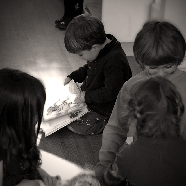
| the whole point of the image is the fact that the reader wasn't playing with the other kids. he was isolating himself with a book. hence the children in the forground happily playing, framing the reader, isolating him visually from the viewer. thus, also, the glow on the book, bringing more power visually to the object of his attention, over that of social interraction. |
|
|
|
05/10/2006 08:35:10 PM |
From the CTP MkII
First Impression: What's with all the kids in the foreground? What are they doing for the shot? 5, because of those pesky kids.
Composition: 5. The foreground elements take a lot of attention from the subject. A tighter crop would've done your subject justice.
Subject: Your subject's a kid. Reading a book. You should've showed a lot more of just that, and a lot less of what it's not.
Technical: 6. Tonalities are fine, but a little bumping up of the contrast wouldn't hurt.
Summary: This is Candid, not Photojournalism. It doesn't have to speak volumes to be appreciated as one. Crop the hell out of it and it's a great photo.
Disclaimer: The following crits are personal opinions, not photographic dogmas. Please see them as suggestions, not claims of mastery nor a show of hauteur.;p
Message edited by author 2006-05-14 22:52:31. |
|
| Photographer found comment helpful. |
Comments Made During the Challenge  |
|
|
04/18/2006 10:58:04 AM |
| its neat how the pages look like they light up |
|
| Photographer found comment helpful. |
|
|
04/16/2006 09:22:25 AM |
| I love this photo - very emotive - like also the textures: smoothness of the floor, softness and shiny-ness of the hair.. very nice |
|
| Photographer found comment helpful. |
|
|
04/14/2006 01:37:03 PM |
| I wonder if this photo does better if the camera was at the same level as the child instead of looking down? |
|
| Photographer found comment helpful. |
|
|
04/13/2006 05:48:07 AM |
| Nicely taken and nicely detailed; rather, er, 'standard' subject doesn't help it amongst so many oother child shots. |
|
| Photographer found comment helpful. |
|
|
04/12/2006 01:31:19 PM |
I'm not much for receiving or giving comments, but since Candids are near and dear to my heart, I have decided to give comment on every entry in this challenge.
Little interest here for me I'm afraid. Just a boy reading a book is what I get from it and I find nothing that speaks to me beyond that. I do like the tones and the dof, but as a candid and in what I like to see in them, this just doesn't do it for me. It's a 3 vote for me. |
|
| Photographer found comment helpful. |
Home -
Challenges -
Community -
League -
Photos -
Cameras -
Lenses -
Learn -
Help -
Terms of Use -
Privacy -
Top ^
DPChallenge, and website content and design, Copyright © 2001-2025 Challenging Technologies, LLC.
All digital photo copyrights belong to the photographers and may not be used without permission.
Current Server Time: 04/07/2025 01:26:40 PM EDT.