| Author | Thread |
|
|
10/27/2008 01:49:25 PM |
| This is pretty awesome, love the colors, really awesome composition and nice use of the window, added to faves. |
|
 Photographer found comment helpful. Photographer found comment helpful. |
|
|
09/09/2006 03:25:20 PM |
| This is beautiful shot.Capturing your inner and outer world on on canvas . Well done |
|
| Photographer found comment helpful. |
|
|
07/10/2006 08:13:01 PM |
|
| Photographer found comment helpful. |
|
|
05/10/2006 07:47:53 PM |
From the CTP MkII
First Impression: Niiice. 7 or 8.
Composition: 9. A tighter crop wouldn't've worked for me as much as this one. It's fine as it is.
Subject: 10. As far as I'm concerned, it rocks in this department.
Technical: 8. A little more saturation, I guess. Then again, maybe not.
Improvement: Sorry. Don't think there's something that could be added in this regard. At least not from me.;p
Summary: It's not a photo that can be appreciated in one glance. One has to linger for a bit to really see this photo's merits. Congrats on your personal best.
Disclaimer: The following crits are personal opinions, not photographic dogmas. Please see them as suggestions, not claims of mastery nor a show of hauteur.;p
Message edited by author 2006-05-11 06:25:12. |
|
| Photographer found comment helpful. |
|
|
05/07/2006 02:17:20 PM |
Greetings from your own critique club.
First Impression
WOW.
Composition:
Very good composition. I would have like little tighter crop on this.
Subject:
I really like the subject. Nice take on the challenge.
Technical (Colour and light):
The color and lighting is perfect. PP is good except the could part. It looks like too much NI, flat. Almost loos like part of the window and not the BG.
Improvement:
Tighter crop, different PP for the cloud part.
Summary:
Nice picture over all. I did not vote in this challenge, but would have scores this 8.
Congrates on your Personal Best. |
|
| Photographer found comment helpful. |
|
|
05/01/2006 10:18:15 AM |
| This is such a stunning photo!!! Absolutely beautiful!!! |
|
| Photographer found comment helpful. |
|
|
04/30/2006 11:04:06 PM |
| think a tighter crop would have ribboned....VERY nice photo |
|
| Photographer found comment helpful. |
Comments Made During the Challenge  |
|
|
04/30/2006 07:22:34 PM |
|
| Photographer found comment helpful. |
|
|
04/30/2006 06:02:41 PM |
|
| Photographer found comment helpful. |
|
|
04/30/2006 04:46:33 PM |
| like it, dont like the silouhette, i thnk this will keep your score down |
|
| Photographer found comment helpful. |
|
|
04/30/2006 04:30:11 PM |
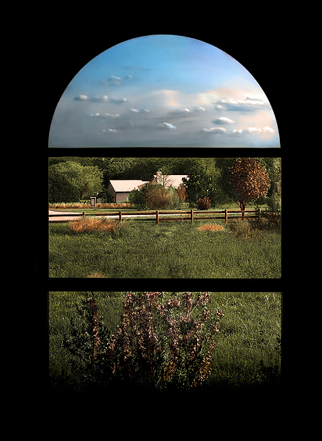
| This is one cool image... I love how it looks like it is in 3 parts. Wonderful job! |
|
| Photographer found comment helpful. |
|
|
04/30/2006 01:32:43 PM |
|
| Photographer found comment helpful. |
|
|
04/30/2006 01:08:52 PM |
| nice, overall shaperning seems stronger than it need be....really pretty scean framed in the window or not i think you should get a shot of the house and fence just pos it up after would love to see more of it. pretty sky also. |
|
| Photographer found comment helpful. |
|
|
04/30/2006 12:48:25 PM |
| I love this image. I especially like how the window pains frame different parts of the landscape, almost making this look like a triptych. |
|
| Photographer found comment helpful. |
|
|
04/30/2006 07:55:57 AM |
| Love the separation of the sky via window .... |
|
| Photographer found comment helpful. |
|
|
04/30/2006 06:59:55 AM |
| Cool shot, like how the window separates the sky from the middle ground from the flowers at the bottom, one of the strongest entries in here, gave it a 9. |
|
| Photographer found comment helpful. |
|
|
04/30/2006 06:20:37 AM |
| Beautiful shot, I just hope its a real window frame. |
|
| Photographer found comment helpful. |
|
|
04/30/2006 04:53:27 AM |
| Very pretty. I like the way the sky is in it's own division. |
|
| Photographer found comment helpful. |
|
|
04/30/2006 04:47:38 AM |
|
| Photographer found comment helpful. |
|
|
04/29/2006 07:00:57 PM |
| Lovely use of framing here, it does look massively over-sharpened though. Great colours and textures. |
|
| Photographer found comment helpful. |
|
|
04/29/2006 06:44:54 PM |
|
| Photographer found comment helpful. |
|
|
04/29/2006 04:02:50 PM |
| Very nice three panel. Might have cropped down a little more to reduce the thick black border. |
|
| Photographer found comment helpful. |
|
|
04/29/2006 12:10:59 PM |
| I like the different nature of light in the 3 different frames. - 8 |
|
| Photographer found comment helpful. |
|
|
04/29/2006 11:53:17 AM |
| I like the painterliness of it but more importantly the way you effectively created a different picture for each pane. |
|
| Photographer found comment helpful. |
|
|
04/29/2006 09:09:41 AM |
| Very good, I like how the window splits the view to three seperate images... well done.. |
|
| Photographer found comment helpful. |
|
|
04/29/2006 08:21:16 AM |
| The sky look like from a painting. But awesome framing, maybe a winner? |
|
| Photographer found comment helpful. |
|
|
04/29/2006 06:58:41 AM |
| I like the way the window creates such a nice strong border. Very nice shot. |
|
| Photographer found comment helpful. |
|
|
04/29/2006 06:29:40 AM |
| Wow, is that real? Looks fantastic, I love the clouds and the post-processing on the grass, etc. One of my favs for this challenge. Good luck. |
|
| Photographer found comment helpful. |
|
|
04/29/2006 02:19:33 AM |
| I like it. It seems like a mural with different topics, as a church gothic window. |
|
| Photographer found comment helpful. |
|
|
04/28/2006 10:45:45 PM |
| Great color and exposure. The way the elements are separated really help the image meet the challenge in a striking way. 10 |
|
| Photographer found comment helpful. |
|
|
04/28/2006 12:40:48 PM |
| This is a great view from a great window but it is my personal opinion that it would have been better with the regular view instead of the portion that is now in the top piece of the window. It doesn't really enhance the photo. However, as everything else in photography that is only one person's viewpoint. |
|
| Photographer found comment helpful. |
|
|
04/27/2006 09:18:32 PM |
|
| Photographer found comment helpful. |
|
|
04/27/2006 12:55:15 PM |
| Good choice of window. Interesting how the 3 panes have no overlap. Those sure are some funky-looking clouds - is the glass distorting them or is that post-processing? |
|
| Photographer found comment helpful. |
|
|
04/27/2006 12:30:07 PM |
| nice framing, I really like the clouds, framed in the top window. looks like the're painted. bumping to 7 :) |
|
| Photographer found comment helpful. |
|
|
04/27/2006 10:39:47 AM |
| Very nice sharp and detailed image. Well done. |
|
| Photographer found comment helpful. |
|
|
04/27/2006 07:40:13 AM |
|
| Photographer found comment helpful. |
|
|
04/25/2006 06:50:52 PM |
|
| Photographer found comment helpful. |
|
|
04/25/2006 06:07:22 PM |
| Perfect for the challenge! |
|
| Photographer found comment helpful. |
|
|
04/25/2006 02:25:07 PM |
ahhh, a beauty. the uppermost pane is the crowning touch.
fairytale like atmosphere. good luck |
|
| Photographer found comment helpful. |
|
|
04/25/2006 10:34:11 AM |
| I think this photo really answers the challenge theme well. The frame itself not only divides the subject into parts, but also draws the eye upwards through the shot to follow those parts. I think the outer edges of the frame appear a bit overbearing and could have been shot/cropped a bit tighter to emphasize what's outside the window more. nice shot nonetheless... I vote 7 |
|
| Photographer found comment helpful. |
|
|
04/25/2006 07:02:07 AM |
| Oooh - this is nice. Beautiful view nicely framed by the silhouette of the window. My only desire would be to either see a little bit of the tree line in the upper frame or a little bit of the sky in the middle frame. It's a bit too much like individual pictures - a little cross over would be nice (in my lowly opinion). Otherwise a great shot. |
|
| Photographer found comment helpful. |
|
|
04/24/2006 07:54:12 PM |
|
| Photographer found comment helpful. |
|
|
04/24/2006 03:34:35 AM |
| nice, but you cut off the horizon, that loses the depth to me |
|
| Photographer found comment helpful. |
|
|
04/23/2006 11:06:09 PM |
| I like how the window cuts this image up into the three main sections of the photograph; foreground, subject, background/horizon. Very nice 10 |
|
| Photographer found comment helpful. |
Home -
Challenges -
Community -
League -
Photos -
Cameras -
Lenses -
Learn -
Help -
Terms of Use -
Privacy -
Top ^
DPChallenge, and website content and design, Copyright © 2001-2025 Challenging Technologies, LLC.
All digital photo copyrights belong to the photographers and may not be used without permission.
Current Server Time: 04/05/2025 01:52:42 PM EDT.