|
|
| Image |
Comment |
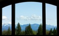
| 05/14/2006 07:09:48 PM | Room With a Viewby margiemuComment: From the CTP MkII
Why don't you go a full 640? It's as small as it is without you shortening it up a bit more. Your 20D can handle a lot more than that.
One of your better shots, IMO. Still wanting in the PP department, but getting there.
A polarizer (or some PP) would've cut through the haze, as it takes a lot of punch from the shot.
Great take on the challenge. |  Photographer found comment helpful. Photographer found comment helpful. |
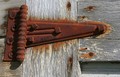
| 05/14/2006 07:04:15 PM | barn hingeby margiemuComment: From the CTP MkII
Here to add another comment on this photo.;p
Getting just one comment's a bit harsh. Anyways, I guess this one didn't stand out amongst the other entries in this challenge.
It doesn't say much, and it's not eye candy. A bit of PP would've placed it higher, but PP could only get you so far.
It's an average shot. You could do better.;p | | Photographer found comment helpful. |
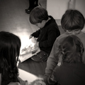
| 05/14/2006 06:55:18 PM | Never alone with a book...by xianartComment: hookay, apologies for for having such a small brain.;p
now that you say it, the fg kids does have a point... wow. didn't see it that way. thanks for showing me. now i like this photo better.;p | | Photographer found comment helpful. |
| 05/14/2006 06:35:19 PM | You can't judge a book by its coverby alexgarciaComment: From the CTP MkII
Okay, I'll be trying a different crit format for this particular entry. To keep it short and sweet.
What Works:
The lighting's great, the exposure's great, the subject's funny. This particular mix got it placed where it is right now.
What Needs Improvement:
The shallow DOF. And the page misalignment. But I guess you know of these by now. These prevented you from placing higher, IMO.
Summary:
Minus minor nitpicks, it IS a great entry for the challenge. Congrats on your current PB. | | Photographer found comment helpful. |
| 05/14/2006 06:22:23 PM | Lonely treeby alexgarciaComment: From the CTP MkII
First Impression: It's an average photo... it doesn't have much to offer, IMO. Sorry. 4 or 5.
Composition: Your comp on this photo is what keeps it standing however the other departments get tanked. 5 or 6.
Subject: When you said lonely tree, I'd've expected more tree and less not tree. 4 or 5.
Technical: DOF's a bit too shallow, and shot's a bit underexposed. 5.
Summary: Okay, this ain't one of your best photos. T least the ones that followed it did good, right?
Disclaimer: The following crits are personal opinions, not photographic dogmas. Please see them as suggestions, not claims of mastery nor a show of hauteur.;p
| | Photographer found comment helpful. |
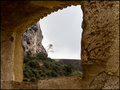
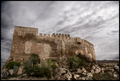
| 05/14/2006 06:13:48 PM | 982 years oldby alexgarciaComment: From the CTP MkII
First Impression:
Nice. The photo pretty much speaks for itself... doesn't need a title although it does get strengthened by it. 7.
Composition: Isn't it a bit tilted? Anyways, off-center works. But I'm left wondering... wouldn't it have worked better had it a vertical composition and about 50% skyspace? Just musing... 6 or 7.
Subject: It's a great subject and it DOES meet the challenge. An 8 or 9 from me.
Technical: I guess it's properly exposed... if not a bit on the dark side. Personally, I'd give it more contrast, but I guess it's fine as it is. 6.
Summary: A top-notch photo, IMO, with a potential for greatness -- with proper tweaking. Congrats on the top 25.
Disclaimer: The following crits are personal opinions, not photographic dogmas. Please see them as suggestions, not claims of mastery nor a show of hauteur.;p
| | Photographer found comment helpful. |
| 05/11/2006 11:34:57 PM | A Stitch in Time Saves Nineby xianartComment: From the CTP MkII
First Impression:
Clever, could be better. 5.
Composition:
5. The composition's okay, but could be better. Maybe a more skewed angle?
Subject:
6 or 7. Clever. Prolly more than most of the entries in this particular challenge.
Technical:
5. Lighting works. But could be better. I guess a better or brighter lit entry would've placed you higher.
Summary:
All in all, a great take on the entry. There's room for improvement, but doesn't it apply to all of us?;p
Edit: Coding. Message edited by author 2006-05-12 03:35:42. | | Photographer found comment helpful. |
| 05/11/2006 11:11:01 PM | Smoking Bulletby xianartComment: From the CTP MkII
First Impression:
NOOKlear! Not quite Warholia, but I don't think that's what you were gunning for. 6.;p
Composition:
Centered vertical. It's a bit too compositionally static for my tastes... would've looked for a more dynamic composition for such wild colors. 5, which is the center of all things.
Subject:
Ah, cuban? 8... Viva la Cubanos!XD
Technical:
6. For curves and levels overkill.
Improvement:
A more dynamic composition, I guess. Off center or diagonal works, for that fuuunky munky effect.
Summary:
Nice photo, all things considered. Keep it up!
New Disclaimer: I'm not on crack.Message edited by author 2006-05-12 03:12:41. | | Photographer found comment helpful. |
| 05/11/2006 03:13:29 AM | Through a Glass Darklyby xianartComment: From the CTP MkII
First Impression: God, the PP on this shot f-ing rocks. But guess what? The title f-ing rocked more! I don't know if you got it from the bible ( 1Cor 13:12) or from the movie ( SÃ¥som i en spegel) or wherever, but such photos with such titles make my day. 10. No, 11.;p
Composition: Minus minor nitpicks, I would have it no other way. 9.
Subject: Hey, I just realized I'm not too wild about those boots... damn. I think I would've liked it better with naked feet. Eh, whatever... it still rocks. 8.
Technical: Spot on exposure, IMO. Blown-out window borders worked for me. 8.
Improvement: Remove those goddamned boots! Hehe. Besides that, nothing from me.
Summary: How do you youngsters say it again? I heart this photo -- is that about right? Good work, man. Congrats on the top 40 and the PB.
Disclaimer: The following crits are personal opinions, not photographic dogmas. Please see them as suggestions, not claims of mastery nor a show of hauteur.;p
P.S. Please pardon the f-word. It just occured to me that it might be offensive to some people. Can't help it. Sorry in advance. Message edited by frisca - language. | | Photographer found comment helpful. |
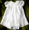
| 05/11/2006 02:46:05 AM | My Grandmother's Christening gown - 1911by xianartComment: From the CTP MkII
First Impression: Product shot!;p If it was, I'd buy one. 6.
Composition: 5. It's pretty square, and square doesn't do your subject justice, IMO. Square = Straightforward = Does not do well, sometimes.
Subject: 10. Because it's old and creepy and from the early 19th century. Hahaaah... this rocks.
Technical: 6. The highlights are blown-out, but the important details aren't. You did good, ma'am.
Improvement: Spiders, skulls, cobwebs, other creepy stuff. Or your gramma, if she's still around.
Summary: Product shot! Product shot! Product shot! I like it, though. I can just imagine what that gown's been through...
Disclaimer: The following crits are personal opinions, not photographic dogmas. Please see them as suggestions, not claims of mastery nor a show of hauteur.;p
| | Photographer found comment helpful. |
Home -
Challenges -
Community -
League -
Photos -
Cameras -
Lenses -
Learn -
Help -
Terms of Use -
Privacy -
Top ^
DPChallenge, and website content and design, Copyright © 2001-2025 Challenging Technologies, LLC.
All digital photo copyrights belong to the photographers and may not be used without permission.
Current Server Time: 04/11/2025 11:08:39 PM EDT.
|