|
|
| Image |
Comment |
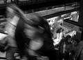
| 05/05/2003 02:56:42 PM | 14th Street - Union Squareby christoComment: One of my favorites this week. It would be a disservice to give the photo a low mark on account of its overall bluriness. I find the blurring is what really makes you feel like you're in rush hour - it adds to the mood of the photo greatly. Lighting, contrast and composition are great here! A wide variety of tones, + your eyes follow a spiral from the opened door, up the escalator and out of the frame. Good shot!!! |  Photographer found comment helpful. Photographer found comment helpful. |
| 05/04/2003 02:24:04 PM | Out In the Rainby kaysrivComment: Great photograph lies right inside this one!... First use levels and you'll see the shot's underexposed...move rightmost slider towards the middle until touching the histogram data and you're done there... Boost saturation slightly, and crop photo for a little more abstraction... (I cropper in the uppe-right area, hard to describe how)...Idea's there, just needs some processing... |
| 05/04/2003 08:52:28 AM | cherry blossoms illuminated at the time of festivalby kenboComment: Greetings from the Critique Club!....
COMPOSITION... Placement of subject, angle chosen, are all fine choices I think. Your horizon goes right through the center of the image though, making the composition a little static, but the diagonal line of the river gives something for your eye to follow. I don't know how I feel about having the top of the building crop off...I keep wanting to back away from the shot so I can see the whole scene. The reflections of the water add interest to the already beautiful trees.... Apart from the technical problems, night scenes are great to look at because they're a stark departure from the "usualness" of daylight scenes. Objects take on a whole new look when illuminated by artificial light.
TECHNIQUE... What I like about the exposure is how the foreground and background is well lit. But some parts of the trees are a little TOO lit...highlights are blown out too much on the trees. And the noise introduced from the long exposure does detract from the shot a little. 2 seconds isn't really that long, but still too much noise, perhaps the image was blown up as well? In a non-dpclegal world...you could take two exposure of the same scene: one that evenly lights the background, and one shot perfectly exposed for the trees. In photoshop, the images are combined, masking out the unwanted sections of each photo. Its really too bad noise on a digital camera is not equal to high grain in film shots.
OVERALL... While night scenes are great subject matter, digital cameras have a bit to go before they can produce good results. You took a good shot given the limitation of your equipment and rules of the challenge.... | | Photographer found comment helpful. |
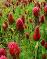
| 05/01/2003 05:54:36 AM | Red Cloverby boyte1Comment: Greetings from the Critique Club!...
COMPOSITION...I think you've done a wonderful job of capturing the feeling of spring and displaying wild plant life. I don't know if there were other angles that could convey the abundance of the flowers better, but you picked a pretty good viewpoint, where you can see flowers from foreground to back with little hinderance. The wild grass growing in between the flowers, especially in the foreground, is slightly distracting...but your only option is to individually pluck out the foreground ones...Perhaps the bottom right corner could use a nice big flower since there's so much space there, but its a minor detail...
TECHNIQUE... Some comments (but not many) wanting more DOF...I think a small/large DOF will either work, but if it is going to be small, I would place more of an importance in having the foreground completely in focus than somewhere in the middle... Lighting's great, slightly backlit? The light on the flower is traced around their edges giving a very pleasing effect... | | Photographer found comment helpful. |
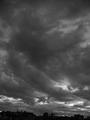
| 04/28/2003 06:38:01 PM | Cloudsby BrunocancadoComment: Greetings from the Critique Club!...
COMPOSITION... Sometimes when trying to shoot a great atmospheric shot, attention is sometimes lost to the foreground... which can be just as important to a photo if it is included of course... I just find this shot could have used a little more of it.... putting in just a little more of the city line by tilting the camera down (filling one third of the bottom ideally)... or even better, finding some large object in the landscape (interesting rock, sculpture) to shoot it against. You definitely got a great foreboding sky though and it aptly fits the challenge.
TECHNIQUE... A levels adjustment should be employed to give proper contrast. A histogram shows the highlights are not close to pure white. Other than that, image quality suffers slightly... the file size is 52 kb. When saving the file as a jpg, use the highest quality (lowest compression) possible such that the file size does not exceed 150kb.
|
| 04/28/2003 06:27:06 PM | Pretty Lady by JeanComment: Excellent lighting and composition, only looks slightly underexposed. A small levels tweaking would fix this. | | Photographer found comment helpful. |
| 04/28/2003 06:25:24 PM | Alligator Alleyby ploogieaComment: My take is that cropping out any part of the image that contains water (leaving a panorma that consists of the lower 3rd to 1/2 of the photo) produces an almost abstract shot thats more appealing to me. What immediately draws me to the photo is the mass of alligators looking in different directions and the muddy, refelective water draws your eyes away from all the action. | | Photographer found comment helpful. |
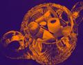
| 04/27/2003 05:59:28 PM | This candy has been chromedby camelotnorthComment: Greetings from the Critique Club!...
FIRST IMPRESSIONS... Just a note on my impressions of extreme photo manipulations such as yours. I don't know if it contributed to your low placement, but I would hope it didn't. While it is true that Photoshop enables anyone to easily make extreme modifications such as yours, there was a time where photographers who produced these kinds of shots had their work published and admired. Well, maybe not by everyone admired them, but they were still considered valid works of art... 'Course, to keep things fair, this kind of effect in a darkroom was more difficult to accomplish, and at the time it was new and experimental...
COMPOSITION... Shot at an interesting angle, the slight crop on bottom and right are immediately noticeable and I'm trying to decide whether putting in the little bit that's missing on the bottom and right frame would help the photo or not, was that an intentional crop or just accidental? The reflections in the glass from the various shapes are nice, as well as the candy. Lack of color in a candy shot? Without the original shot of the candy, its hard to say whether this shot would be aided or suffer with the addition of color -> an ultimate judgment for the photographer to make. Perhaps it is this extreme effect that makes the subject stand out as it does, and the shot could have been quite mundane if rendered in absolute realism. I personally like the effect, sure the candy doesn't look like candy or anything any kid would want to touch, but that could be part of a message trying to be conveyed -> candy bad for you? :).
TECHNIQUE... Hard to evaluate this part. Hard to say if good lighting was used, at al. Technique seems pretty straightforward, nothing else I can add.... Curve adjustments also do funky things with your photos... you can try that too :)
OVERALL... It's pretty bold to submit an extremely manipulated photo. Such a departure from a typical photo is usually not met well in any forum, but if it worked for you and you like it, that's what counts in the end. I find it interesting and different, and would have probably rate it a 6 or 7.
| | Photographer found comment helpful. |
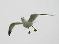
| 04/26/2003 06:23:22 PM | Flabbergastedby lionelmComment: Have the makings of a great photo here. With some editing, I think it can be enhanced...try one or several of the following: 1) Levels adjustment: Move left and right siders to the edges of the histogram to improve overall contrast 2) Selective Color adjustment: Under the "Whites" option, move the black slider to the left to your liking, if any. 3) Crop: I find taking out some negative space improves compo. -> Top and bottom for a panoramic shot, or all areas around bird except for a little space... Give these a try if you like...
Excellent capture! | | Photographer found comment helpful. |
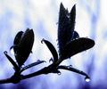
| 04/24/2003 09:03:58 PM | Evening Rainby drdab99Comment: Greetings from the Critique Club!!...
COMPOSITION... I think the monochrome tone with blue toning gives the photo a really nice look...very moody. Also like the fact that the droplets are different sizes and have clear reflections. Background's a nice blur which doesn't detract from the subject. Composition of the leaves are ok, but something about their placement bothers me... If the right buds were tilted towards the right, the eye would have an easier time following the branch, would make a more natural curve. A little nit-picky but I just feel the branch takes an abrupt turn and has a hard time fitting the frame. How about a diagonal composition? When about to shoot a subject, always a good idea to try looking at it from many angles, moving your camera viewfinder like crazy.. I'm not sure how other compositions would have worked, maybe this one was the best giving the rest of the plant, other obstacles, etc...
TECHNIQUE... I like silhouetting the leaves... I think a shot with the leaves perfectly exposed would dull the image. Still, I find them a little too dark... a little more texture in the dark areas of the leaves would be nice...the top-rightmost bud is an example of the kind of exposure that would have been nice for the rest of the branch. A little noisy, but it adds a gritty feel to the photo that I think adds to the image as a whole.
OVERALL.. Any flaws I mentioned are pretty minor, a very moody capture that would have worked well for the flora challenge as well :) |
Home -
Challenges -
Community -
League -
Photos -
Cameras -
Lenses -
Learn -
Help -
Terms of Use -
Privacy -
Top ^
DPChallenge, and website content and design, Copyright © 2001-2025 Challenging Technologies, LLC.
All digital photo copyrights belong to the photographers and may not be used without permission.
Current Server Time: 04/11/2025 04:41:39 PM EDT.
|