| Image |
Comment |
| 01/07/2006 12:56:21 PM |
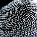
Reticello (a blown glass technique)by lindesComment: Very useful feedback, Neil. Thanks!
I did actually try to minimize blow-out, and would have done so given a bit more time to spend -- perhaps I'll re-shoot at some point, and see what I can come up with... Because of the shape of the piece, it was hard to not have _something_ be blown out -- but hard doesn't mean impossible, so I may well try again. :-)
Anyway, again, thanks! |
| 01/07/2006 06:24:44 AM |
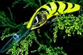
shape of a lureby CONRADComment: I would like this better, I think, with just a tad more space on each side -- especially the left. (Top and bottom are probably OK, but even there I might give a little more space.) |
| 01/07/2006 06:18:19 AM |
|
 Photographer found comment helpful. Photographer found comment helpful. |
| 01/07/2006 06:14:52 AM |
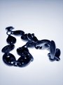
my favorite shapeby jossyComment: Between the small upload size, and the bright-but-mixing-together colors, I found it difficult to see what your shape was, at first. |
| 01/07/2006 06:03:39 AM |
Tangled Up In Blueby JaniePants4Comment: I would prefer this shot with either a deeper DOF, or focused at (or at least nearer) the front-most links... |
| Photographer found comment helpful. |
| 01/07/2006 06:01:03 AM |
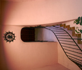
Stairwellby GermaineComment: Interesting scene. To my eye, though, the rotation really detracts from the image. |
| Photographer found comment helpful. |
| 01/07/2006 05:52:21 AM |
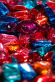
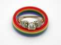
Marriage in Circles and Squaresby literaryradicalComment: This shot, especially as titled, would do well with a square crop, I'm thinking. It would also be nice if the gems had more in the way of highlights. I like the theme, though. |
| Photographer found comment helpful. |
| 01/04/2006 01:10:24 PM |
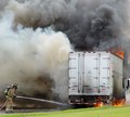
Downtown Box Truck Fireby CamComment: Very nice shot. I would like it if there was just a _tad_ more space to the right of that side-view mirror... otherwise great. |
| Photographer found comment helpful. |
| 01/04/2006 01:04:35 PM |
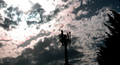
Talking Treesby fraughtComment: Hmm, with the contrast and color and such, this has definite potential... I'm afraid I'm not much of a fan of the overall composition, though. Perhaps the cell tower could have been made to be further to the left in the frame? Even making a square crop of this otherwise-as-is might work, though that does get rid of the sun... Not sure what's best, just some thoughts. Somewhere in the 6 to 7 range for me. |
| 01/04/2006 10:40:16 AM |
Time to Reflectby AlexSaberiComment: The face doesn't do much for me, but the photo does. Nice colors, nice reflection capter, etc. |
| Photographer found comment helpful. |
Home -
Challenges -
Community -
League -
Photos -
Cameras -
Lenses -
Learn -
Help -
Terms of Use -
Privacy -
Top ^
DPChallenge, and website content and design, Copyright © 2001-2025 Challenging Technologies, LLC.
All digital photo copyrights belong to the photographers and may not be used without permission.
Current Server Time: 04/07/2025 06:18:55 AM EDT.