| Image |
Comment |
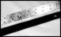
| 03/18/2006 02:54:24 PM |
Ruler - Shadowby angela_packardComment: Interesting idea for a composition. I like the angle of the ruler and with the exception of the flash being too bright on one portion of the ruler, the lighting is good. The age of the ruler and texture on it is dynamic. |
 Photographer found comment helpful. Photographer found comment helpful. |
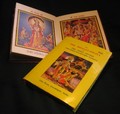
| 03/18/2006 02:52:46 PM |
Fascinating Mythological Stories!!! (Indian Mythology)by minuComment: The glare is a little distracting on the book cover... glare on gloss is really hard to avoid. The colors on the books are lovely and the use of angles is nice. There really isn't anything to capture my interest in the composition except the illustrators artwork though. |
| Photographer found comment helpful. |
| 03/18/2006 02:46:30 PM |
|
| Photographer found comment helpful. |
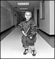
| 03/18/2006 02:44:59 PM |
why why Whyby sctajcComment: Absolutely adorable! I love this kids expression. There is a lot of emotion in the picture. It would have helped to crop it just a little tighter to eliminate the kids faces in the background. Cutting out distractions would keep the focal point on this kids eyes instead of his hair. Good Job! |
| Photographer found comment helpful. |
| 03/18/2006 02:42:53 PM |
Thinking of his Futureby Melly8522Comment: The flash was too close to the subject and washes him out. It is a cute idea for a composition though. The auto focus chose to focus on the walls beside him, so he is out of focus some. I really like the idea - the clock, lockers, book and shoelaces all add to a great idea, just a little work on focus and lighting and you will be good to go! |
| Photographer found comment helpful. |
| 03/18/2006 02:38:34 PM |
Eye View Of Reading by gsalComment: oooooh! I like this shot! GReat composition - very artistic. Love the bright attentive eye - the depth that the book being open adds to the picture, and the texture of the fly away hair. The borders also help with impact. VEy good job! |
| Photographer found comment helpful. |
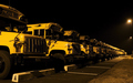
| 03/18/2006 02:37:15 PM |
all lined up, ready for the next morningby haakkyComment: Nice use of ambient lighting. A tripod probably would have helped with the motion blur. It (the motion blur) isn't bad, but it is noticable. Nice composition - a little too dark for my tastes... maybe a star filter for the street lamps just to kick it up a notch. Also maybe a closer crop to keep the focus on the buses instead of the dead grass etc. |
| 03/18/2006 02:33:28 PM |
Booksby NigelComment: Nice composition - really fits the challenge! Good use of angles, and color. Nice cropping and good lighting. No distractions and the textrue of the books adds to the overall feel of the picture. Keep it up! |
| Photographer found comment helpful. |
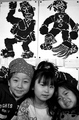
| 03/18/2006 02:29:20 PM |
ART!by Pug-HComment: Cute kids! The subjects are spaced a little too far from the top to the bottom though. Good focus and use of black and white. |
| Photographer found comment helpful. |
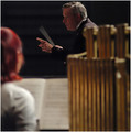
| 03/18/2006 02:27:59 PM |
Diminuendo to the Bellplayer.by gsquiggleComment: Really impressive that he stayed perfectly still except for his conducting wand! I like the intensity and gentle warning on his face and the pointing finger. Good focal length to keep the foreground from becoming too distracting. The only suggestion I might have is to crop out about an inch from the bottom - it is just dead space. |
| Photographer found comment helpful. |
Home -
Challenges -
Community -
League -
Photos -
Cameras -
Lenses -
Learn -
Help -
Terms of Use -
Privacy -
Top ^
DPChallenge, and website content and design, Copyright © 2001-2025 Challenging Technologies, LLC.
All digital photo copyrights belong to the photographers and may not be used without permission.
Current Server Time: 04/12/2025 11:09:55 AM EDT.