| Author | Thread |
|
|
04/11/2006 01:33:35 AM |
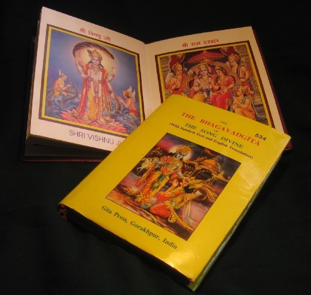
| Hello Minu. The idea might be there but the execution however is lacking. I think this would have garnered a bit more appeal had something else been in the mix aside from just books. Remember that image appeal is what voters look for. |
|
Comments Made During the Challenge  |
|
|
03/20/2006 03:54:56 PM |
| For this type of material a well diffused light source from the left would help eliminate the glare. In addition you can use a polarizer, which might make the colors pop out a bit more and reduce glare. |
|
 Photographer found comment helpful. Photographer found comment helpful. |
|
|
03/20/2006 09:20:30 AM |
| I think this would have been a better image if the lighting and color were better. |
|
| Photographer found comment helpful. |
|
|
03/19/2006 01:39:55 PM |
|
| Photographer found comment helpful. |
|
|
03/19/2006 01:36:40 PM |
| not quite right, but very close to being good for the challenge |
|
| Photographer found comment helpful. |
|
|
03/18/2006 07:52:46 PM |
| The glare is a little distracting on the book cover... glare on gloss is really hard to avoid. The colors on the books are lovely and the use of angles is nice. There really isn't anything to capture my interest in the composition except the illustrators artwork though. |
|
| Photographer found comment helpful. |
|
|
03/15/2006 01:23:09 PM |
| Lighting's fair, don't really like black background but ... . Doesn't really grab my interest though. |
|
| Photographer found comment helpful. |
|
|
03/15/2006 05:35:45 AM |
| a picture of books doesn't really do anything for me sorry...poorly photographed |
|
| Photographer found comment helpful. |
Home -
Challenges -
Community -
League -
Photos -
Cameras -
Lenses -
Learn -
Help -
Terms of Use -
Privacy -
Top ^
DPChallenge, and website content and design, Copyright © 2001-2026 Challenging Technologies, LLC.
All digital photo copyrights belong to the photographers and may not be used without permission.
Current Server Time: 02/01/2026 07:39:51 AM EST.