| Image |
Comment |
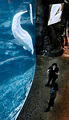
| 03/19/2006 04:02:53 AM |
Aquatic Edutainmentby RyShuComment: A little underexposed makes this shot a little too grainy. Cool composition though - love the color difference from water to stone and the curve of the glass is really artsy! Either a longer exposure or a smaller f-stop number would make this shot a winner! |
 Photographer found comment helpful. Photographer found comment helpful. |
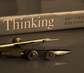
| 03/19/2006 03:58:46 AM |
Scholastic educationby MontagueComment: Great composition idea - love the colors - it looks cool! Most would have been tempted to black and white it - but keeping the gold tone makes it really enticing. I think that you could have improved this shot by cropping out the glare on the top of the book - it is distracting. Either a crop of a higher angle would have accomplished the same thing. Good job! |
| Photographer found comment helpful. |
| 03/19/2006 03:55:53 AM |
Shelf of knowledgeby paulb_17Comment: You may want to crop in more on your subject - fill your frame and try a different angle. Just books all in a line, with flash washing out some of the titles, doesn't do it. The idea is good, just the artwork is missing. Try different focal lengths and/or different angles and/or cropping. |
| Photographer found comment helpful. |
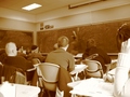
| 03/19/2006 03:52:27 AM |
The first schools in the worldby jnpalmaComment: Good cropping. It is a little "foggy" looking - too much light maybe? Really great location for a shot and framed really well... just missing the WOW factor. |
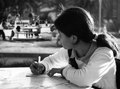
| 03/19/2006 03:49:54 AM |
homeworkby hamsandwichComment: Too much light on the book - and not much of a story told - your subject does not appear to be looking at the book or concentration on what she will write next... the focus is not sharp or clear on the subject either - but it was a good idea - keep it up |
| Photographer found comment helpful. |
| 03/19/2006 03:48:10 AM |
"The Happiest Days Of Our Lives"by dayberryComment: Strange title... hmmm, well the morion blur is a little too much, but kind of works with the sepia. Great cropping job - leaves you wanting to see more... and a really good composition idea! |
| Photographer found comment helpful. |
| 03/19/2006 03:46:01 AM |
|
| Photographer found comment helpful. |
| 03/19/2006 03:44:37 AM |
HOMEWORK !!! #@#§% homework...by np22saComment: Keen lighing! - Great composition idea. A little weak in focus, but nice use of black and white. Very good depth and plenty to look at without any distractions. The only thing I don't like is the title - she doesn't look profane. High scores! |
| Photographer found comment helpful. |
| 03/19/2006 03:42:31 AM |
All Aboardby riversongComment: Good composition. I really like the mountain view in the background and the cropping is good. The only problem is too much light. It washes out a lot of the detail in the picture and makes the lines less clear. Also a second sooner and you wouldn't have to play hide and seek to see the kid getting on the bus. |
| Photographer found comment helpful. |
| 03/19/2006 03:39:48 AM |
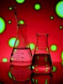
Chemistry by jodiecostonComment: Great use of color - love the depth, the focus and the reflection! Just a very pretty shot! |
| Photographer found comment helpful. |
Home -
Challenges -
Community -
League -
Photos -
Cameras -
Lenses -
Learn -
Help -
Terms of Use -
Privacy -
Top ^
DPChallenge, and website content and design, Copyright © 2001-2025 Challenging Technologies, LLC.
All digital photo copyrights belong to the photographers and may not be used without permission.
Current Server Time: 04/12/2025 11:12:45 AM EDT.