| Author | Thread |
Comments Made During the Challenge  |
|
|
03/20/2006 09:10:23 AM |
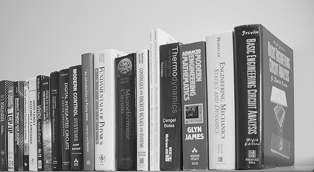
| I don't like it that the books are sitting on the bottom of the frame. |
|
 Photographer found comment helpful. Photographer found comment helpful. |
|
|
03/19/2006 11:47:12 AM |
| Great shot. The lighting and the simplicity of the composition are great. These titles bring back a lot of memories -- my degree is in mechanical engineering. |
|
| Photographer found comment helpful. |
|
|
03/19/2006 08:55:53 AM |
| You may want to crop in more on your subject - fill your frame and try a different angle. Just books all in a line, with flash washing out some of the titles, doesn't do it. The idea is good, just the artwork is missing. Try different focal lengths and/or different angles and/or cropping. |
|
| Photographer found comment helpful. |
|
|
03/18/2006 01:33:44 PM |
| I can't understand the use of black and white here. |
|
| Photographer found comment helpful. |
|
|
03/17/2006 12:11:49 PM |
| I think I'd prefer to see less crop on the left or more on the right so that the books are either continual from side to side or have space on both sides - as is, seems a bit awkwardly uneven, like the B&W but it seems a bit flat, my preference would have been to tweak up the black a little - or add some contrast, it seems kind of drab. I do think "education" when I look at this - so it certainly meets the challenge - good job :) |
|
| Photographer found comment helpful. |
|
|
03/16/2006 06:00:08 PM |
| Looks like we share the same nightmare... |
|
| Photographer found comment helpful. |
|
|
03/16/2006 04:28:53 PM |
| Good technically, but it's a bit bland. |
|
| Photographer found comment helpful. |
|
|
03/16/2006 03:36:04 PM |
|
| Photographer found comment helpful. |
|
|
03/16/2006 11:20:50 AM |
| this challenge has many many book pictures. for one to get a high score they really need to be unique and very well taken. i think that this one doesnt fall into either catagory. it has serious potential but i think it comes up a little short. i think this would have stood out more if there was a more creative use of DOF and lighting. but by the looks of the books it seems that you might already have your hands full. i know mine are 5 |
|
| Photographer found comment helpful. |
|
|
03/15/2006 10:28:00 AM |
| Exposure is good and composition draws my eye along. I might have cropped it a bit tighter at the top. |
|
| Photographer found comment helpful. |
Home -
Challenges -
Community -
League -
Photos -
Cameras -
Lenses -
Learn -
Help -
Terms of Use -
Privacy -
Top ^
DPChallenge, and website content and design, Copyright © 2001-2026 Challenging Technologies, LLC.
All digital photo copyrights belong to the photographers and may not be used without permission.
Current Server Time: 02/01/2026 09:47:08 AM EST.