| Image |
Comment |
| 01/27/2007 12:50:52 AM |
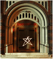
Portalby MichaelCComment: I didn't know what to think of this, but from an image perspective it didn't do much for me; shadows, coloring and focus vary from the right columns to the left, and while it looks like some kind of long exposure, I wasn't sure what was being said or why it was done this way. |
 Photographer found comment helpful. Photographer found comment helpful. |
| 01/27/2007 12:49:32 AM |
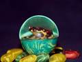
Now how did I get in here, ribbit, ribbit... ...by tolovemoonComment: This didn't do much for me; there are light reflections on the ball (on part of the frog), there are focus problems (I'm not sure where the focus is), and I think I would have liked the composition better if it was either dead center or more off-centered. I also wasn't sure what was being said by the picture (beyond the straight forward title), so it didn't really speak to me as an image. |
| Photographer found comment helpful. |
| 01/26/2007 10:30:46 PM |
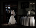
"Ladies and Gentleman, Mr & Mrs...."by CutterComment: The strong focus on the cake, the soft focus on the bride, and the blurry groom really hurt this image for me. Lighting was also a problem, with the shadows making the whole thing look like a rather grim occasion to me (which I'm guessing it wasn't). |
| 01/26/2007 12:03:12 PM |
Into the void (vacuum)by redpandaComment: I didn't get this at first, even with the title (I'm thick, though, so don't worry about that); but the loss of focus on all of the stones (?) did bother me, though, and overall the image just didn't reach me. Still bumped you up a bit after I realized what it was! |
| Photographer found comment helpful. |
| 01/26/2007 11:59:17 AM |
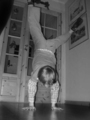
My Little Brotherby erl89endComment: I really like the concept of this image -- the little brother making an entrance on his hands -- but the image didn't capture that for me. Part of it was the technical bits, like focus (which is a bit too soft for me) and lighting (I found the shadows on the left side of his body distracting). Part of it is that it looks more like a handstand than walking; having one of his hands in the air, or with some motion blur on it, would have gotten the concept of him making an "entrance" across to me better. |
| 01/26/2007 11:54:02 AM |
Eat or be Eatenby cyanComment: This was just too busy for me, and I wasn't sure where to focus. You might have tried it with a much, much more extreme narrowing of the depth of field (so that essentially everything behind the sign was blurred), but I'm still not sure, given the lighting, that it would work. |
| 01/26/2007 11:52:52 AM |
Breath's Entranceby posthumousComment: This didn't really do much for me; I liked the concept (a lot), but the severe use of the blur was too much. Something in focus would have given me a point to, well, focus on, and that would have helped it in my eyes. |
| Photographer found comment helpful. |
| 01/26/2007 11:51:16 AM |
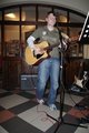
Guitar Playerby airaComment: Composition was the killer for me here. Two things that bothered me were the microphone crossing the guitar player's face, and the inclusion of so much of the floor at the bottom of the image. Cropping out the feet (were they supposed to show he was entering? if so, it didn't do that for me), and moving to the left a bit (so that stand was out of the way) would have improved the shot a lot for me. |
| Photographer found comment helpful. |
| 01/26/2007 11:45:30 AM |
First Steps to Cancer-Freeby lauraodomComment: This image didn't really work for me; it's not the subject matter, but the focus is a bit off in the plants in the center, as well as (and this is more important to me) in the wording of the sign. I can tell there's emotion here from the subject matter, but the color minimized the emotion for me. |
| Photographer found comment helpful. |
| 01/23/2007 12:13:30 PM |
The winds of Scotlandby dd1989Comment: Things are moving here, but I don't see anything as a sharp subject - I couldn't really find a subject at all. I like the colors, but I probably would have cropped out the statue on the right (doesn't seem to fit with the rest of the image to my eyes). |
| Photographer found comment helpful. |
Home -
Challenges -
Community -
League -
Photos -
Cameras -
Lenses -
Learn -
Help -
Terms of Use -
Privacy -
Top ^
DPChallenge, and website content and design, Copyright © 2001-2025 Challenging Technologies, LLC.
All digital photo copyrights belong to the photographers and may not be used without permission.
Current Server Time: 04/12/2025 10:02:59 AM EDT.