| Image |
Comment |
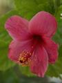
| 07/21/2005 02:30:45 PM |
Bloom in the desertby byednakComment: This shot looks a bit flat. Adjusting the curves to lighten the shot and then upping the contrast would make the colors brighter and punchier. I am not too sure about the focus. |
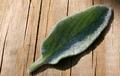
| 07/21/2005 02:28:24 PM |
Lambs Ear Leafby LesleyNelsonComment: If the leaf had been tilted to the left so that the light reached the furry surface better and perhaps a slightly closer crop I feel this would have been a better shot. |
 Photographer found comment helpful. Photographer found comment helpful. |
| 07/21/2005 02:25:46 PM |
Orangeby DvosdonComment: Great idea but is overexposed which spoils it. |
| Photographer found comment helpful. |
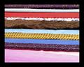
| 07/21/2005 02:24:32 PM |
RAG TRADEby Jade 11Comment: This was a great idea but the lack of focus spoils it. Also it appears to have a lot of noise which could be the result of underexposure and then excessive adjustments to lighten the image in your editing package.
|
| Photographer found comment helpful. |
| 07/21/2005 02:23:11 PM |
Soft, rough and sharpby VanGoghComment: A nice idea but the shot is a bit flat, try upping the contrast so that it looses the grey overlay look, it will give the shot more punch. Focus looks good. |
| 07/21/2005 02:20:02 PM |
Fringe Factorby gothgirl83Comment: The lack of focus brings this shot down. Next time try moving it into better light, even if that means putting it outside and be careful not to shoot closer than the minimum distance that your camera is capable of focusing at. Even if it means cropping a bit of the excess off in Photoshop because you are a bit further away. |
| 07/21/2005 02:14:16 PM |
Tulip Abstractby stormyComment: I love pink but this looks a little on the light side. If you had adjusted the curves a bit to make the colors richer and added a bit more contrast this would have been much nicer. Because it is dull it looks a bit grainy and lacks punch. |
| Photographer found comment helpful. |
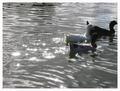
| 07/21/2005 02:12:00 PM |
Leaving trailsby beatlebrisaComment: Nice idea, in a perfect world the sun would have been behind you and the ducks would have been lit nicely. I am not too sure about the focus either, generally the shot looks a bit flat, try playing with the curves in Photoshop and also the contrast. I also find the sparkles a bit too distracting |
| Photographer found comment helpful. |
| 07/21/2005 02:08:52 PM |
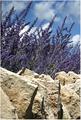
Lavendulaby JeileenComment: Nice idea, three different textures in one. I found the colors blended a bit too much in the flowers and the sky. Not sure what time of the day it was shot but early morning or late evening when the light is softer might have helped to give the flowers more punch and have them stand out better? The light just looks a little bit too hard. |
| 07/21/2005 02:07:10 PM |
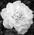
Layers in Whiteby dwolffComment: Great idea but I think that some of the white is a bit too blown out which hasnt helped to maintain some of the definition and thus the texture of the flower. Adjusting the curves if you have photoshop would help with regaining some of the definition |
| Photographer found comment helpful. |
Home -
Challenges -
Community -
League -
Photos -
Cameras -
Lenses -
Learn -
Help -
Terms of Use -
Privacy -
Top ^
DPChallenge, and website content and design, Copyright © 2001-2025 Challenging Technologies, LLC.
All digital photo copyrights belong to the photographers and may not be used without permission.
Current Server Time: 04/07/2025 06:27:33 AM EDT.