| Author | Thread |
Comments Made During the Challenge  |
|
|
07/23/2005 05:57:34 AM |
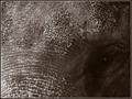
| This comes close to being great for my eye. The haziness works against it. |
|
|
|
07/22/2005 11:19:14 AM |
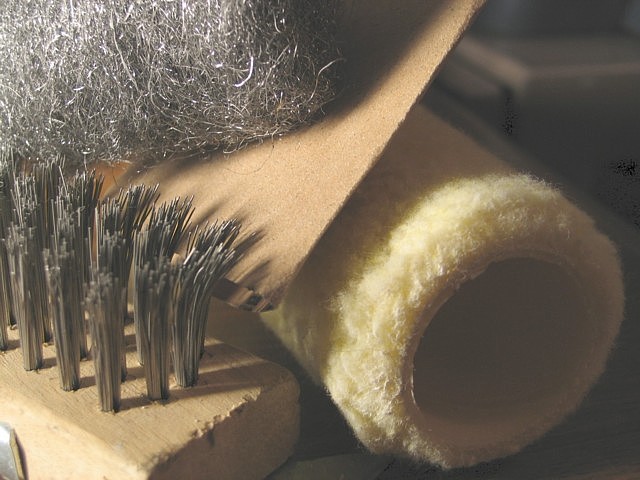
| Tools of the trade of a painter/constrution/DIY home owner! You're early! Lots of texture here! |
|
|
|
07/22/2005 10:23:14 AM |
This certainly would have been a great shot if you managed to give it proper processing. Right now, even the dark shadows are so creamy that you feel like screaming. You have adjusted the tones in to to the point where I am having a hard time trying to understand how you can possibly achieve this. Black is present in a few dots, but the rest is just hazy.
I don't know if it's your monitor that's showing you something different or you have actually chosen to present it this way, but to me it looks really odd. A lot can be done to this image and it can be made so much better. Although I don't know, I feel that calibrating your monitor is the first step. |
|
|
|
07/22/2005 09:03:23 AM |
| Unsharp would enhance this image. |
|
|
|
07/22/2005 01:43:19 AM |
| Nice idea, but the composition is litte jumbled for my taste. Also the colour is a bit washed out - stronger shadows would help it I think. |
|
|
|
07/21/2005 04:52:19 PM |
| Ugh... Crop out that box on the upper-right corner and it'd be great. |
|
|
|
07/21/2005 03:16:07 PM |
| perhaps your monitor needs to be calibrated but there is a haze over the image... |
|
|
|
07/21/2005 02:23:11 PM |
| A nice idea but the shot is a bit flat, try upping the contrast so that it looses the grey overlay look, it will give the shot more punch. Focus looks good. |
|
|
|
07/21/2005 04:42:56 AM |
| i like the composition in this photo, but tere is something wromg with the light i think. 8 |
|
|
|
07/20/2005 05:01:05 PM |
| This image lacks contrast. Also, I don't know what are those patch of dark noise in the upper right |
|
|
|
07/20/2005 10:30:44 AM |
| I can't help but feel that you tried too hard on this one. Too much kinds of texture. Should just stick to one object. 4 |
|
|
|
07/20/2005 10:22:24 AM |
| Shoot this again for next week...:-) |
|
|
|
07/20/2005 07:38:24 AM |
| Wow! That's an awesome composition. Good job. It looks a tiny bit hazy, but it's still a great picture. 10 |
|
|
|
07/19/2005 10:14:56 PM |
| bit overexposed in top left |
|
|
|
07/19/2005 08:49:45 PM |
| could really use a contrast boost. |
|
|
|
07/19/2005 08:42:39 PM |
| This has a lot of promise, but the colors turned out very flat. A little bit of time in photoshop and this could be a gem. |
|
Home -
Challenges -
Community -
League -
Photos -
Cameras -
Lenses -
Learn -
Help -
Terms of Use -
Privacy -
Top ^
DPChallenge, and website content and design, Copyright © 2001-2025 Challenging Technologies, LLC.
All digital photo copyrights belong to the photographers and may not be used without permission.
Current Server Time: 04/08/2025 08:03:41 AM EDT.