| Image |
Comment |
| 05/06/2003 02:27:51 AM |
Lincoln,California Civic Centerby sherryk471Comment: To be brutally honest, the text color is horrid, and I'm not attracted to a photo of the Civic Center, although the pic is not bad, but it looks a bit over-processed and fuzzy. |
 Photographer found comment helpful. Photographer found comment helpful. |
| 05/06/2003 02:23:15 AM |
|
| Photographer found comment helpful. |
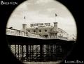
| 05/06/2003 02:21:41 AM |
Looking Backby mbardeenComment: Good shot, but I'm wondering what "Looking Back" means for a postcard. |
| Photographer found comment helpful. |
| 05/06/2003 02:10:30 AM |
|
| Photographer found comment helpful. |
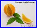
| 05/06/2003 02:09:22 AM |
.25 cents each / 5 for $1.00by KarenBComment: This is a nice photo, but I don't like how the text falls below the pic for most of the lowercase letters and goes above for others. |
| 05/06/2003 02:07:00 AM |
|
| Photographer found comment helpful. |
| 05/06/2003 02:05:18 AM |
Ryman Auditorium, Home of the Grand Ole Opryby DougPazComment: I must be brutally honest here. I hate the text color and font; it's just gaudy. And the framing of this pic needs to pull back and show the whole building, or move to a different perspective. |
| 05/06/2003 01:56:05 AM |
Hi there! Greetings from Frisco!! by Pep VentosaComment: I really like how you placed the tall building and I like the transparent border. The text works well also. The only bad thing I can see is the lower shadows on the buildings to the left, but that is nitpicking. GREAT postcard!!! |
| Photographer found comment helpful. |
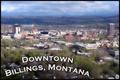
| 05/06/2003 01:52:12 AM |
Billings, Montanaby CLarson557Comment: I feel I have to be brutally honest here and say that I really hate the text, although I do appreciate the attempt at originality. Also, it looks like you did some processing that made the trees really fuzzy and not natural-looking. I hope to visit Billings some day, but I'm afraid this postcard won't help draw me there. |
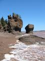
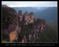
| 05/06/2003 01:40:37 AM |
The Three Sistersby p_johnsComment: Very nice perspective. How far did you have to climb to get this one? Can't wait to visit. |
| Photographer found comment helpful. |
Home -
Challenges -
Community -
League -
Photos -
Cameras -
Lenses -
Learn -
Help -
Terms of Use -
Privacy -
Top ^
DPChallenge, and website content and design, Copyright © 2001-2025 Challenging Technologies, LLC.
All digital photo copyrights belong to the photographers and may not be used without permission.
Current Server Time: 04/09/2025 03:30:34 AM EDT.