| Author | Thread |
|
|
05/15/2003 09:22:14 AM |
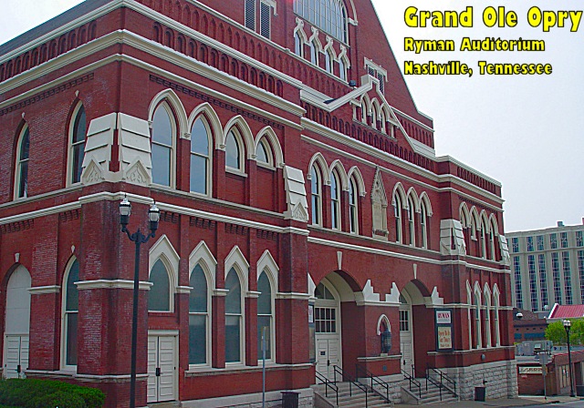
Hello again from the Critique Club, Doug!
I think there is a conspiracy in the CC with me getting your pictures! :) I hope you don't get sick of me and my suggestions! At least I get the chance to expand on my original comments on this photo.
Colour, Composition and Contrast:
I like your choice of subject a lot. Architecture and buildings are naturally dramatic shots I find. I miss the top of the building though, and would have liked to get the peak in, especially if it is modeled after a church, I think it would be a good inclusion in the shot. I like the angle, and prefer it to a head on shot, but almost wish you were a little more to one side or the other to make the angle more dramatic.
All the colours seem a bit shadowed, though I think the contrast is just fine. I am not fond of the yellow font, I think it detracts from the building, but the size and place is good, and with a right justification as Paul suggested below, it would be bang on! :)
Focus and lighting:
I think your focus is crisp on the building and I haven't a word to offer you in improving that! :) I don't like the compression artifacts on the beige building to the right of our subject, but jpeg compressions are notorious for messing with fine lines.
On lighting, I think the whole shot appears to be in shadow due to the overcast day. As kiwi suggested, it would have been nice if the day was a bit sunnier to give you some interesting sky either blue, or even a few clouds and to give a little more light and brightness to the building.
Overall
I like this shot, its certainly great fodder for a postcard and I like the trivia behind it. A slightly brighter day and slap a thin border on that baby, and you've got yourself a fine postcard! :) Well done. |
|
Comments Made During the Challenge  |
|
|
05/11/2003 11:33:02 AM |
| Ahhhhh....I've been there...had a great time. Nice architectural shot. If you'd have backed up or zoomed out you could have included the peak. |
|
 Photographer found comment helpful. Photographer found comment helpful. |
|
|
05/11/2003 07:06:24 AM |
| This angle gives a good idea of the whole building. If you right-adjust the type, the left margin will follow the roofline, especially if you reduce the size of the last line slightly. |
|
| Photographer found comment helpful. |
|
|
05/09/2003 09:53:05 AM |
| Your point of view makes this building come to life in 3-D as it were. The light isn't very interesting, but your composition and focus are great. |
|
| Photographer found comment helpful. |
|
|
05/08/2003 05:06:58 AM |
| I'm not sure about the font, otherwise good |
|
|
|
05/07/2003 04:38:34 PM |
| Nice angle on the building but the text color doesn't seem to mix well with the photo. Maybe black text. Jacko. |
|
|
|
05/07/2003 04:20:10 PM |
| ooh..why the yellow text? it doesn't match with your photograph! This isn't the most dramatic angle on this building it would seem, and it all needs just a little something to make it "pop" as it were..perhaps if you moved to your right a little and got a slightly more head on view? :) Just an idea! |
|
|
|
05/06/2003 06:02:23 PM |
| I like your text and where you've placed it. this is a good shot of The Ryman |
|
|
|
05/06/2003 08:08:00 AM |
| Nice photo, but I don't really like your choice of text... That yellow is kind of harsh agains the stately quality of the building, IMO. |
|
|
|
05/06/2003 02:15:45 AM |
| I have heard a lot about this place but never actually seen what it looks like. Now I know thank you. You have taken this pic from a very good perspective and cropped it well. What a pity you didn't have blues skies to make this a perfect shot! But you can't control the weather I guess, I like it anyway :-) |
|
|
|
05/06/2003 02:05:18 AM |
| I must be brutally honest here. I hate the text color and font; it's just gaudy. And the framing of this pic needs to pull back and show the whole building, or move to a different perspective. |
|
|
|
05/05/2003 03:12:38 PM |
| since the text is placed right, try right justifying it. also the yellow is overpowering |
|
| Photographer found comment helpful. |
|
|
05/05/2003 04:40:23 AM |
| the yellow text really detracts |
|
|
|
05/04/2003 08:09:46 PM |
| Wonderful photo, of the Opryhouse. The angle you captured this at keeps it from appearing to be a falling building. well worth a 10. |
|
| Photographer found comment helpful. |
Home -
Challenges -
Community -
League -
Photos -
Cameras -
Lenses -
Learn -
Help -
Terms of Use -
Privacy -
Top ^
DPChallenge, and website content and design, Copyright © 2001-2025 Challenging Technologies, LLC.
All digital photo copyrights belong to the photographers and may not be used without permission.
Current Server Time: 04/07/2025 12:15:37 AM EDT.