| Author | Thread |
Comments Made During the Challenge  |
|
|
05/09/2003 12:00:33 AM |
| Although this isn't really a wow photo it does have it's good points. Using the trees on the sides as natural framing works well. The focus is good and the composition as well and the framing fits the image. I find that the saturation could be increased and that the blue text doesn't really fit to the pic. |
|
 Photographer found comment helpful. Photographer found comment helpful. |
|
|
05/08/2003 12:59:18 AM |
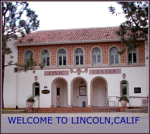
| This shot needs to be leveled and the sky should be blue instead of white. Not a bad looking building, but not much visual impact here either. |
|
| Photographer found comment helpful. |
|
|
05/06/2003 02:27:51 AM |
| To be brutally honest, the text color is horrid, and I'm not attracted to a photo of the Civic Center, although the pic is not bad, but it looks a bit over-processed and fuzzy. |
|
| Photographer found comment helpful. |
|
|
05/05/2003 03:18:40 PM |
| The font is horrendous. You shouldn't say "Calif". Better to use "CA". |
|
| Photographer found comment helpful. |
|
|
05/05/2003 01:26:29 PM |
| i might have cropped in closer on the building since the sky wasn't that inspiring that day. i don't like the choice in font for the text, i don't think it matches the photo very well. |
|
| Photographer found comment helpful. |
Home -
Challenges -
Community -
League -
Photos -
Cameras -
Lenses -
Learn -
Help -
Terms of Use -
Privacy -
Top ^
DPChallenge, and website content and design, Copyright © 2001-2025 Challenging Technologies, LLC.
All digital photo copyrights belong to the photographers and may not be used without permission.
Current Server Time: 04/17/2025 03:58:27 PM EDT.