| Image |
Comment |
| 02/06/2003 05:41:04 PM |
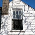
Square in disrepairby 3boyzMomComment: ...from Critique Club...
Hi Tracy :)
FIRST IMPRESSION:
Really nice contrast!
COMPOSITION:
I like the way you tried to get some of the sky to contrast with the house....but I really wish there was more sky. The fact that you cut off the tip of the house, IMO, takes from the beauty of the photo. I would even try to get the entire chimney in as well. Other than that, I think the angle you shot it at is very interesting :|
TECHNICAL:
Nice and sharp photo. Maybe a bit over exposed. Sky looks very deep and real. :)
ARTISTIC:
I think it's worth going back and shooting some more, as this house looks really neat (you probably did take more shots). I think closing in on the windows would have been better for this challenge. :|
OVERALL:
A nice a sharp photo that would have done better with a diff comp.
Cheers and good luck in the future challenges. |
| 02/04/2003 05:21:42 PM |
Day and Nightby elgominComment: Before giving you a vote, i'd like to know how you did this. The lighting is very different on the two sides of the photo...making it look like a comp of two photos...please PM me...for now I'll leave it at a 10 :) |
| 02/04/2003 05:04:37 PM |
fenceby neoathematrixComment: ...from Critique Club...
Hi Jens
FIRST IMPRESSION:
Nice sky!
COMPOSITION:
Since there is no 'real' subject in the photo, it's hard to judge the composition. I think you did a great job on the angle of the fence. I would have cropped the bottom a bit to lose the top of the building showing on the bottom right. :)
TECHNICAL:
I think a bit more DOF would have helped the photo. It would make the fence a bit sharper against that brillian sky (not sure if you can control that on your camera or not) Exposure is perfect. Really need that fence in focus though :|
ARTISTIC:
The sky really makes the shot. I hope you tried different angles on the fence and even get more of the fence in. It makes a nice pattern. As for meeting the challenge...sure, there are tons of squares :)
OVERALL:
A solid shot of a solid sky and a fence. Nicely done :)
Cheers and good luck in the future challenges. |
 Photographer found comment helpful. Photographer found comment helpful. |
| 02/04/2003 04:55:15 PM |
Caught in a block of iceby camelotnorthComment: ...from Critique Club...
Hi Betty
FIRST IMPRESSION:
Wow, 'cool' shot...I thought it was a real bear...doh!
COMPOSITION:
Too centered and cropped IMO. I think that's why you didn't score higher. Because you cropped the 'block of ice' so tight, you lose the square, and therefore some marked you down for that. :(
TECHNICAL:
I tough one to get it perfect. I think you did a good job creating the illusion, but a bit more lighting would have helped. DOF is great, making the bubbles in focus and the bear slightly soft. :|
ARTISTIC:
Your artistic mind was brilliant on this shot. It's too bad that it 'bombed' because of the challenge. If the challenge had been something like 'wild life' this would have been a 10 all the way :)
OVERALL:
A great imaginative shot, well executed...but I can't see a square. ;)
Cheers and good luck in the future challenges. |
| Photographer found comment helpful. |
| 01/28/2003 12:47:02 PM |
Avenueby mciComment: ..from Critique Club...
Hi Micheal
First of all, I think this photo should have scored better. It's tones and composition are very attractive to the eye. Your use of a shallow DOF only made this a 'classier' shot, and in my opinion works very nicely. The style of lettering on the sign is really cool and reminds me of David Carson's work.
Technically the photo is well done. the focus is good (understanding that you wanted a shallow dof). the lighting could have been a bit better. i'm not too crazy about the over-exposure happening on the top left.
Welcome back to the site, and hope to see more from you.
z |
| Photographer found comment helpful. |
| 01/26/2003 06:47:36 AM |
Newcastle Sunsetby AndyLeeG4Comment: ...from Critique Club...
Hi Andy
FIRST IMPRESSION:
Nice and dramatic :)
COMPOSITION:
Perfect...I really don't know what I would change...perhaps making the photo larger by getting a bit more sky in. :)
TECHNICAL:
Maybe a tad under-exposed. I'm not too crazy about the cyan water...maybe you could have fixed that in post-processing. Focus is very nice. :|
ARTISTIC:
Very good eye. The sky compliments the roughness of the see and waves breaking agains the rocks. Nice job :)
OVERALL:
A great shot, a dramatic shot. :)
Cheers and good luck in the future challenges. |
| Photographer found comment helpful. |
| 01/26/2003 06:42:44 AM |
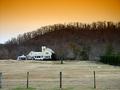
Country escapeby fotofrogComment: ...from Critique Club...
Hi Parke
FIRST IMPRESSION:
Man, that's a really nice sky! :)
COMPOSITION:
I also think that cropping out the fence on the bottom would make for a nicer shot...but it doen't mean that it ruins the shot either. Great balance and positioning. oh...maybe cropping the photo slightly on the left would eliminate that 'half' pole on the fence :)
TECHNICAL:
Very interesting use of filter. The photo seems a bit 'soft' though for my taste, and would like to see things a bit sharper. Lighting is pretty good. :|
ARTISTIC:
I think the filter makes the shot. the sky stands out quite a bit and might distract from the rest of the image, including your main subject- the house. I wish you could have gottent closer to it. :|
OVERALL:
Very neat shot.
Cheers and good luck in the future challenges. |
| 01/26/2003 06:32:17 AM |
Karoriby SlimharpoComment: ...from Critique Club...
Hi Sam
FIRST IMPRESSION:
Nice...a bit dark :|
COMPOSITION:
I think the composition is actually pretty good on this photo. Well balanced and nicely framed. I wonder what it would have looked like with more sky than land :)
TECHNICAL:
The foreground seems a bit under-exposed while the sky is a bit over-exposed. Focus and DOF are great. :|
ARTISTIC:
Not a very interesting photo to look at, but it does convey the message. I would have tried to shot it from ground level and have the path 'lead' to the villages :)
OVERALL:
I good idea that suffered a bit cause of the lighting.
Cheers and good luck in the future challenges. |
| 01/22/2003 08:50:38 AM |
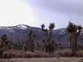
Where the mountains meet the desert...by terik65Comment: ...from Critique Club...
Hi Teri
FIRST IMPRESSION:
Nice scene. :|
COMPOSITION:
I don't have any problems with the setup of the photo. Maybe getting lower and shooting 'up' a bit more would get you a bit more sky and eliminate the bottom of the photo (path?) :)
TECHNICAL:
Your lighting seems a bit dark on the foreground. Also, there is quite a bit of noise on the photo. I realize that you are using a Sony camcorder, and I'm sure you don't have much control over exposure/shutter. :|
ARTISTIC:
I honestly think that this was a nice scenery to which the camera did no justice. :|
OVERALL:
A fair shot, technically poor. :(
Cheers and good luck in the future challenges. |
| Photographer found comment helpful. |
| 01/22/2003 08:34:26 AM |
Five Minutes From Midtown.by catpixelComment: ...from Critique Club...
Hi David
FIRST IMPRESSION:
Way too much stuff happening here :|
COMPOSITION:
The shot seems balanced enough, but the busyness of all the branches totally detracts from your focal point- the bridge. I think that if you had moved to the right more and get the bridge in between the trees it would have worked better :(
TECHNICAL:
Lighting is good here. The sky seems a bit over-exposed. Focus could be a bit sharper (even sharpening in post-processing would do it) :|
ARTISTIC:
Just by looking at the photo, I can tell that you were at a nice enough location. I wonder how many shots you took, and if this was truly the best one. Getting the bridge with minimal destraction from the trees would be better :|
OVERALL:
A very busy shot with some technical flaws.
Cheers and good luck in the future challenges. |
Home -
Challenges -
Community -
League -
Photos -
Cameras -
Lenses -
Learn -
Help -
Terms of Use -
Privacy -
Top ^
DPChallenge, and website content and design, Copyright © 2001-2025 Challenging Technologies, LLC.
All digital photo copyrights belong to the photographers and may not be used without permission.
Current Server Time: 04/09/2025 12:46:33 PM EDT.