| Image |
Comment |
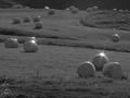
| 08/14/2002 11:15:00 AM |
New bales of hayby jonrComment: This is a pretty good photo although I don't know if b&w is the best option (color would be nice if the grasses were green and on the light conditions were favorable). Another reason is that the contrast in b&w is really low with a small range of greys and in color the contrast should be less noticable because you're getting more than just different shades of one tone (grey). I would also be interestd to see how the composition would look framed vertically, especially if it allowed for any sky to be seen at the top of the frame which could help with the contrast if it were still in b&w. Score: 5 Courtenay |
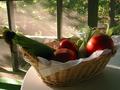
| 08/14/2002 09:42:00 AM |
Morning Harvestby puppet10Comment: This is a really nice composition. Even though I can tell that it is sharp and in focus it still has a soft feel to it because of the dimly lit foreground, blurred background and sunlit haze, which I like. I am wondering how it may look with a little more light from the right side to further illuminate the food and bring out a little more color to help balance out the greens. Overall, very well done. Score: 8 Courtenay |
| 08/14/2002 11:35:00 AM |
Modern Day Communicationsby daverx7Comment: This is an interesting composition. Looks kind of similar to one of the entries from the corporate challenge. Same photographer maybe? It's a nice shade of blue off the windows. Score: 6 Courtenay |
| 08/15/2002 06:00:00 AM |
Monetary Reformsby stephanComment: This is a good idea for a photograph but I have some suggestions that may give the idea more impact. First, the higlights on the euro are too bright and drown out a bit of the detail. Plus, to enhance the idea, you might try reversing the order of arrangement putting the euro up front and the mark in back to emphasize the age. I would also try (and you may have experimented with it) lowering the angle of view to give a more 3d perspective instead of an overhead shot and decreasing the aperture to further blur the trailing two coins. Also try standing or propping them up in a domino-like procession if you lower your angle of view. I do still like your idea though. Score: 4 Courtenay |
 Photographer found comment helpful. Photographer found comment helpful. |
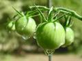
| 08/14/2002 10:37:00 AM |
Cherry Tomatoesby shedonistComment: This is pretty well done. I like the water droplets hanging off the tomatoes and throwing the background out of focus helps to emphasize the nicely rounded, wet tomato up front. It's difficult to get a good photo when so much of the frame has roughly the same tones and this is a good job. Score: 7 Courtenay |
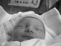
| 08/14/2002 10:22:00 AM |
Hannaby ShiiizzzamComment: This is a really nice portrait which, I think, benifits from being in b&w. The head is nicely framed plus the "I'm a girl" sign adds a little something to the photo. Very nice. Score: 7 Courtenay |
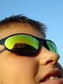
| 08/14/2002 10:30:00 AM |
Needful Thingsby jmsetzlerComment: The photo is pretty good by itself but with the title, the impact of "something new" really hits. I know I have had that feeling many times before at Best Buy. You may have chosen to frame this as you did (not capturing the models entire face) because of possibly losing the detail of the Best Buy sign in the sunglasses and then losing the overall impact but the face being cut off at the lower lip gives the portrait a somewhat awkward look and feel even though my eyes are still drawn to the sunglasses and the BB reflection. Maybe keeping more of the lower face in frame would have helped that. Over all, though, It's a really good job. Score: 6 Courtenay |
| 08/15/2002 05:08:00 AM |
Morning's Workby KazComment: Spider webs are a nice subject but a couple of problems I have with this image are: (1) The background is too busy. Basically there are too many colors and too much variance between brightly lit and shadowed areas. Maybe shooting from a different angle and getting closer could have corrected this. Another thing (2) is the web itself. It seems that you are again too far away to effectively capture the detail that a macro shot could have provided and also the harsh light reflecting off of the spider and the web at this distance drown out any color and detail that could have been captured on the spider. Next time try to shoot closer for more detail and not worry about capturing the entire web in the frame, this can also help with the background problem by decreasing the focal plane and further throwing it out of focus. Score: 4 (room for improvement though) Courtenay |
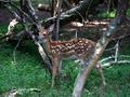
| 08/15/2002 06:29:00 AM |
fawnby KrazyKatComment: I know that photographing any kind of wildlife can be very difficult and a lot of times is dependent upon luck. I like this shot but the deer could be a little more in focus, especially its face. Also the background is too busy and the tree in the foreground blocking the left rear leg detracts from the subject a little. Again, I know that you probably couldn't really control these things and that getting the deer that close and still was lucky enough. Score: 5 Courtenay |
| Photographer found comment helpful. |
| 08/15/2002 05:13:00 AM |
New Potatoesby muckpondComment: Ha! When I saw the new topic on Sunday, new potatoes was actually the first thing that came to my mind. :) I like the idea of course and the colors. The composition is nice but I'm wondering if you tried others that showed more of the potatoes in frame from that same angle of view. I would also probably like to see more of the potatoes in focus. Looks good enough to eat, though! Score: 5 Courtenay |
Home -
Challenges -
Community -
League -
Photos -
Cameras -
Lenses -
Learn -
Help -
Terms of Use -
Privacy -
Top ^
DPChallenge, and website content and design, Copyright © 2001-2025 Challenging Technologies, LLC.
All digital photo copyrights belong to the photographers and may not be used without permission.
Current Server Time: 04/11/2025 12:10:55 AM EDT.