| Author | Thread |
|
|
08/19/2002 08:35:00 PM |
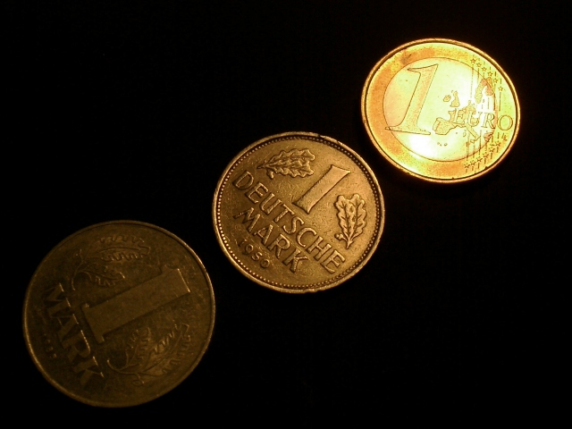
Many thanks to all who commented on my photo. I'll answer to some in detail:
rocco22: You do know that the 1 is bad and 10 is good, do you? ;-) I'm sorry but the hot spot was intended.
jasonmccarthy: I did it on purpose ;-)
hbunch7187: I placed the coins that way on purpose. See below. I see what you mean with your "pringles" (yes we have them here in good ol' germany) and it's a good suggestion. I had only one lamp and to create a deep contrast I had to place it fairly low. But I also wanted to have the reflection on the Euro, so I had to use this particular angle.
courtenay27: *grin* actually the other way around of what hbunch7187 suggested. So see above why I used this angle. I tried the domino-like position but it didn't work out very well.
Remie: Sadly I kept only one Mark which was in a good shape. Silly me still hopes it will be worth someting someday. Who could know that I someday will use it in a photography? (Who could know at this time that I'll start with photography at all ;-) On the other hand I was not able to find a totally blank Euro.... *grgs*
jkiolbasa: Your comment was the most helpful to me (not implying that the others we not helpful at all). And you're right. The negative space just makes the photo empty and does not add anything. I think a different composition of the coins could have avoided that.
Overall I'm pleased that my idea with the different lighting showing old to new came across (mostly). It encourages me to make more photos that way.
But all of you missed one thing: I placed the coins that way so that the figures form a growing curve, like the optimistic market analysts love to do. But I didn't expected that anyone noticed _that_ ;-)
Thanks again,
Stephan
|
|
Comments Made During the Challenge  |
|
|
08/18/2002 05:19:00 PM |
| Finished all the voting and keep coming back to your image. I initially had this photo in the top 30 or so, but I think it's better than that. One of my top five for the week -- excellent work; really like the light gradient from left to right. 9 LanSnake |
|
 Photographer found comment helpful. Photographer found comment helpful. |
|
|
08/18/2002 02:01:00 PM |
| Good use of lighting to draw the eye to the subject. |
|
| Photographer found comment helpful. |
|
|
08/18/2002 12:17:00 PM |
| excellent shot... I love the way the light moves from dark on the older coins to lighter on the new... nice idea and great job with the dark background... - jmsetzler |
|
| Photographer found comment helpful. |
|
|
08/18/2002 09:15:00 AM |
| the lighting change from old coin to new is nice |
|
| Photographer found comment helpful. |
|
|
08/18/2002 02:55:00 AM |
| This is very creative and well composed. The frame seems a bit empty, though. The negative space isn't doing much. |
|
| Photographer found comment helpful. |
|
|
08/17/2002 05:17:00 PM |
| Good idea to show the transition from the old Mark to the new Euro in steps and the black background is great. Instead of being only darker and brighter, I wished the old Mark would llook really old and the Euro really shiny new though. |
|
| Photographer found comment helpful. |
|
|
08/16/2002 07:17:00 PM |
| I really like the lighting transition here. Good job! 8 md |
|
| Photographer found comment helpful. |
|
|
08/16/2002 10:38:00 AM |
| Good concept...highlights are burned out too much. |
|
| Photographer found comment helpful. |
|
|
08/15/2002 04:03:00 PM |
| The lighting really adds to the feel of "old to new". |
|
| Photographer found comment helpful. |
|
|
08/15/2002 10:00:00 AM |
This is a good idea for a photograph but I have some suggestions that may give the idea more impact. First, the higlights on the euro are too bright and drown out a bit of the detail. Plus, to enhance the idea, you might try reversing the order of arrangement putting the euro up front and the mark in back to emphasize the age. I would also try (and you may have experimented with it) lowering the angle of view to give a more 3d perspective instead of an overhead shot and decreasing the aperture to further blur the trailing two coins. Also try standing or propping them up in a domino-like procession if you lower your angle of view. I do still like your idea though.
Score: 4
Courtenay |
|
| Photographer found comment helpful. |
|
|
08/15/2002 09:54:00 AM |
| nice idea but I would of like to seen more of the darkest coin |
|
| Photographer found comment helpful. |
|
|
08/15/2002 02:02:00 AM |
| I like this, and I like how you have the newest coin lit, second partially lit and oldest somewhat dark. What could have made this better is if the coins were all laying in the same direction. They seem to be staggered. Also, the photo doesn't appear to be a direct shot from the top, it looks like it was taken at a slight side angle, this making the coins not look completely round, but somewhat "squished" looking. If you aren't quite sure what i'm talking about...a pringles can lid (those are potato chips just in case you don't have them where you're from) is the exact same size as the oldest coin in your photo. This is, if the photo is in the large form as seen on this commenting page. If you place the pringles lid over the oldest coin directly onto the computer screen, you can see that the coin does not appear to be perfectly round, implying that the photo was taken at a slight angle. Now, I KNOW this is VERY picky, but maybe something to think about when taking pictures from the top. Setting my pickyness aside, I rated this photo high, and wish you the best of luck in the challenge. |
|
| Photographer found comment helpful. |
|
|
08/14/2002 11:11:00 PM |
| good composition and highlighting |
|
| Photographer found comment helpful. |
|
|
08/14/2002 09:34:00 PM |
| Mmmm...Euro...I can see the progression from old to new monetary systems and the lighting helps to establish that. Like the abstraction and it's very original. |
|
| Photographer found comment helpful. |
|
|
08/14/2002 10:57:00 AM |
| Simple bug effective. Nice subject (gives a historical setting). The Euro is shiny, the Euro is New, the Euro best! Good color for such a simple subject. |
|
| Photographer found comment helpful. |
|
|
08/14/2002 10:22:00 AM |
| Great idea, nice shot – meets the challenge… |
|
|
|
08/14/2002 09:30:00 AM |
too dark on the oldest coin. Nice detail on the center and Euro. Good luck!
crisa58 |
|
| Photographer found comment helpful. |
|
|
08/14/2002 06:35:00 AM |
| Excellent use of lighting to lead the viewer to your intended conclusion. I like your slant on the challenge and your photo shows technical ability. Excellent work. |
|
| Photographer found comment helpful. |
|
|
08/13/2002 06:09:00 PM |
Something new.
Composition - quite good
Technical Aspects - very good. I like the gradiant in lighting
Meets Challenge - yes
Visual Impact / Originality – quite good
Jim msp
|
|
| Photographer found comment helpful. |
|
|
08/13/2002 05:16:00 PM |
| good idea, however the reflection from the light or flash is not even across the photo |
|
| Photographer found comment helpful. |
|
|
08/13/2002 03:32:00 PM |
| I like what you did with the lighting on this one. focus is good. subject matter is good. 7 |
|
| Photographer found comment helpful. |
|
|
08/13/2002 02:45:00 PM |
| Nice job with the lighting. |
|
| Photographer found comment helpful. |
|
|
08/12/2002 10:01:00 PM |
|
| Photographer found comment helpful. |
|
|
08/12/2002 09:51:00 PM |
Composition8
Technical Aspects7
Appeal6
Creativity7
Rating7Autool
|
|
| Photographer found comment helpful. |
|
|
08/12/2002 07:57:00 PM |
| I'm not sure if you wanted each to be at differing brightness or not but I wish the bottom one could be seen a little better...just my opinion :) Good job! |
|
| Photographer found comment helpful. |
|
|
08/12/2002 06:46:00 PM |
| I like how you used light to emphasize the progression from old to new. |
|
| Photographer found comment helpful. |
|
|
08/12/2002 05:26:00 PM |
|
|
|
08/12/2002 04:16:00 PM |
| I think there were two ohter coin submissions. Yours stood out because of the excellent lighting. You made your point without my having to read your caption. |
|
| Photographer found comment helpful. |
|
|
08/12/2002 03:28:00 PM |
| Lighting a bit too extreme on the edges (too dark, too light) but I love the idea and composition. |
|
| Photographer found comment helpful. |
|
|
08/12/2002 11:26:00 AM |
| shows the transition from old to new. nice, i like the way the light shows the new stuff, and gets darker towards the old. |
|
| Photographer found comment helpful. |
|
|
08/12/2002 05:41:00 AM |
| I did this ide also but didn´t post it because i didn´t like it in the end, Your is better then mine was but to much hot spots on the Euro coin. rate it 2 |
|
| Photographer found comment helpful. |
Home -
Challenges -
Community -
League -
Photos -
Cameras -
Lenses -
Learn -
Help -
Terms of Use -
Privacy -
Top ^
DPChallenge, and website content and design, Copyright © 2001-2026 Challenging Technologies, LLC.
All digital photo copyrights belong to the photographers and may not be used without permission.
Current Server Time: 02/01/2026 11:20:06 AM EST.