| Image |
Comment |
| 06/15/2008 02:43:58 PM |
Conservation of Energyby boyd2000Comment: The duality of this image is refreshing to see in this challege - you've tried to meet it on two levels by including an obvious reference to chemistry (ie the books) and then linked your title into your subject matter using chemistry terminology. Technicals all look good to me but I'm hungry for more subject matter - I cast my eyes over this shot and theres nothing to hold me there, nothing to make me linger. Perhaps use of gels and colour would add more interest, or focusing in more on the sleeping guy with the chemical textbooks in the foreground might have helped this image a bit more. Overall 5. |
 Photographer found comment helpful. Photographer found comment helpful. |
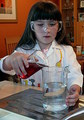
| 06/15/2008 02:41:03 PM |
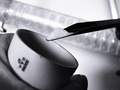
Kitchen sink chemistryby pdbartlettComment: This is an interesting concept and meets the challenge well. The look of concentration on the girls face is really what makes this shot work, for me. I think some technical faults let the image down on the hole though. Your subject (the girl) isn't sharp - it looks like a case of camera shake to me. This is pretty distracting and takes my attention away from your subject matter. The background is too cluttered, again this means its competing for my attention and gives the photo a snapshot kind of feel. Try minimising objects in the background and focus attention in on exactly where you want people to be looking in your photo. 4 from me. |
| Photographer found comment helpful. |
| 06/15/2008 03:35:50 AM |
Cautious by h2Comment: This looks like a photo from a stock site, thats a good thing. Its crisp, clean and well executed. The depth of field isolates the subject matter well and the out of focus guy in the background underlies the chemistry theme. This is a great example of blowing the highlights to good effect, as they are only blown in the background and this again adds the focus to the foreground.
The only thing which lets this down a little is that I think the concept is a little too obvious and I would have liked to have seen a more creative interpretation of the challenge. However its tough to balance ideas against the guys like me and the 'DNMC!' crowd so I won't hold it aginst you ;) 8. |
| Photographer found comment helpful. |
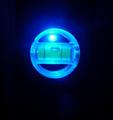
| 06/15/2008 03:32:40 AM |
Phosphoric Glowby omikeoComment: This is an interesting little object which piques my interest. I'm curious what it is, as the blue light isn't revealing a lot of detail and so because of this curiousity I'm tempted to linger for longer on this photo in order to discern what I'm looking at. I suspect its a spirt level.
The blues are a nice interesting shade and that helps with the overall interest of the photo.
Unfortunately you need a steady hand it seems as this looks a little blurry to my eyes. I also question why you have so much negative space in the image? It doesn't really seem to add anything to the picture overall so a closer crop might have been a better choice, particuarly because this is something of an abstract photo and a closer crop would have added to this feeling. Overall 4. |
| Photographer found comment helpful. |
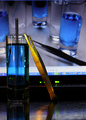
| 06/15/2008 03:29:36 AM |
my private labby ytshuvaComment: This is well executed, the colours work really well with the blues in the liquid and the oranges and yellows of the tweasers. Blue/Orange is a dramatic colour choice and this sense of drama is great in any image provided its used correctly. I'm not sure it is here, as I struggle to understand what this picture is about. I'm not sure of the connection between the liquid and the tweasers - why are they there? Because of this confusion the image doesn't quite sit right with me and the concept fails. If there is a reason these items are in the photo you need to demonstrate this in the image itself so that the viewer doesn't flounder too much. Overall 4. |
| Photographer found comment helpful. |
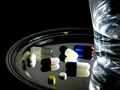
| 06/15/2008 03:26:18 AM |
Health or Deathby LelezComment: I see where your trying to go with this still life, the concept of drugs and health fits the challenge well but I feel you need some improvement in the execution of the idea. A couple of things which jump out - the arrangement of the pills on the tray looks a little slipshod - with a still life you have total control over the image and I'd have concentrated on the arrangement to add emphasis to your idea. You've titled your entry health and death and if this was thought out in advance of taking the picture I'd have tried to fit a 'death' element in there somewhere as this doesn't shout death to me.
You've used an interesting selection of colours in your image and this is good - particularly when placed against a stark background like you have done, but the colours are under utilised for me. They're dark and don't pop enough.
Lastly, the thing on the right hand side. I think this is a glass of water for taking the pills with? I can't make it out, maybe this is because of the crop and the reflection working against you? Whatever this is, its pretty confusing for me as a viewer and I'd have been tempted not to include it or to replace it with another object such as bottle of medicine. I give this a 4. |
| Photographer found comment helpful. |
| 06/15/2008 03:20:28 AM |
Last Danceby lauraodomComment: This is a subtle response to the challenge, but I'm thinking its the chemistry of love that you are trying to convey here. I suspect the less patient will not appreciate this aspect but I think its commendable to try something a bit different and that requires a little thought by the viewer to 'get it'.
Having said that however, I think some elements of the photo could do with a little improvement. If I'm right in my assumption that this is to do the with chemistry of love then the couple who are your subject matter should dominate the photo. As it is, you have put them in a real life perspective and I'm not sure that really adds anything to the photo. Cropping off the right side of the image might have helped, and a black and white or subtle sepia would really have added an intimate feel to underline your concept. Overall, 5 from me. |
| Photographer found comment helpful. |
| 06/15/2008 03:17:02 AM |
c12h22o11 is a soluble white crystalline ...by GeneralEComment: This is a pretty unique approach to the subject matter, the black and white with cranked up grain is a stong photojournalistic type of style which adds a lot of drama and interest to what could be an otherwise fairly dull shot. your composition is strong and the tilted angle adds to the image I think. I'm not sure about the object in the background though, with backgrounds its always helpful to think 'does this add anything to the image, and if so, does it add the right effect and fit in with the rest of the photo?'. In this case I'm not sure what the object is but I suspect it was added to add extra weight to the 'chemistry' element. Overall a strong entry I think, and a bit more risky than a typical 'colourful chemical' shot. 8 from me. |
| Photographer found comment helpful. |
| 06/15/2008 02:29:47 AM |
egg on iceby vera1988Comment: Interesting concept but I don't think the link to the challege is demonstrated stongly enough. You might have some hidden meaning behind this photo, but unless its clearly demonstrated in the photo your viewers are going to struggle to discern it.
Technically well executed, the egg leads your eye into the shot due to the angle its posed at, the ice and texture of the egg are clear and sharp, and the depth of field adds an extra dimension to the picture. Its as though this is some kind of ice cave that leads off into the distance and this sense adds extra interest to the picture. The colour of the egg is seaping out onto your ice though, which does niggle with me a bit too, so overall I have given this a 5. |
| 06/15/2008 02:29:45 AM |
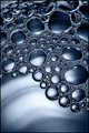
R--COO- H3 N+ --CH2 --CH2 --SO2- Y + H2O = Liquid Pearls by hotpastaComment: A very strong abstract shot, I'm going to assume you know what those chemical compounds in the title are and am not going to bother looking them up :)
Theres a lot to like here - the lighting is subtle and effective, it doesn't draw attention to itself and instead focuses on your subject which is exactly how lighting should work, but seldom does.
The contrast and clarity of the bubbles make them a really strikig subject and this offset with the smooth background adds a sense of drama that works really well.
My only slight niggle is the top left corner - I think you just caught the edge of the container that this was being shot in? Overall 8. |
| Photographer found comment helpful. |
Home -
Challenges -
Community -
League -
Photos -
Cameras -
Lenses -
Learn -
Help -
Terms of Use -
Privacy -
Top ^
DPChallenge, and website content and design, Copyright © 2001-2025 Challenging Technologies, LLC.
All digital photo copyrights belong to the photographers and may not be used without permission.
Current Server Time: 04/07/2025 06:15:35 AM EDT.