| Image |
Comment |
| 02/18/2006 03:17:52 AM |
Faithby sangeethComment: i'm not overly sure i like the centered-balance of this shot. its a nice shot of an eye, just not sure of the balance/position. |
| 02/18/2006 03:17:01 AM |
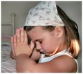
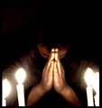
For These Things.......by missinseattleComment: lighting is unbalanced (her hair and her lower cheek are burning out), background of the bedpost is distracting. crop on the right-hand side is a bit odd, as it seems she is floating, perhaps crop a little into and use her body as a frame.
for a better effect, i would have taken this picture at night time to give the idea that she is saying her prayers BEFORE waking up which is more customary than after you wake up. |
 Photographer found comment helpful. Photographer found comment helpful. |
| 02/18/2006 03:15:19 AM |
Faith and hopeby BrinComment: i'm not sure how your image actually conveys the title. the subject looks more like he's lost than he has faith. perhaps he's doing tai chi? if so, it may have been better to wait for a better/more distinguishable pose? its a nice shot, i'm just confused as to the relation to the title. |
| Photographer found comment helpful. |
| 02/18/2006 03:14:02 AM |
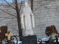
Motherby jayitaComment: branches in background are a bit distracting against the white wall. also the dead planters on the sides are a bit distracting. i think the angle is a bit off here too, i'd either overly emphasize the angle (from bottom looking up OR the left-right slant, but not both at the same time).
also a tighter crop would help bring this image to life a bit more. |
| 02/18/2006 03:12:07 AM |
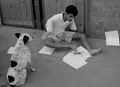
Live on Faith, World will Sit & take noticeby honikumComment: this image has a lot of potential, but i think the composition could be improved a little. the problem is that its hard to focus on what is actually going on in the picture. the best aspect is the little dog watching this man, which draws away from what i believe was your main focus. perhaps if the piece of paper on the right was removed and you had a little better lighting so as not to lose all of the detail in his hair it would be a better shot. also, using the leading lines of the wall on more of an angle would better emphasize the man in the shot. hth. |
| Photographer found comment helpful. |
| 02/18/2006 03:09:58 AM |
|
| Photographer found comment helpful. |
| 02/18/2006 03:09:32 AM |
Faith by mciComment: nice colour, sharp silhouette, nice photo |
| Photographer found comment helpful. |
| 02/18/2006 03:09:11 AM |
Praying for Faithby Green_PieceComment: a bit too grainy, perhaps should crop into a square, as there is a little bit too much negative space on top (not much, perhaps a 1/4 inch) |
| 02/18/2006 03:08:08 AM |
|
| Photographer found comment helpful. |
| 02/17/2006 03:21:29 AM |
Fortitudeby SJCarterComment: you used too much photoshopping for a basic challenge (ie: your curves balance has lost all detail, all of the sticks along the bottom are very distracting) |
| Photographer found comment helpful. |
Home -
Challenges -
Community -
League -
Photos -
Cameras -
Lenses -
Learn -
Help -
Terms of Use -
Privacy -
Top ^
DPChallenge, and website content and design, Copyright © 2001-2025 Challenging Technologies, LLC.
All digital photo copyrights belong to the photographers and may not be used without permission.
Current Server Time: 04/08/2025 04:52:57 PM EDT.