| Author | Thread |
|
|
04/27/2006 07:30:23 PM |
| Doesn't work for me also.. Too grainy.. |
|
|
|
02/27/2006 06:25:36 PM |
Greetings from the Critique Club
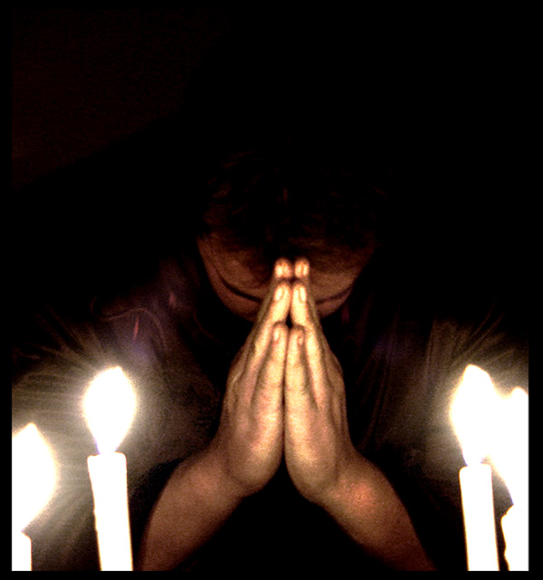
I like the composition. Good pose. The negative space at the top works well. The noise adds to the mood. The color doesn't seem quite right, and the overexposed candles, although essential to the message, are somewhat distracting. I'm not sure what to think of the exaggerated hands. I can't really say I like it, but it does certainly emphasize the subject of the photo, so I guess I'll commend your innovative use of wide angle.
Overall, it's difficult to easily tell what the photo is about; you have to look closely. That isn't necessarily bad, but here it doesn't really work for me. |
|
Comments Made During the Challenge  |
|
|
02/21/2006 05:23:23 PM |
| a little too pixelated in the lowlight |
|
|
|
02/21/2006 07:04:41 AM |
| I think this would have been better with a lower ISO and longer exposure. |
|
|
|
02/21/2006 06:28:34 AM |
| Nice, except the candles are too distracting, next time try and get them out of the shot. |
|
|
|
02/20/2006 12:04:27 PM |
| I LOVE THE GRAIN EFFECT IT BRINGS FEELING TO THE PHOTO |
|
|
|
02/20/2006 08:13:57 AM |
| love your picture...good luck |
|
|
|
02/19/2006 02:30:53 PM |
|
|
|
02/18/2006 05:21:21 PM |
| A bit too grainy, perhaps a lower iso and longer exposure? Concept and framing is great. |
|
|
|
02/18/2006 04:32:13 PM |
| I suspect the use of Neat Image was slightly abused. Otherwise a great idea. |
|
|
|
02/18/2006 03:55:03 PM |
| beautiful, a little grainy, but a great photo never the less |
|
|
|
02/18/2006 11:59:57 AM |
| I like the "triangular" composition very much, with the negative space above. A bit grainy, but I don't mind that. |
|
|
|
02/18/2006 03:09:11 AM |
| a bit too grainy, perhaps should crop into a square, as there is a little bit too much negative space on top (not much, perhaps a 1/4 inch) |
|
|
|
02/18/2006 01:13:28 AM |
| Great composition, I also lik ethe grain which rarely works well. The candles are very much overexposed though. |
|
|
|
02/17/2006 05:37:32 PM |
| for me, your image would be more powerful if cropped off the top and turned into more of a horizontal. Also, keeping all four candles within the frame rather than having them cut off. I also wonder how this would look in black and white - might help with the grain, unless you're going for that look. |
|
|
|
02/15/2006 08:08:19 AM |
| "help me my unbelief"...nice capture. |
|
|
|
02/14/2006 11:17:30 PM |
| the imagery is is great, but the top could be a bit brighter |
|
Home -
Challenges -
Community -
League -
Photos -
Cameras -
Lenses -
Learn -
Help -
Terms of Use -
Privacy -
Top ^
DPChallenge, and website content and design, Copyright © 2001-2025 Challenging Technologies, LLC.
All digital photo copyrights belong to the photographers and may not be used without permission.
Current Server Time: 04/07/2025 01:28:31 PM EDT.