| Image |
Comment |
| 02/18/2006 06:56:56 AM |
Fortitude - Courage of Spiritby CutterComment: looks like you missed out on the extreme sports challenge :)
horizon is nice and level, wish the blues of the water were a bit brighter (perhaps increase saturation a little bit), a little bit dark on the legs and losing detail throughout the jacket which is a shame. overall, good sense of timing, and nice leading lines with the strings/ropes (wish there was more of that) |
 Photographer found comment helpful. Photographer found comment helpful. |
| 02/18/2006 06:50:47 AM |
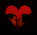
Forever Yoursby M.O.C.Comment: a tad bit grainy, and a little on the cheesy side (80's glamour shot-like?). i'm not a fan of the cropping (each persons' ear is cut off) and there are some stray hairs on the woman that could be cleaned up. |
| 02/18/2006 06:49:33 AM |
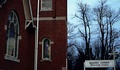
What do you believe - Reflection or Spirit?by ltaylorComment: i'm not sure i like the drainage pipe going up the wall of the building. also wish you could have used a bit more unsharp mask to highlight the pattern of the bricks, perhaps a bit more saturation to bring out the red as well.
the trees in the background draw attention away from the cross at the bottom left which is a pity, and the hydrowire going to the church is a bit distracting as well. fortunately, most of these things can be fixed in photoshop with some clone brush and usm, saturation.
hth. |
| Photographer found comment helpful. |
| 02/18/2006 06:47:42 AM |
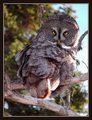
Wise Old Owl (prudence)by paul58Comment: the tree in the background is very distracting. a nice CLEAR shot of an owl, however, i feel like its missing emotion. the eyes are GREAT, but I think you really needed to close in tighter around those, to really give the impression of wisdom. |
| Photographer found comment helpful. |
| 02/18/2006 06:46:35 AM |
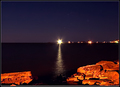
Hope: Reach for Your Beaconby SandyPComment: nice foreground lighting, although it seems to have lost some level of detail in the rocks. the sky was captured nicely, and wow, the horizon is level! :)
i wish that the lights to the right of the lighthouse weren't there, as they seem to be competing for attention, but the stars in the sky add a nice subtle accent. |
| Photographer found comment helpful. |
| 02/18/2006 06:44:57 AM |
I'm Drivingby shadowdoc31Comment: the white backdrop in this image is all wrinkled and REALLY pulls away from the image
also lighting on the bottom of the hand and middle finger is too dark. the beer bottle is too close to the right side of the frame, and you've really lost the warmth of the image by converting to black and white. i think the golden hue of the beer would have contrasted nicely with the flesh tones of the hand, but you're removed that altogether. :( |
| 02/18/2006 06:43:26 AM |
Sevenly Virtuousby MistyMuckyComment: the halo effect needs to be more pronounced. also the lighting is a bit flat, making the colours muted. would be nice to increase the saturation and improve the curves of this image to bring it a bit more to life. otherwise, interesting concept, just wish the image wasn't so muddy.
(lighting issues with the shadow on the left of her nose), and perhaps wearing a less textured shirt would help improve the image. |
| Photographer found comment helpful. |
| 02/18/2006 06:41:37 AM |
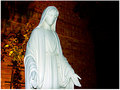
Mary full of graceby garrfosterComment: the backlighting is nice, however, I feel that there is a bit much glare on the actual statue which is causing some loss of features (especially in the face). the orange glow in the back is very nice, as well as the fade into negative black space on the right.
i'd also might have cropped a little less so as not to bring her hands so close to the bottom of the picture. |
| 02/18/2006 03:19:28 AM |
Faithby StangComment: difficult to distinguish subject matter. i like the smoke and silhouette, but i find it loses alot of meaning without compromising its art appeal. a nice shot artistically. |
| 02/18/2006 03:18:20 AM |
Faithby marvinComment: interesting use of leading lines, wish the corss was a bit sharper, or even had more of a glowing effect to it. |
| Photographer found comment helpful. |
Home -
Challenges -
Community -
League -
Photos -
Cameras -
Lenses -
Learn -
Help -
Terms of Use -
Privacy -
Top ^
DPChallenge, and website content and design, Copyright © 2001-2025 Challenging Technologies, LLC.
All digital photo copyrights belong to the photographers and may not be used without permission.
Current Server Time: 04/08/2025 04:52:57 PM EDT.