| Author | Thread |
Comments Made During the Challenge  |
|
|
02/21/2006 05:38:25 PM |
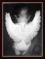
| I would beef up the curves a bit here |
|
|
|
02/21/2006 02:43:55 PM |
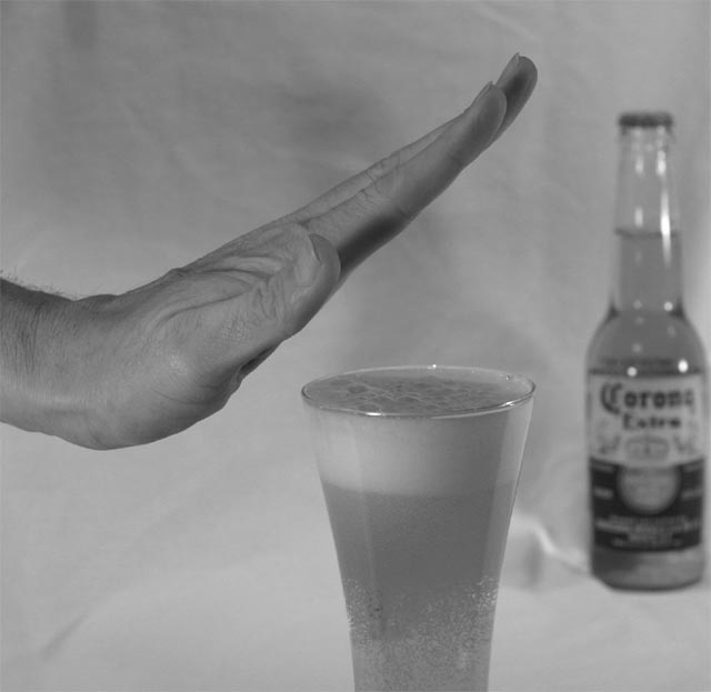
| I think that a color capture would have given this picture a better viewer grab. The idea is excellent but have you ever tried to resist a Corona! |
|
|
|
02/18/2006 06:52:59 PM |
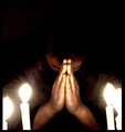
| very good message.... I like the b&w - |
|
|
|
02/18/2006 12:07:50 PM |
| Good sentiment, but the execution is a bit "gray" - needs more vivid lighting and contrast. |
|
|
|
02/18/2006 09:46:39 AM |
| I think that colour would have been better here. |
|
|
|
02/18/2006 06:44:57 AM |
the white backdrop in this image is all wrinkled and REALLY pulls away from the image
also lighting on the bottom of the hand and middle finger is too dark. the beer bottle is too close to the right side of the frame, and you've really lost the warmth of the image by converting to black and white. i think the golden hue of the beer would have contrasted nicely with the flesh tones of the hand, but you're removed that altogether. :( |
|
|
|
02/18/2006 03:50:13 AM |
| Good entry for the challenge. For me, if there was more contrast overall - the grays seem flat - I would have scored it even higher. |
|
|
|
02/17/2006 05:38:00 AM |
| it's a crapy beer anyways ;) |
|
|
|
02/16/2006 09:48:19 AM |
|
|
|
02/16/2006 06:58:55 AM |
| Good idea. Maybe a slightly higher contrast would help the image stand out a little. |
|
|
|
02/15/2006 12:23:22 PM |
| A good idea, which could be improved technically. The wrappings of the background are distracting a bit, I would iron it and would not place the bottle to the side, I would put it a little bit more to the left, no matter if the glass covers a part of it. Holding the hand absolutely vertical would make your decision more confident, IMO. |
|
|
|
02/14/2006 10:59:51 PM |
| Dull contrast, work on lighting. |
|
Home -
Challenges -
Community -
League -
Photos -
Cameras -
Lenses -
Learn -
Help -
Terms of Use -
Privacy -
Top ^
DPChallenge, and website content and design, Copyright © 2001-2025 Challenging Technologies, LLC.
All digital photo copyrights belong to the photographers and may not be used without permission.
Current Server Time: 04/06/2025 10:52:51 PM EDT.