| Image |
Comment |
| 11/14/2004 08:51:40 AM |
Marchby PedroComment: Hmmm, the pose seems a little awkward? I think its because she is standing on her tiptoes? I like the angle at which its shot and the scene is interesting, almost detracts from the beautiful girl a bit too much? Also the shot seems to have too much of the warm colour cast. Good work, a five from me. |
 Photographer found comment helpful. Photographer found comment helpful. |
| 11/14/2004 08:48:27 AM |
Aussie spring. "November"by NodeComment: Nice shot, good viewpoint, but and its a big but in a seascape, the horizon is not level, its slightly down at the right. I said good viewpoint but I think it could have been better if we could see more of the curve of the bridge / jetty / pier? Also it leads the eye out there and then there's nothing to see, no focal point in the distance, because the bridge / jetty / pier is not the focal point out there. Nice colours and textures on the rocks, well done a five from me. |
| Photographer found comment helpful. |
| 11/14/2004 08:41:24 AM |
April Showersby jmleliiComment: Nice light feel to this shot, I like the softness and glowing effect. The desaturated colours add to the effect well. However I thing the pose is a little off, looking towards the camera would have been better for me. A five from me, well done. |
| Photographer found comment helpful. |
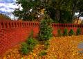
| 11/14/2004 08:38:03 AM |
Novemberby oksamitComment: The colours are what atracted me to this shot and they are great. The worst thing for me is that its just a bit ordinary in its content. With an "ordinary" scene like this you need to find a dramatic viewpoint and / or have some extraordinary lighting. The lighting here is a bit flat, there are hardly any shadows being cast. How about being right up against the wall or right down at ground level, don't be afraid to experiment with the veiw ans look at it through the camera to see what it sees, things can look very diferent from our own eyes. Well done though, a five from me. |
| Photographer found comment helpful. |
| 11/14/2004 08:32:38 AM |
Novemberby banmornComment: I just love the colours in this shot. Well done for spotting this opportunity and giving us an urban calendar shot. A five from me. |
| Photographer found comment helpful. |
| 11/14/2004 08:30:47 AM |
Aprilby scottwilsonComment: Good veiwpoint for the Paris, would make a nice calendar picture. Would remind me of my holiday! Well lit, gives some texture to the buildings, even though they are a bit small. I might have just concentrated on the tower and the main building? Well done though, a five from me. |
| Photographer found comment helpful. |
| 11/14/2004 08:26:43 AM |
Novemberby lwkimagesComment: Not sure why I'd want this as a picture in my calendar, I'd like my calendar to be uplifting and this seems to portray destruction, not letting that affect my voting though. I think this scene would work well if more post processing were applied, which of course isn't allowed in the challenge. Its kind of halfway between a pretty rural cottages scene and an urban abandonment scene. The image and therefore me the veiwer can't decide. Good effort keep shotting and submitting, a five from me. |
| Photographer found comment helpful. |
| 11/14/2004 08:21:27 AM |
August (Last Days of Summer)by kennytComment: Nicely captured. Good sillouhette. Some noise in the stern of the boat but there is very high contrast there. Not sure about the composition though? There seems to be an awful lot of empty space at the bottom of the shot, I know there are reflections but it still seems a bit much to me? Well done anyway, a six from me. |
| Photographer found comment helpful. |
| 11/14/2004 08:17:48 AM |
Novemberby wlevyComment: Not sure about having a scene from a cemetery on a calendar? But that aside its well done. Quite well balanced, very good. The colours are wonderful in the sky but look a little strange on the stones and the grass? What's with the wavy border along the bottom of the shot?
Well done a six from me. |
| Photographer found comment helpful. |
| 11/14/2004 08:13:51 AM |
Mayby artvetComment: Studio flower shots are not normally my thing but, I like this for its simplicity and high contrast. The colours are great, nice composition. I think the border is great, using a colour from the scene, just to balance those anti border comments. Well done a six from me. |
| Photographer found comment helpful. |
Home -
Challenges -
Community -
League -
Photos -
Cameras -
Lenses -
Learn -
Help -
Terms of Use -
Privacy -
Top ^
DPChallenge, and website content and design, Copyright © 2001-2025 Challenging Technologies, LLC.
All digital photo copyrights belong to the photographers and may not be used without permission.
Current Server Time: 04/07/2025 06:27:20 AM EDT.