| Author | Thread |
|
|
11/26/2004 05:14:23 AM |
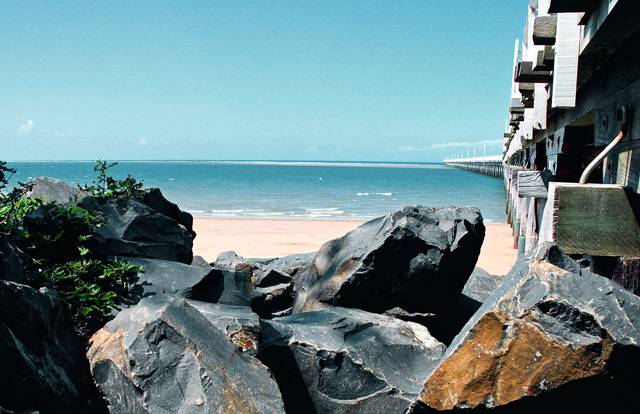
The rocks really dominate this composition. THe pier less so - in fact it is quite hard to tell what it is initially. The sky is quite featureless and flat and the light isn't the best either - feels like it was shot around mid-day - giving you the very harsh shadows and dark areas in the rocks and pier.
I think this location probably has some potential - on a day with some more interesting cloud forms and later or earlier in the day when the light is better. Around 1 hour before and after sunset and sunrise are great times to shoot landscape shots - the light is beautiful, the shadows aren't so harsh - depending which way this pier faces would help determine the best time though - you want some light on the side of the pier.
Composition Issues:
The horizon doesn't feel straight - this can be quite easily fixed using the skew transform in something like photoshop to tweak it to horizontal. It seems like a little thing but it can be quite distracting.
Horizon placement - it isn't quite along the top third, floating somewhere between there and splitting the middle of the frame - I think with the almost total lack of sky in this shot, I'd have placed it quite agressively high in the shot - maybe even only about 2% of the scene as blue sky, just by tilting the camera down - and probably getting myself to a higher position if possible.
Rock/ sand/ sea composition. The rocks merge with the sea and sand - particularly the two that poke 'up' A slightly higher viewpoint would have had the rocks surrounded by the sand, making them stand out more strongly as a main element in the composition (blue/grey against orange/yellow sand, rather than blue/grey rocks against the blue/grey sea)
Pier - it certainly can make for a strong leading line element - though I think you need to be slightly to the left and shooting more 'in' to the pier for that to work - here it forms a strong vertical line on the right that doesn't really lead off and then further out in the distance starts to lead in to the scene. |
|
|
|
11/19/2004 06:22:14 PM |
| Hi greetings from the CC, the horizon seems a bit crooked, I am not sure if I like the perspective here, with the rocks and all, I think I would like to see more of the pier. Something to keep in mind is that the horizon is generally more interesting when it is not dead center. I find the elements of your shot pull at me, the rocks to the bottom the pier to the left and yet I dont really have a focal point. The blues are really nice however, and the grey tones in the rock. Hope that helps a little |
|
 Photographer found comment helpful. Photographer found comment helpful. |
Comments Made During the Challenge  |
|
|
11/14/2004 08:48:27 AM |
| Nice shot, good viewpoint, but and its a big but in a seascape, the horizon is not level, its slightly down at the right. I said good viewpoint but I think it could have been better if we could see more of the curve of the bridge / jetty / pier? Also it leads the eye out there and then there's nothing to see, no focal point in the distance, because the bridge / jetty / pier is not the focal point out there. Nice colours and textures on the rocks, well done a five from me. |
|
| Photographer found comment helpful. |
|
|
11/11/2004 07:30:54 PM |
| Nice shot! As I'm looking at it, I'm finding myself wondering what it woud have looked like if you were a few steps to the left where we could have seen more of the pier. 7 |
|
| Photographer found comment helpful. |
|
|
11/10/2004 10:09:03 AM |
| I like the blue colour of the sky and the water. Well done. |
|
| Photographer found comment helpful. |
|
|
11/09/2004 06:09:23 PM |
| Sure wish our Novembers looked like this! |
|
| Photographer found comment helpful. |
|
|
11/09/2004 02:46:42 PM |
| Nice photo, maybe could use a bit more beach and a bit less rocks. |
|
| Photographer found comment helpful. |
|
|
11/09/2004 02:29:26 PM |
| Fantastic, refreshing, clear and sparkling. I would love to see this every day for a month! |
|
| Photographer found comment helpful. |
|
|
11/09/2004 09:39:17 AM |
| Aussie spring in november? now that i didn't know.. I like the colors and subject mater of this shot. I don't care for the peir on the right of the screen it distracts from the best features of the photo imho. Perhaps a differnt angle would have eased the pull to the close up part of the peir... |
|
| Photographer found comment helpful. |
|
|
11/08/2004 01:54:58 AM |
| I think I would have liked this photo more if the camera were a little more to the left and I could see the symmetry of the bridge pylons. But still nice. |
|
| Photographer found comment helpful. |
Home -
Challenges -
Community -
League -
Photos -
Cameras -
Lenses -
Learn -
Help -
Terms of Use -
Privacy -
Top ^
DPChallenge, and website content and design, Copyright © 2001-2025 Challenging Technologies, LLC.
All digital photo copyrights belong to the photographers and may not be used without permission.
Current Server Time: 04/08/2025 12:56:35 PM EDT.