| Image |
Comment |
| 08/08/2002 08:48:00 AM |
Valentines Dayby rll07Comment: Nice subject -- if you were to apply a bit of sharpening, the detail in the lettering would be more defined and easier to read. |
| 08/05/2002 08:42:00 AM |
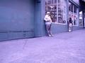
Grumpy Old Menby tydComment: I love the composition, and title......the photo seems to have a weird bluish hue which is distracting to me. |
| 08/05/2002 08:44:00 AM |
|
 Photographer found comment helpful. Photographer found comment helpful. |
| 08/06/2002 08:29:00 AM |
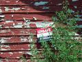
unsafeby jbolingComment: I love the texture of the building. I might like the composition a bit more if the sign were closer, and maybe not so near the center of the photo (move to the lower right?). The photo could also be improved with a small amount of sharpening in Photoshop. Overall, nice work! |
| 08/06/2002 08:31:00 AM |
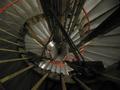
Abandoned Stairwell?by ManicComment: Great subject and position. Wish it were more crisp and sharp -- the red spiral line adds a nice touch. |
| 08/01/2002 08:49:00 AM |
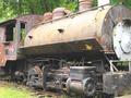
Customer Dissatisfactionby mciComment: Great composition -- this is one of my favorite photographs of the week. Did you try from a slightly lower angle, with the subject filling just a bit more of the frame? I'm not sure I'd like that better -- just wonder how many variations you have of the photo. Excellent! LanSnake |
| 08/01/2002 09:06:00 AM |
Back to Basics by dequinixComment: Excellent photo and meets the challenge very well. I'm rating this as one of the my four favorites this week -- only real negative I have (and you may not have any control over this) -- I think I may like this better if the Wall Street sign in the middle of the photo were more to the right, with the big steel post on the far right. I realize that this would move the Wall Street sticker off camera (the one on the white pole to the far right). Of course, that is assuming that there are not elements to the left that you are trying to keep out of the frame! Great work!! LanSnake |
| 08/01/2002 08:39:00 AM |
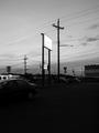
something has come over usby heartsdivideComment: You've captured an interesting sky in this photo. I'm not sure what you want me to look at.....the wires and signs? The beautiful sky...masked by all of these wires? I had initially rated this photo low, but as I look at it again (after voting on all of the others) I'm moving you up. LanSnake |
| 08/01/2002 08:34:00 AM |
Heaven and Hell by chakkobboComment: Excellent composition! One of my favorites this week....I'd like to see this photo in color if you decide to post after the competition. (Just curious what color is added by these buildings.) |
| 07/26/2002 08:11:00 PM |
Garden Angelby jmsetzlerComment: Beautiful photograph. I love the composition, colors, and subject is great for texture (some voters might be asking where's the texture?.....I remember the feel of a butterfly's wings...and the powder that rubs off on your fingers). My favorite of the week -- great! LanSnake 10 |
Home -
Challenges -
Community -
League -
Photos -
Cameras -
Lenses -
Learn -
Help -
Terms of Use -
Privacy -
Top ^
DPChallenge, and website content and design, Copyright © 2001-2025 Challenging Technologies, LLC.
All digital photo copyrights belong to the photographers and may not be used without permission.
Current Server Time: 04/11/2025 12:04:26 AM EDT.