| Author | Thread |
|
|
08/11/2002 09:34:00 PM |
| I like the perspective, and I intentionally added the blue tint. I thought it was interesting... and that's all that really matters to me. |
|
Comments Made During the Challenge  |
|
|
08/11/2002 07:08:00 PM |
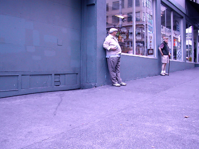
| There is WAY too much space. I think it needs to be cropped on the buttom and left side big time. Or at least the buttom. I realize you need to have the proper persective and still have your pic conform to the size rules, so this could be difficult to do without distortation. But I say try cropping more next time. |
|
|
|
08/11/2002 01:49:00 PM |
| Meets the challenge! The overall tonality has too much blue. |
|
|
|
08/11/2002 10:38:00 AM |
| This picture is taken too far away to know if the men are grumpy |
|
|
|
08/10/2002 02:02:00 PM |
| Should this really be that purple? It looks very odd. |
|
|
|
08/09/2002 05:56:00 AM |
| How much room did you have to crop this vertically around the two guys, eliminating the left part of the photo? |
|
|
|
08/08/2002 12:37:00 PM |
| I like the the composition of this shot. If the blue is intentional, it doesn't work for me, but if you like it, rock on. karmat |
|
|
|
08/08/2002 10:43:00 AM |
| not sure what the focus is on. is it the guy in the foreground that's old? the one in the background? the building? |
|
|
|
08/08/2002 10:20:00 AM |
| I like the colour cast--nice composition Andrewm |
|
|
|
08/07/2002 11:26:00 PM |
| yep, them's old all right. was the bluish tinge intentional? was the almost 100% reflection of a nearby partment building intentional? nice use of the diagonal and the two poses. |
|
|
|
08/07/2002 03:10:00 PM |
| Photo appears purple to me (esp. the cement). I would have preferred a closer crop to your subjects. (the big door isn't interesting, nor do I think it offers enough blankness to be negative space). 6 Swash |
|
|
|
08/07/2002 09:35:00 AM |
| Blue cast drowns the intricacy of the photo. |
|
|
|
08/07/2002 08:06:00 AM |
| You got that right..great characture shot and color |
|
|
|
08/07/2002 07:43:00 AM |
| This is a great photo, I love the placement of the old men. |
|
|
|
08/07/2002 06:53:00 AM |
| Too much open space and the colour tint take so much from a really good idea (in my view). It seems to take away the central theme. Sorry (4) |
|
|
|
08/07/2002 05:42:00 AM |
| This has sort of a strange purple cast...white balance setting? I'd have liked to see the men more closely... |
|
|
|
08/07/2002 05:14:00 AM |
| I love your composition here! The colouring is a little strange to me, but I still really enjoy this photo. There's something... eccentric about the way those men are standing there, part of the streetscape, frowning at the world going by. |
|
|
|
08/06/2002 05:07:00 PM |
| Great street shot. I would like it even more if it were cropped or zoomed in so as to bring these two in closer. |
|
|
|
08/06/2002 12:54:00 PM |
| Not sure about the lighting but good subjects. |
|
|
|
08/06/2002 12:46:00 PM |
| This doesn't immediately say "old" to me without the title to nudge me along. lhall |
|
|
|
08/06/2002 10:06:00 AM |
| A decent artistic street shot, would be made more interesting as a grayscale, then tinted. Try an all-blue image and see how it looks. |
|
|
|
08/06/2002 08:12:00 AM |
| well done. i like the lines in this photo and the purple tint gives it a unique look |
|
|
|
08/05/2002 07:51:00 PM |
| the subject is a bit small in this shot....perhaps some zooming or cropping |
|
|
|
08/05/2002 06:26:00 PM |
I Thik this is cute. I liekt he angle of the shot - one thing sort of bothers be just a little - the color - purple/blue - was it done that way on purpose...still is a good photo 8
Ruthann |
|
|
|
08/05/2002 04:56:00 PM |
| The color seems a bit bluish. The composition could have worked better with a close up IMO. Nice title. |
|
|
|
08/05/2002 01:56:00 PM |
|
|
|
08/05/2002 10:36:00 AM |
|
|
|
08/05/2002 08:42:00 AM |
| I love the composition, and title......the photo seems to have a weird bluish hue which is distracting to me. |
|
|
|
08/05/2002 07:59:00 AM |
| Lots of negative space and in this case Im not sure it adds much to the picture. The subjects are good - suitably old style of dress. I especially like th flat caps. There seems to be a blue tint to the picture, though. |
|
|
|
08/05/2002 07:55:00 AM |
great shot...I wish it were a little closer in so I could see thier expressions better! classic! 7 Lisa
|
|
|
|
08/05/2002 06:05:00 AM |
| This is a good idea, but I think I would have liked less of the garage door and more of the old men. |
|
|
|
08/05/2002 06:04:00 AM |
|
|
|
08/05/2002 06:00:00 AM |
| A closer shot of them would have made for more emotion |
|
|
|
08/05/2002 04:53:00 AM |
| interesting choice of subjects :) Since the 'men' are the subjects, i think bringing them in as a little larger part of the image would have been nicer. The photo also has a 'blue' tint that may have been correctable with a white balance setting... the sidewalk carries a blue/purple cast that looks a little strange... - jmsetzler |
|
|
|
08/04/2002 11:39:00 PM |
| heheh it looks from the angle like you have taken this discretly.. or did you go up to the men and say "Hi, I'm taking photos for a topic named Something Old, and I was just wondering if you could pose for me" |
|
Home -
Challenges -
Community -
League -
Photos -
Cameras -
Lenses -
Learn -
Help -
Terms of Use -
Privacy -
Top ^
DPChallenge, and website content and design, Copyright © 2001-2025 Challenging Technologies, LLC.
All digital photo copyrights belong to the photographers and may not be used without permission.
Current Server Time: 04/06/2025 10:32:39 PM EDT.