| Image |
Comment |
| 08/26/2002 08:24:00 AM |
Shadow and Lightby LanSnakeComment: Thanks for all the great comments. The blemish in the top center is a pencil marking on the paper backdrop. Over the course of the week I had taken approximately 200 pencil photos on this paper work-area. Some of my experiments used many pencils (40+), so by the end of the week the paper had several light pencil lines. My submitted photo was taken very late at night. I should have placed a new sheet of paper down, but didn't think of it till the next day when I noticed this marking in the photo. It was a very faint marking on the paper, but brought out in the final image because of the over-exposure (the over-exposure was intentional). |
| 08/21/2002 08:45:00 AM |
Pencil-Necked Geekby ClubJuggleComment: Wonderful idea! I like this photo very much -- wish the shirt color didn't blend so well with the computer monitor in the background though. |
 Photographer found comment helpful. Photographer found comment helpful. |
| 08/19/2002 05:47:00 PM |
|
| 08/21/2002 08:55:00 AM |
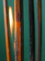
Red and White by RemieComment: Wow! This is really a cool photograph -- I love the symmetry, and how the white pencil disappears. I guess to be consistent I might like this more if the red pencil also disappeared into the red background. This might be a difficult thing to do (to eliminate the shadow on the right of the red pencil by changing the lighting setup). Great Job -- one of my favorites this week. LanSnake |
| 08/23/2002 09:12:00 AM |
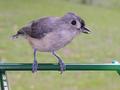
Tufted Titmouseby pnichollsComment: Excellent capture -- did you have to wait long? I love the detail in this image, especially in the feet, and feathers. Depth of field is very good too -- great job! 10 LanSnake |
| 08/20/2002 06:46:00 PM |
Forest Fireby KimblyComment: Very creative! I love the colors in your photo, especially the brown/green combination. Depth of field very effective also. Nice abstract quality -- is that a flame in the photograph, or just intense sunlight or ? |
| 08/20/2002 06:53:00 PM |
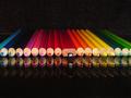
Obvious Imposterby syamjonimiComment: Excellent -- I love the humor! The background and reflective surface are very effective here. Love the photo....only thing I see that I might consider changing...the dark pencils; third and fourth from the left; seem to vanish against the dark background. I might like it better if the far end of the pencils formed a continuous line across the back. |
| 08/18/2002 12:50:00 PM |
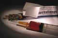
A New Addictionby lamedosComment: My favorite photo of the week -- very creative idea! The only thing I can see that MIGHT improve this image -- the all-white flap of the box is rather large and close to the center of the photo. I might like the photo better if this flap were not so central in the image (make it smaller? put more emphasis on the box label somehow?). Great job -- extra points for creativity. 10 LanSnake |
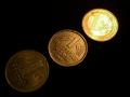
| 08/18/2002 01:19:00 PM |
Monetary Reformsby stephanComment: Finished all the voting and keep coming back to your image. I initially had this photo in the top 30 or so, but I think it's better than that. One of my top five for the week -- excellent work; really like the light gradient from left to right. 9 LanSnake |
| Photographer found comment helpful. |
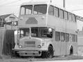
| 08/08/2002 08:52:00 AM |
Big Al's Old Busby GuillermoComment: Nice subject -- I think the photo would be better with a bit more contrast (everything is now almost the same shade of gray). |
Home -
Challenges -
Community -
League -
Photos -
Cameras -
Lenses -
Learn -
Help -
Terms of Use -
Privacy -
Top ^
DPChallenge, and website content and design, Copyright © 2001-2025 Challenging Technologies, LLC.
All digital photo copyrights belong to the photographers and may not be used without permission.
Current Server Time: 04/11/2025 12:10:54 AM EDT.