|
|
| Image |
Comment |
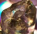
| 04/12/2003 06:04:24 AM | Purple Flame Iceby shareinncComment: Greetings from the Critique Club,
Composition:
Purple Flame Ice (great title, by the way!) is an interesting composition. While I like the close-in feel in the photograph, I wonder if the composition might be stronger if the ice were not crowding so close to the edges of the frame. Also, I think the composition could be improved by including the upper right section of ice that runs out of the frame.
Technical:
The lighting and exposure work very well and help to capture the wonderful colors from the flame. It is sometimes difficult to get a tight focus on a translucent object like ice. I think this photograph could be improved by working with different aperture settings, to try and get more of the ice in focus. The outer edges of the ice are in soft focus. It would be interesting to see how this photograph would look if the edges of the ice were more tightly in focus.
Meet the Challenge Objective?
This is a bold entry for the symmetry challenge. I see elements of light and color that form a symmetrical pattern, but I don't see symmetry in the shape of the ice. I think this is a creative exploration of symmetry in light, but many DP voters were probably looking for symmetry that is more "in your face" and that could account for the lower score for this challenge. Note that lower scores in DPChallenge are necessarily a bad thing -- it usually means that you've pushed certain creative elements outside the boundaries of what the "quick reviewer" is expecting to see. |
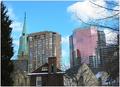
| 01/26/2003 11:26:12 AM | Lanscape became Cityscapeby jgillardComment: Greetings from the Critique Club,
Your landscape photograph is a very nice composition. I especially like how you've framed the left and right edges with trees -- this works very well, and reinforces your "Landscape became Cityscape" idea.
You've captured the sky color very well, good exposure and focus. A minor point (that will bother some of the DPC voters more than others) is your misspelling in the title (lanscape vs landscape).
Some of the comments below mention that the composition seems a bit crowded. I agree somewhat with this, but also realize that most cities look crowded. It might be interesting to try a wide-angle lens, and moving further away might open up other compositional ideas that work. This is a creative photograph for this challenge -- great idea to capture a landscape photo within the city!
LanSnake
|  Photographer found comment helpful. Photographer found comment helpful. |
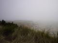
| 01/23/2003 02:05:56 AM | Untitledby KanedaComment: Greetings from the Critique Club;
This landscape photograph provides an element of mystery, due to the fog. I like how the background elements vanish in the distance. This effect seems to pull the viewer in, as they try to see what might be hidden just at that line where you can only make out the shape of objects.
While I like the composition, I think there may be a little too much fog in the upper third of the photograph. One way to add an element of interest to a fog photograph is to have an object, a fence for example, that runs from the foreground into the background. This could provide a viewer a better 'yardstick' so they can judge how thick the fog is. This element could also help to pull the viewer into the photograph, to examine more closely those objects in the background.
A level adjustment might also help with this photograph, as it seems that the entire image is a bit dark.
LanSnake
| | Photographer found comment helpful. |
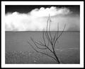
| 01/19/2003 09:31:44 AM | Desertby JackoComment: Beautiful composition and really nice tonal range. Excellent work. 10 LanSnake | | Photographer found comment helpful. |
| 01/15/2003 05:59:08 PM | (I Wanna Be) Your Underwear, Bryan Adamsby KimInNBComment: Greetings from the Critique Club,
Interesting photograph for the Song Title challenge! This photo captures the texture of silk very well, although I find the blue silk in the background tends to draw my attention away from the subject. Lighting and focus are very effective.
I believe the composition could be improved by playing with the location of the underwear within the frame. The bottom fifth of the photograph does not contain the subject -- could the photograph be improved by making better use of this area? One interesting composition might be to move the camera back a few feet, and position the underwear so that it breaks up the background into more definite shapes.
LanSnake | | Photographer found comment helpful. |
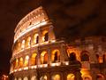
| 01/10/2003 05:30:17 PM | Colosseumby shetyamoutComment: Greetings from the Critique Club,
Excellent Travel photograph -- wonderful sky and lighting on the arches. As other people have mentioned below, the only real distraction here is the street lights in the lower left. You could crop this subject in many different ways to eliminate the street lights (or remove them in Photoshop!).
This is an eight second exposure -- did you take any with a faster shutter?
Great work -- keep shooting!
LanSnake |
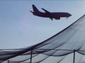
| 01/10/2003 05:20:11 PM | Nothing But Netby GolferDDSComment: Greetings from the Critique Club,
Very interesting Travel photograph! I like the range of blues in the photograph and the lighting works very well in my opinion.
This would be a difficult composition to grab, since your subject is obviously moving very fast. Very good capture!
To possibly improve the composition, I would see if there are other ways to crop the photo. For example, in the lower left there are some elements of the fencing that don't really add anything to the photo -- can these be cropped out? The composition is interesting, but it might look a bit more balanced if the jet were more to the left -- is there any way to crop your original to create more of a balance?
LanSnake | | Photographer found comment helpful. |
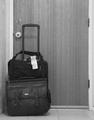
| 01/10/2003 05:07:23 PM | ... I hate to wake you up to say goodbye ...by myqylComment: Greetings from the Critique Club,
I like this composition and I think it fits the Travel Theme very well. I especially like how the lines of the door, and floor in the lower left, all converge to the subject -- the luggage. The luggage handle in the up position also works well, as it runs parallel to the lines of the door. (And gives the feeling that the traveler will be leaving very soon....)
I wish the focus were better on the luggage. Black and white works well here, but I might like to see more contrast -- would this photograph have more impact if the door were solid white?
LanSnake | | Photographer found comment helpful. |
| 01/10/2003 04:58:10 PM | For Your Protection...by GeneralEComment: Greetings from the Critique Club,
This photograph has a science fiction feel to me; leaves me with one of those disturbing 'we are watching you' vibes. This weird feeling seems to be amplified by the odd colors -- has this photo been inverted in a graphic editor?
There are two things I would consider to improve this photograph:
1. It might be fun to work with all of the geometric shapes here and try for a composition that draws the viewer's eye to the subject. Which element is most important? Play with the lines and framing to pull the viewer to that important element.
2. Technically, I think the focus could be improved. I'm not sure the weird color effect is helping either, maybe try this as a black and white study in contrasts?
LanSnake
|
| 12/20/2002 03:34:43 AM | Marcoby amonteforteComment: Greetings from the Critique Club --
amonteforte -- beautiful photograph for the Free Study challenge! Your model's eyes and skin tone are amazing! The lighting is fantastic. Focus on the subject is great, depth of field (DOF) is excellent.
The composition is also excellent. I like how you've placed the subject to the right-side of the frame. I might like to see the subject not so close to the top of the frame, but this is a minor point. There are a few distracting elements in your background (the horizontal blue lines, and the dark area in the lower left), but I feel this is also a very minor issue. You could minimize these elements with a few tweaks in Photoshop, if desired.
Excellent work!
LanSnake | | Photographer found comment helpful. |
Home -
Challenges -
Community -
League -
Photos -
Cameras -
Lenses -
Learn -
Help -
Terms of Use -
Privacy -
Top ^
DPChallenge, and website content and design, Copyright © 2001-2025 Challenging Technologies, LLC.
All digital photo copyrights belong to the photographers and may not be used without permission.
Current Server Time: 04/11/2025 12:11:01 AM EDT.
|