| Image |
Comment |
| 07/07/2004 10:03:20 AM |
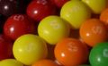
Taste the Rainbowby bmatt17Comment: Nice macro shot of the Skittles. I could see this as wall art at a Roller-Skating rink or someplace similar.
Well done. |
 Photographer found comment helpful. Photographer found comment helpful. |
| 07/07/2004 10:01:29 AM |
Heaven Scentby peeceeComment: Wow, very nice shot.
I would like to see how this was done, I can't even begin to guess. Wait a minute, it looks like you might have suction-cupped or otherwise glued this to a windoe. Ingenious.
I like the focus, I like the composition. |
| Photographer found comment helpful. |
| 07/07/2004 09:58:41 AM |
"Cats know the difference" - Sebastian (Official Whiskas Spokescat)by mandypComment: What's up with the eyes on this cat? It looks, I dunno, almost cross-eyed.
This shot greatly meets the challenge and is really well put together. With that background the cat and the product really sticks out. The only thing that isn't purr-fect is the white light/flash showing up on the top Whiskas can. |
| Photographer found comment helpful. |
| 07/07/2004 09:56:21 AM |
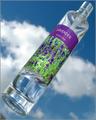
Absolut waterby MiinervaComment: This is a nice take on the Absolut Vodka ads, except for the lack of the Absolut bottle shape...
Still it's a very nice shot. |
| Photographer found comment helpful. |
| 07/07/2004 06:28:20 AM |
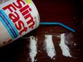
Slim Fastby beauty_doesnt_poseComment: It's out of focus and the subject matter isn't appealing to me. Honestly, suggesting drug use for weight loss is in very poor taste. |
| 07/07/2004 06:16:02 AM |
Harley Davidsonby rkfooteComment: I think the bike should be more prominent in this shot, perhaps propped up straigther as well. I have seen a large number of HD ads over the year, as my father is absolutely obsessed with those bikes, and they always place a great deal of emphasis on the bike and the shinyness of its chrome and paintjob.
It's a good concept, crisp and in focus. The background suits the 'open road' theme that HD owners like and want. |
| 07/07/2004 06:13:41 AM |
|
| 07/07/2004 06:12:49 AM |
Frames by 'Red Or Dead'by TiNComment: Nice shot. It's a great angle. I am not sure if I like the shadow of the frame across the models face, but it would have been difficult to get this image with the strict rules of Basic Editing as adding more light would have possibly eliminated the shadow on the other side of the face. |
| 07/07/2004 06:11:13 AM |
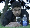
Seriously Refreshingby RoosterComment: The lighting makes the model and the subject a little unappealing. I understand the tone being sought here, but the darkness seems a little 'eh' to me. It's a nice concept.
I think I can just make out your shape reflected in the glass. |
| Photographer found comment helpful. |
| 07/07/2004 06:09:21 AM |
|
| Photographer found comment helpful. |
Home -
Challenges -
Community -
League -
Photos -
Cameras -
Lenses -
Learn -
Help -
Terms of Use -
Privacy -
Top ^
DPChallenge, and website content and design, Copyright © 2001-2025 Challenging Technologies, LLC.
All digital photo copyrights belong to the photographers and may not be used without permission.
Current Server Time: 04/12/2025 09:43:18 AM EDT.