| Author | Thread |
Comments Made During the Challenge  |
|
|
07/13/2004 12:38:35 PM |
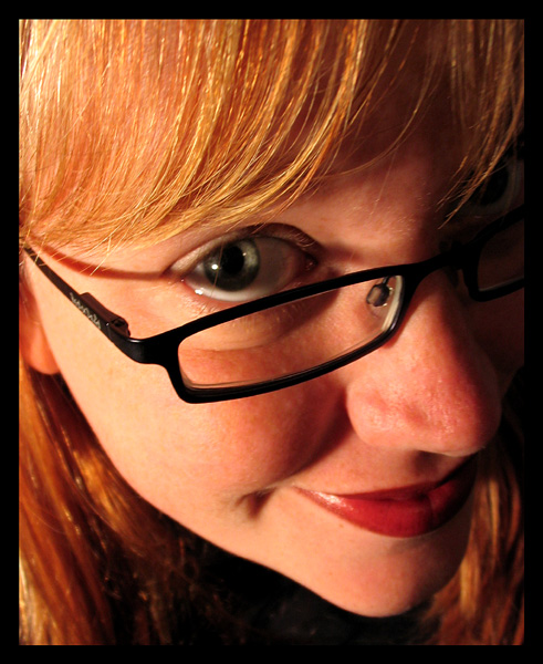
| Dispite the poor title, this would be a great pic for a variety of ad situations. Good exposure, crop, draws viewer in, Just what the creative director was looking for when they made the assignement to you.... |
|
|
|
07/11/2004 07:21:04 PM |
| Great entry! I love this. The color the angle the style - 10 |
|
|
|
07/11/2004 07:38:27 AM |
| great! i love the reddish glow, but the shadow that the glasses are creating on her eye is abit to harsh. it covers up her beautiful eye:) 8 |
|
|
|
07/10/2004 02:13:32 PM |
| Haha, cute picture- i like the zoon and the expression- aweosme job |
|
|
|
07/08/2004 08:52:47 PM |
|
|
|
07/08/2004 09:05:09 AM |
| My luck is turning! Another really nice effort! Great model, good expression, prominent product placement. It reminds me of some great ads for specs that appeared a few years back. Rufus Wainwright was in one of them. I can't remember the brand name. Anyhoo, I really like this. The specs could perhaps be in a bit sharper focus but when compared against the great composition (shows understanding of effective tight cropping and not just random tight cropping), the appealing model, the good makeup, the great lighting, that is a minor nit. A winning effort! |
|
|
|
07/08/2004 08:03:45 AM |
| Great image that sells. I don't understand the title but guess I don't need to. I can see it in a magazine, possibly in my optomitrist's office. Or possibly as a poster on his wall. |
|
|
|
07/08/2004 12:28:07 AM |
|
|
|
07/07/2004 06:12:49 AM |
| Nice shot. It's a great angle. I am not sure if I like the shadow of the frame across the models face, but it would have been difficult to get this image with the strict rules of Basic Editing as adding more light would have possibly eliminated the shadow on the other side of the face. |
|
|
|
07/07/2004 03:49:59 AM |
| Attractive photo overall. Kinda looks like the camera front focused a bit making the bottom of the bangs more in focus than the eye. Lighting also seems a bit off. The shadow from the glasses intersects the pretty eye. Might also have been better to have more ambient light so her pupil wouldn't have dilated so much. |
|
|
|
07/06/2004 11:43:35 PM |
|
Home -
Challenges -
Community -
League -
Photos -
Cameras -
Lenses -
Learn -
Help -
Terms of Use -
Privacy -
Top ^
DPChallenge, and website content and design, Copyright © 2001-2025 Challenging Technologies, LLC.
All digital photo copyrights belong to the photographers and may not be used without permission.
Current Server Time: 04/08/2025 01:33:17 AM EDT.