| Author | Thread |
Comments Made During the Challenge  |
|
|
07/13/2004 06:55:41 PM |
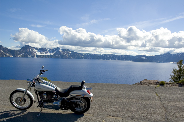
Very beautiful photo, I thought of the same thing, but bike would not start, plus I dont have that kind of scenery. :)
The only thing I may have done is get a bit closer to the bike in the photo, but nice job. |
|
|
|
07/13/2004 11:20:13 AM |
| a fill flash on the bike would have helped to bring it out of the shadows. Looks tiltled to right. I would have rotated a couple of degrees CCW. It's a beautiful lake. Love the deep blue color of the water. |
|
|
|
07/13/2004 06:08:33 AM |
| scenery is great, the bike tho needs better lighting and less shadow on the ground. |
|
|
|
07/12/2004 11:15:29 PM |
| The bike needs a little more lighting. Perhaps some fill in flash? |
|
|
|
07/12/2004 02:48:09 PM |
| Try this shot again with less harsh lighting |
|
|
|
07/09/2004 09:43:30 PM |
| nice!!!great pic good job n goodluck |
|
|
|
07/09/2004 07:30:52 AM |
| Nice sceanery but unfortunatly the bike dosen't display well! Maybe its the sun on the wrong side. Nice try.. |
|
|
|
07/08/2004 06:06:51 PM |
| Needs to have the subject (bike) clear and focused. |
|
|
|
07/08/2004 01:21:55 PM |
| Great shot, would have cropped out the tree, its a little distracting. |
|
|
|
07/08/2004 11:47:00 AM |
| This image sells! Makes me want a Harley. Good job. A little work with levels, curves or saturation would have deepende the sky a bit and possibly improved this otherwise perfect image. |
|
|
|
07/08/2004 09:42:20 AM |
| Good idea and very good spot for shooting. I have 3 nits, though: there should be someone on the bike, to make it look like more fun, the white part of the clouds is blown out and the horizon is quite tilted. Good composition and very interesting shot, nevertheless. |
|
|
|
07/08/2004 02:49:42 AM |
| Not enough emphasis on the Harley. Maybe if you turned the bike in the other direction so it would be leaning away from you would have allowed more light to be on the bike and you could see more of the bike. One other thing that may have helped a little more is if you showed less of the road behind the bike. |
|
|
|
07/07/2004 11:21:26 PM |
| The landscape seems to be the primary subject here. |
|
|
|
07/07/2004 11:05:02 PM |
| i like the view. I dont like the crack in the road its distracting. Also, I think it looks too much like a snapshot. I think you could have done some really wonderful things with the beautiful machine. Maybe taken from a different angle??? |
|
|
|
07/07/2004 08:28:30 PM |
| Too bad the kick stand leans the bike so far to the left. Great shot of the setting. I'd like this better if the logo on the tank was readable. |
|
|
|
07/07/2004 08:06:16 PM |
| Nice bike, nice background. A little stronger focus would help, but this is a very good ad photo. -8 |
|
|
|
07/07/2004 12:28:35 PM |
| Over priced POS, nice scenery though. |
|
|
|
07/07/2004 10:31:06 AM |
| Should have moved bike closer to the other egde of the road. just how I see it. 9 |
|
|
|
07/07/2004 10:16:02 AM |
I think the bike should be more prominent in this shot, perhaps propped up straigther as well. I have seen a large number of HD ads over the year, as my father is absolutely obsessed with those bikes, and they always place a great deal of emphasis on the bike and the shinyness of its chrome and paintjob.
It's a good concept, crisp and in focus. The background suits the 'open road' theme that HD owners like and want. |
|
|
|
07/07/2004 01:01:25 AM |
| Beautiful horizon, however the bike seems to be secondary and being in the shadow does not attract attention. |
|
Home -
Challenges -
Community -
League -
Photos -
Cameras -
Lenses -
Learn -
Help -
Terms of Use -
Privacy -
Top ^
DPChallenge, and website content and design, Copyright © 2001-2026 Challenging Technologies, LLC.
All digital photo copyrights belong to the photographers and may not be used without permission.
Current Server Time: 02/01/2026 08:32:22 AM EST.