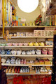
DPChallenge: A Digital Photography Contest You are not logged in. (log in or register
 
Browse Settings
Currently viewing:
Registered UserGabriel

Show comments:

Per page:

Order:

Comments:


Comments Made by Gabriel
Pages:   ... ...
Showing 61 - 70 of ~291
Image Comment
Urban web
08/05/2007 03:49:46 AM
Urban web
by Gabriel

Comment:
original picture:
Jurrasic one
08/05/2007 03:44:04 AM
Jurrasic one
by Gabriel

Comment:
original picture:
seven
05/24/2007 01:58:04 PM
seven
by Gabriel

Comment:
Original picture:
Metal and Lace
05/08/2007 09:45:23 PM
Metal and Lace
by Gabriel

Comment:
Original Picture:
33 centuries apart
05/08/2007 08:40:06 AM
33 centuries apart
by Gabriel

Comment:
Original picture:
Chinatown Teapots
05/04/2007 01:07:29 PM
Chinatown Teapots
by S_Lanterman

Comment:
As this is your first challenge submission, it deserves to have a few comments:

Regarding the subject, you should be aware that to some voters, it is likely that this did not appeared to really be kitchenware, as not beeing shot into a kitchen and clearly featuring a shop.

Altough this pic is probably representative of Chinatown shops by conveying a sensation of a very small place full of a lot of various things, it is also unfortunately clearly lacking the "usual" DPC look/wow factor.

First, the stuff on the left and right are a bit distracting, and not very visually pleasing. The porcelain stuff are nicely laid, while there appear to be some stuff on the floor that is a bit un-organized. Cropping those parts would probably improve the pic.

Looking at the shelves, the 4 lower ones are the most interesting ones. I think that you should focus on those, cropping the upper ones. That would give you an horizontal pic, or a square one, with only porcelain stuff from the 4 lower shelves, without any extra stuff around.

Now, in such situation, you could have shot those 4 lower shelves from the side, increasing the apperture in order to reduce the depth of field, and focusing on the nearest procelain stuff.
You would then have some vanishing lines (preferably going to the right), producing more depth and dynamic to the shot.
Photographer found comment helpful.
Little Guardian of Symmetry
05/04/2007 09:43:50 AM
Little Guardian of Symmetry
by jaysonmc

Comment:
Very good use of the full grayscale range
Photographer found comment helpful.
Go for it......
05/04/2007 09:39:03 AM
Go for it......
by gorant71

Comment:
There seems to be a bit of chromatic aberration, producing some blue fringing.
As this shot is mostly black and white, converting to greyscale would have removed this blue fringe.
Sideways
05/04/2007 09:36:41 AM
Sideways
by paynekj

Comment:
The sky seems to be a little overexposed/burnt.
You should try to underexpose a bit in those cases.
Distorted
05/04/2007 09:34:07 AM
Distorted
by bbright

Comment:
Composition and subject are good.
Black point, however, does not appear to be black enough.
Photographer found comment helpful.
Pages:   ... ...
Showing 61 - 70 of ~291


Home - Challenges - Community - League - Photos - Cameras - Lenses - Learn - Help - Terms of Use - Privacy - Top ^
DPChallenge, and website content and design, Copyright © 2001-2025 Challenging Technologies, LLC.
All digital photo copyrights belong to the photographers and may not be used without permission.
Current Server Time: 04/07/2025 06:23:02 AM EDT.