| Image |
Comment |
| 06/21/2007 11:49:35 AM |
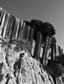
Clean Linesby PixelKingComment: Quite interesting to look at, it looks almost architectural to me. Can't tell what this is! |
 Photographer found comment helpful. Photographer found comment helpful. |
| 01/24/2007 02:41:05 AM |
Leaving this worldby inanutshellComment: Good idea and concept but the image is too under exposed for my taste. With a little work on the contrast and curves this could be improved dramatically. As I said though, this was a really good idea |
| Photographer found comment helpful. |
| 01/18/2007 10:51:18 PM |
Departure Rollby jmosherComment: A good idea for a shot, your panning technique is also good with the aircraft appearing nice and sharp with some nice motion blur. For me though, the composition of the shot is weak. It almost feels too tightly framed (perhaps a slightly more off center composition)and I would have suggested making sure the background was less cluttered, the warehouse in the background is very distracting and also limits the sense of speed because it isn't that blurred. Perhaps there were clearer area's further along the runway? |
| Photographer found comment helpful. |
| 01/18/2007 10:40:35 PM |
Zoom zoomby DoubledizzleComment: This is more of a zoom burst than a motion panning shot in my opinion and so feel it doesn't meet the challenge.
The image is very nice and your zoom burst technique is very good, but as I said it doesn't meet the challenge and so I must mark it down accordingly....sorry |
| 01/16/2007 02:07:22 AM |
Me, Myself & Iby tkoonceComment: Quite a nice pose and the plain background is a good decision too, but I am afraid that this image will suffer because it simply isn't sharp in the right places. You have nice eye contact with the model but there is too little detail as the focus seems to be on the nose of the model instead.
Nice effort but focusing on the eyes is vital with portraiture. |
| Photographer found comment helpful. |
| 01/14/2007 02:47:48 AM |
Not aloneby BogiComment: I love the composition, pose(s) and expression here, really nice and creative. My one critisism is that there is a lack of contrast in the image, just a little tweak of curves and this would be fab. Of course this is just my take on it.
Again, well done on a fine image, hope this does well. |
| Photographer found comment helpful. |
| 01/05/2007 01:38:44 AM |
Waning Strengthby rscorpComment: I really like this shot. The background colour is gorgeous and I like the juxtaposition of the old, dull fencepost against that riot of colour in the BG. Nice texture on the post and the barbed wire seems really harsh compaired to the post and twig. Hope this does well, I like it a lot. Good luck - 8/10 |
| Photographer found comment helpful. |
| 01/05/2007 01:33:34 AM |
Still standingby max90034Comment: LOts of nice texture and an okay composition but for me the image seems a little 'flat'. I think its because many of the components of the image are similar in tone. Lots to like in the image though, good luck! |
| Photographer found comment helpful. |
| 01/04/2007 02:30:31 AM |
Bright Greenby hayleesComment: I love this image. The colours are fantastic but for me its the composition that I like most, it breaks all the rules and shouldn't work, but it does. Great work, and I hope it gets the credit it deserves, its a fine image! |
| Photographer found comment helpful. |
| 01/04/2007 01:27:36 AM |
Crafted Protectionby TiNComment: Nice idea and great colour. The problem for me is the composition, with the spikes in the background interupting the shape of the silhouette (and focal point)in the foreground. Perhaps moving around a little to the right would have separated the nearest spike from the background. Good effort |
Home -
Challenges -
Community -
League -
Photos -
Cameras -
Lenses -
Learn -
Help -
Terms of Use -
Privacy -
Top ^
DPChallenge, and website content and design, Copyright © 2001-2025 Challenging Technologies, LLC.
All digital photo copyrights belong to the photographers and may not be used without permission.
Current Server Time: 04/18/2025 12:09:55 PM EDT.