| Image |
Comment |
| 03/02/2004 08:11:58 PM |
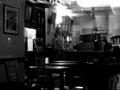
finally quiet caféby KainnonComment: i really like the modd this sets. i like the lighting and the strong contrast and lighting. good job. |
 Photographer found comment helpful. Photographer found comment helpful. |
| 03/02/2004 08:11:34 PM |
|
| Photographer found comment helpful. |
| 02/28/2004 02:14:52 PM |
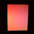
Printer Paperby MaestroGeek1Comment: hmmm... doesn't really spark much interest... it seems a little unfocused, on the top, or over saturated.... perhaps something else could have been done on the same theme, that could be more interesting, ... i.e. a stack of papers, with the picture taken of the end, or a mess ofpapers..... |
| Photographer found comment helpful. |
| 02/28/2004 02:13:41 PM |
Toolasaurusby Links 2 3 4Comment: hmm,... i find the overexposed top part of the tool rather distracting. i think the cropping could have been improved, by including the lower screw, maybe a different image size could have been good, like a square... i think it could be allright in the end, but there are a number of problems to work through yet. |
| Photographer found comment helpful. |
| 02/28/2004 02:12:32 PM |
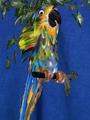
A new species!by tolovemoonComment: well, ... hmm... i think the backgound is distracting, in it's texture and the immitation bird doesn't really captivate me. allright with the framing, but perhaps rule of thirds could have been profitedfromin this image... ... |
| Photographer found comment helpful. |
| 02/28/2004 02:11:12 PM |
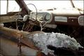
I Waited Foreverby ShiiizzzamComment: nice image. burn't out on the top, nice textureon the seat and in the car. i like this image quite a bit, if it was just a little better exposed. 6 |
| 02/28/2004 02:10:40 PM |
Go Speed Racer!by welcherComment: fairly interesting shot, but the low depth of field is distracting. the curve was perhaps a good choice for lining up the cars. low contrast. good start. 5 |
| 02/28/2004 02:09:55 PM |
Marblesby rj324Comment: fairly interesting, but doesn't keep my interest... perhaps a little bit larger depth of field, but then again you can't please everyone.... decent... but not much punch. |
| Photographer found comment helpful. |
| 02/28/2004 02:09:05 PM |
|
| Photographer found comment helpful. |
| 02/28/2004 02:08:43 PM |
City of the Lost Locksby PacloComment: really intersting shot. it sure looks like a city. i think it is perhaps too high contrast, orover exposed at the top, otherwise quite interesting. |
| Photographer found comment helpful. |
Home -
Challenges -
Community -
League -
Photos -
Cameras -
Lenses -
Learn -
Help -
Terms of Use -
Privacy -
Top ^
DPChallenge, and website content and design, Copyright © 2001-2025 Challenging Technologies, LLC.
All digital photo copyrights belong to the photographers and may not be used without permission.
Current Server Time: 04/12/2025 03:35:16 PM EDT.