|
|
|
Showing 121 - 130 of ~979 |
| Image |
Comment |
| 09/03/2006 01:27:09 PM | Watching Me Watching Youby mistComment: i'm not sure if it's the bird, or the position you were in, but he appears to have a very oddly shaped head. unfortunately, one of the more immediate things you notice is that his bum appears more in focus than his head - probably the result of a low f-thingy - which lets you down a little bit (especially the softness round his left / our right eye). though the depth of field does give a nice background which compliements the colours of the feathers, and the grain / noise is a pleasant effect. the best thing is the expression on the birds face; almost humanly grumpy. and this makes the shot more characterful and endearing than the majority of nature shots, and makes it stand out for me. a bird with personality scores highly in my book; so 8. |  Photographer found comment helpful. Photographer found comment helpful. |
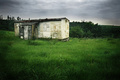
| 09/03/2006 01:22:24 PM | Before the rainby EnnilComment: i like the derelict nature of the building a lot, and the post processing suits the ambience perfectly. the burning around the edges is a bit obviously fake, but it fits with the style of the high contrast and bright colours. composition is very nice; i like where the building is in relation to the surroundings muchly. the choice of subject is really good too; the building is obviously kackered, and it has character and you feel there is narrative here. the bushes in the background seem a bit grey / dudged compared to the rest of the setting. love the green grass against the building and the grey skies. nicely stylish - 9. | | Photographer found comment helpful. |
| 09/03/2006 01:27:39 AM | Ansichtby ajschelComment: an elegant photograph, nice sepia tones and a tastefully applied level of grain and noise. it's pretty, and i like the peaceful slightly old fashioned style of it. the little elements (horse, trees, building, mill, fence) all add to the overall feel, but there still seems to be missing something - i guess with such a flat landscape a wider view might be more effective??? maybe by cropping a bit off the top of the mill? dunno, personal choice i suppose. nice, but overall i don't feel particularly moved by it... 6. | | Photographer found comment helpful. |
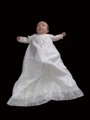
| 09/03/2006 01:22:19 AM | Great-Grandfather's Christening Gownby electinaComment: personally i feel the large quantities of black in the frame quite oppressive, and it leads to two other problems in that it gives the sprog no sort of dimensional plane (is he floating, suspended?) nor does it give him any sense of personality. the picture aslo looks like it has artefacts of some over sharpening, especially round the head. afilny, with the sprog looking away i feel totally detached freom the subject, and can't connect. 4. | | Photographer found comment helpful. |
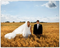
| 09/01/2006 11:00:33 AM | Field of Dreamsby PedroComment: this is one of the fines wedding photographs i have ever seen; these people are so lucky to have this to keep! everything is completely perfect; their pose being not too lovey, the mix of colours is glorious, the light and shadows on the field really gives a sense of swaying and wind, the gorgeous sky... one of my top favourites i've seen so far in the challenge. 10. | | Photographer found comment helpful. |
| 09/01/2006 10:16:05 AM | asperousby annahComment: the guys face is really rich in character, and i love the sharpness of detail... i think a slightly greater depth of field might be preferred; the almost immediate change to a soft focus round the back of his head and ears seems on the aggressive side. the white background adds nothing, nor gives the picture any sense of context really. and the only other negative thing for me is the composition, which just doesn't sit right - maybe it's because it feels like a (really excellent) passport photo, my pre-conceived subliminal expectations is that a head on shot like this should be centred? maybe cropping a bit from the top and bottom so it's squarer might help??? like i said though, this is a great shot, with lot's of personality and does grab attention. his eyes - so much depth there... 9. | | Photographer found comment helpful. |
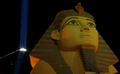
| 09/01/2006 10:07:32 AM | Skyward Gaze of the Sphinxby skieruscanComment: i think the shot suffers a little bit in that it has very little sense of scale. it might be huge, or just 6 inches tall, but there is no way of knowing. the pyramid thing in the background (i'm guessing now that this is vegas) has the combined unfortunate effect of being a distraction and also being more dynamically interesting photographically. 4. | | Photographer found comment helpful. |
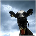
| 09/01/2006 10:04:09 AM | 0860by MajankaComment: oh yes, i adore this! this so sweet and adrable. the angle this is taken from is superb, and very funny. i do wish that the sky wasn't quite so white at the bottom because the greyish blueness is really beautiful and looks great against the blacks and white, but that aside, really lovely stuff. the title is the proverbial icing, really. 9. | | Photographer found comment helpful. |
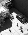
| 09/01/2006 07:48:00 AM | Curious...by taterbugComment: really really like this one. it's obviously not a conventionally beautiful photograph, but it has the benefit of feeling real, urban, and interesting. composition, is terms of placing of the relevant pieces, is exquisite. there are really so many interesting details, but it all gels together very nicely. you should try selling this photo poster-size to the bookshop. anyway, the b&w is nicely executed, exposure feels a little overdone but not by much (lots of very light and dark, so technically looks a bit tricky). really nice - 9. | | Photographer found comment helpful. |
| 09/01/2006 07:05:43 AM | Waiyanby kiwinessComment: a very lovely portrait. the set up (specifically make up and the oriental style of the jacket) certainly complements the stunning prettiness of your model. exclamations along the lines of "phwoar!", and i'll wager, "crikey!", are right now being muttered by a healthy percentage of voters. i must confess though, i am in two very distinct minds about whether or not I agree with the eyes being shut... i admit that the make up on the eyes is brilliantly done and the level of detail (on the lashes in particular) is amazingly sharp and the colours are extraordinarily bold and gorgeous. and the eyes being shut do give her a more coy and demure shyness which gives you some sense of her character (and somehow suits the more stereotypical geisha-ness you get from the clothing). but the biggish patches of green feel slightly too prominant a feature detracting attention, and i feel the bright lashes might have been less overwhelmed by the shadow if you could see her eyes open... just a thought really. still, this is an amazing portrait - 10. | | Photographer found comment helpful. |
|
Showing 121 - 130 of ~979 |
Home -
Challenges -
Community -
League -
Photos -
Cameras -
Lenses -
Learn -
Help -
Terms of Use -
Privacy -
Top ^
DPChallenge, and website content and design, Copyright © 2001-2025 Challenging Technologies, LLC.
All digital photo copyrights belong to the photographers and may not be used without permission.
Current Server Time: 04/12/2025 01:18:57 PM EDT.
|