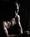
DPChallenge: A Digital Photography Contest You are not logged in. (log in or register
 
Browse Settings
Currently viewing:
Registered Userkirsty_mcn

Show comments:

Per page:

Order:

Comments:


Comments Made by kirsty_mcn
Pages:   ... ...
Showing 261 - 270 of ~339
Image Comment
I'm Ready for My Close-Up Mr. DeMille!
01/01/2006 10:05:39 AM
I'm Ready for My Close-Up Mr. DeMille!
by SJCarter

Comment:
from thread:
wonderful expression, nice warmth to it. personally i'm not a fan of the title, the photo seems too nice for a candid quote. There seeems to be some haloing of some description round the head (using the term loosely) which could definitely be dealt with. Also, I'm not sure if the background could be smoothed in the middle left where there's that stray white bit going into the grey stripe. But this probably isnt really necessary, i'm just trying to find fault cos its an awfully nice photo. One finally thing you dont notice til staring at it for ages, is the background above her (his?) left (from my pov) canine. Possibly been missed out in postprocessing.
Photographer found comment helpful.
Deferred
12/19/2005 08:12:50 AM
Deferred
by rayz1

Comment:
aaaaaaaaaawwwwwwwwwwwwwwwwwwwww you big meany!
Photographer found comment helpful.
New to the World
11/30/2005 04:46:12 AM
New to the World
by sylandrix

Comment:
i personaly love the softness of this.
reminds me of konador's 'J'adore', though his is definitely sharper


Message edited by author 2005-11-30 09:47:04.
Barn Fan
11/26/2005 10:46:45 AM
Barn Fan
by bucket

Comment:
saving you from 666, may come back and actually *comment* when i get the chance :)
Photographer found comment helpful.
Star Rise
11/26/2005 10:40:42 AM
Star Rise
by banmorn

Comment:
very sensitive textural study, way underrated in the challenge. my first impression is that the composition would be stronger if the stars werent in a straight line, maybe curved down slightly, but not sure exactly if this would work...maybe play around

Message edited by author 2005-11-26 15:41:21.
Photographer found comment helpful.
Pensive
11/03/2005 11:31:46 AM
Pensive
by flip89

Comment:
*critique club*
Composition
I feel the composition works well, but could have possibly been cropped *slightly* less tightly at the bottom, where you’re cutting off the arm. The way the guy is facing is spot onâ€Â¦kind of towards the camera but not too intense.
The negative space on the right helps to balance the composition.
The two lines in the background are slightly distracting – I’d suggest trying to position the model further away from the wall or near a plainer background (not sure what was practical in terms of lighting) Outside of a challenge of course, you could clone these lines out perfectly easily.

Technical stuff (exposure, dof, lighting etcâ€Â¦)
The image is soft; it seems the focal plane is a little too close (around near underarm), making it out of focus. A bigger dof would minimize the effects of this, but I'm aware you were already shooting at 1/30 so this may have been difficult. The lighting is very atmospheric and thoughtfully done, but there are some slightly blown-out highlights on his far arm. The image is dark but this works well in creating the mood. However, I think I̢۪d like to see just a little more lighting on his face (or simply from a different angle) just to give a little more definition and a more aesthetically pleasing boundary between light and dark.

Post-processing
The tones produced by the lighting, particularly on his body shape work very well in black and white. Seeing as it was shot at ISO 400, I̢۪m assuming grain was mostly added in post-processing, which has been done effectively.

Message/atmosphere portrayed
The atmosphere created by the lighting and grain is very effective.

Meeting the challenge
The grain helps bring out the atmosphere you were aiming for, so the photo clearly meets the challenge. There is just the right amount of grain to enhance the photo without going over the top for the sake of the challenge.

My personal opinion
The lighting is very effective, but the lack of focus/sharpness does detract from the rest of the photo imho. I would love to see another attempt where the subject was more in focus, even with a slight softness from Gaussian blur or similar to retain the feel of the photo but with more clarity.

Kirsty
Peter Peter Pumpkin Eater
11/01/2005 07:29:29 AM
Peter Peter Pumpkin Eater
by The Eskimo

Comment:
wow thats ambitious. cool
Photographer found comment helpful.
Majestic
10/30/2005 01:43:03 AM
Majestic
by crabappl3

Comment:
methinks a top 10 for this one :)
Photographer found comment helpful.
Looking up to my son.
10/28/2005 07:01:46 AM
Looking up to my son.
by just_havin_fun

Comment:
Originally posted by just_havin_fun:

As for the size, I am desperately needing help in that area. When I reduce it to the maximum allowed pixels it is still far too large a file size. I don't know how to change my file size without reducing the image size?????


what image editing software do you use?? i'll try and help if i'm familiar with it...it's pretty important as many people immediately score down a pic for being too small
Upon Scrutiny
10/22/2005 05:55:43 AM
Upon Scrutiny
by ssan

Comment:
beautiful tones and composition, with nice black blacks and perfect colour

haven't got through all the voting yet, but so far this is my favourite
Photographer found comment helpful.
Pages:   ... ...
Showing 261 - 270 of ~339


Home - Challenges - Community - League - Photos - Cameras - Lenses - Learn - Help - Terms of Use - Privacy - Top ^
DPChallenge, and website content and design, Copyright © 2001-2025 Challenging Technologies, LLC.
All digital photo copyrights belong to the photographers and may not be used without permission.
Current Server Time: 04/12/2025 10:59:00 AM EDT.