|
|
|
Showing 181 - 190 of ~339 |
| Image |
Comment |
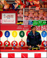
| 05/22/2006 01:06:27 AM | Keeper of the Gameby timfythetooComment: trading post
I love the composition of this, with the prizes and game framing him; and the pose works well- kinda in between candid and a very posed portrait. The colours work well to give context to the fun, colourful fair. Contrasting with that the guy's expression shows him as a normal guy, who has a life outside of his work.
You could do with some more lighting on the guy, but I guess you couldn't help that. |  Photographer found comment helpful. Photographer found comment helpful. |
| 05/22/2006 12:58:10 AM | happy fishermanby DanSigComment: critique trading post
You've captured the subject in his environment well, but it would be a lot stronger imo if he was looking at the camera - would make it more portrait-ey and less candid-ey. Black and white suits, but the composition is very busy, and he doesn't stand out that well from the b/g. I'm not sure what you could have done about that, other then severe dodge/burn, or maybe kept some colour (not sure what the colours were like though)
Other than the busyness, the composition is well arranged, and suits the square crop. Lighting is good on the subject, but a lot of the right-hand side is in shadow.
I didn't get round to this in voting, but comparing to those I did vote on, would probably have voted a 6. I think the score is fair - you've met the challenge well but the busyness & candidness detracts, so isnt as powerful as some of the higher scoring ones. | | Photographer found comment helpful. |
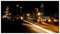
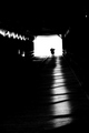
| 05/21/2006 11:39:44 AM | Twinkle, Twinkleby ericwooComment: Sorry to get to it so late - I started a comment a few days back but never finished it.
This is a very crisp, strong cityscape. The car trails work well as a leading line, and the small aperture has worked wonders with the lights!
The area of darkness in the bottom left makes the composition a little unbalanced (but I didn't really notice it til the second time I looked at it). Conversely, the brighter area of streetlights on the right hand side works well as a compositional element right on the third. | | Photographer found comment helpful. |
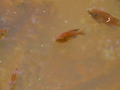
| 05/21/2006 11:30:25 AM | Dirty Pond Crisis (A documentary on the effects of water pollution on fish)by KelliComment: I noticed this in the challenge, and it was certainly not a title I'd considered lol. It was a good idea to pursue something for an environmental documentary, but I feel this topic is just a little bland - I'd certainly fall asleep during the movie if you don't mind me saying.
All the technical things are ok, don't have anything to criticise with the composition, but it just lacks emotional appeal. Shouldn't have got the brown, but don't wanna take your ribbon from you :P | | Photographer found comment helpful. |
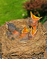
| 05/21/2006 11:08:16 AM | Documenting Predatory Chicksby tngrndreamComment: Its a very impressive shot, and a nice idea for a title, but the flash is very strong and makes it look a little unnatural. Focus is spot on, with a good DOF.
Partly because of the flash, it seems very bright, and could do with some burning to darken some of the areas. Maybe also a lower angle, so it was more "at their level", less passive observer's birds-eye view.
Other than that, I think its a good shot of a hard subject, but the strong flash detracts from it somewhat. |
| 05/21/2006 10:52:52 AM | |
| 05/21/2006 10:36:36 AM | Dad's Patricide Comedyby chaliceComment: fwiw, I'm surprised at this score, would expect at least a 5.
Would look a lot neater with a plain black b/g, or even just burning in behind him, under advanced editing rules. There does seem to be a WB problem, has an orange tint. There's also the blown out bit on the arm thats distracting.
But its always hard to do selfportraits, and the result was a lot more cinema-relevant than a lot of the entries. | | Photographer found comment helpful. |
| 05/21/2006 10:27:17 AM | Night Light for the Wearyby chaliceComment: This is one of the nightshot's that stood out to me in the challenge - I like the subtle lighting and the composition. It doesnt give a big impression to me of nighttime, would be more suited to a candid challenge imho.
The lighting is perfect, keeping nice soft tones and detail. The framing of the trees and the horizontal wall (?) along the bottom works well to contain the subject, but I would crop of a little of the bottom - maintaining the stripe, but just not so much 'wasted' space.
I have to admit the shadow on the wall is rather distracting - makes it look to me as thought you have shot through railings or something. But its a great shot nonetheless, congrats on the personal best :) | | Photographer found comment helpful. |
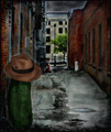
| 05/21/2006 09:44:00 AM | Dill Pickle Conspiracyby timfythetooComment: I love the creativity of this one. The juxtaposition of all the elements (pickle, hat, street b/g) is priceless, if a little wacky.
While I like the grunge look, it seems a little too dark where the pickle is concerned - could do with slightly different lighting to make it stand out more (although obviously it still needs to fit with the b/g)
Great image though, should have done better, | | Photographer found comment helpful. |
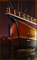
| 05/21/2006 09:38:33 AM | The Santa Mariaby timfythetooComment: I like this. Its busy, but not too crowded a composition. The viewpoint works well, even if it was the only angle you could get. I have to admit I don't personally like the border - maybe I've been around dpc too long, 'cause I used to like that style of border.
I can't quite put my finger on it, but there's something about the top railings that isnt quite right - possibly a little oversharpened?
Its a good clean, dynamic image, deserving of its score/placing. I know you were stuck for choice with the angle, but I'd like it if there was nothing distracting behind in the b/g. | | Photographer found comment helpful. |
|
Showing 181 - 190 of ~339 |
Home -
Challenges -
Community -
League -
Photos -
Cameras -
Lenses -
Learn -
Help -
Terms of Use -
Privacy -
Top ^
DPChallenge, and website content and design, Copyright © 2001-2025 Challenging Technologies, LLC.
All digital photo copyrights belong to the photographers and may not be used without permission.
Current Server Time: 04/13/2025 04:41:39 PM EDT.
|