| Author | Thread |
|
|
09/15/2006 09:46:45 AM |
| Hahaha.. this would've kind of fit in with the Gary Larson challenge - it's similar to the Far Side humor. Love it. |
|
 Photographer found comment helpful. Photographer found comment helpful. |
|
|
05/21/2006 09:59:34 AM |
| looks like a painting. nice! |
|
| Photographer found comment helpful. |
|
|
05/21/2006 09:44:00 AM |
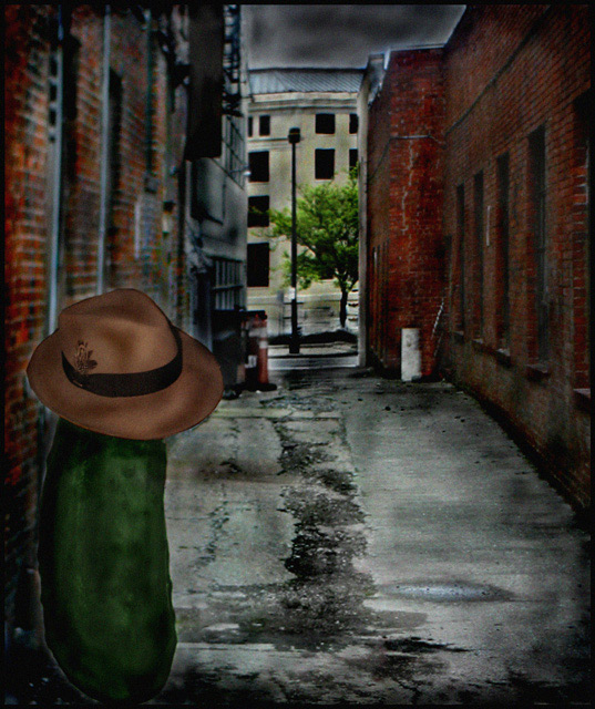
I love the creativity of this one. The juxtaposition of all the elements (pickle, hat, street b/g) is priceless, if a little wacky.
While I like the grunge look, it seems a little too dark where the pickle is concerned - could do with slightly different lighting to make it stand out more (although obviously it still needs to fit with the b/g)
Great image though, should have done better, |
|
| Photographer found comment helpful. |
|
|
05/18/2006 03:02:24 AM |
[[trading post]]
I like this image, looks like a 1950's drawing.
the only thing that I don't like is the bright spot on the roof and the water on the ground, those bright spots are bad for the image. |
|
| Photographer found comment helpful. |
|
|
05/18/2006 01:25:36 AM |
I liked the idea and the title, but the postprocessing looked too heavy for my taste...just too dark. Nice hat though. I know this critique is not too helpful.
I think this is just one of those ideas you just have to try because you want to. I know I've wandered down that path before myself. Come to think of it, I charged down that path in this same challenge. I had a nice hat too. ;-) |
|
| Photographer found comment helpful. |
|
|
05/16/2006 07:39:01 PM |
hello again,
thought this one was nice. good idea and well played. looks like a poster.
my only problem with it is that it looks like you processed it (yeah i know you did). but it actually looks like it. other than that it is a great image. |
|
| Photographer found comment helpful. |
|
|
05/15/2006 06:34:24 AM |
| This was certainly a very unique take on the challenge and I'm surprised it didn't score higher. You are always so creative with your entries! The editing is terrific - great job. |
|
| Photographer found comment helpful. |
|
|
05/15/2006 04:24:53 AM |
Trading post...
This is quite the bizarre shot. I like it. The only thing is it looks more like a painting than a picture. There's something else about it that seems off, but I really can't put my finger on it. Maybe it's the perspective on the pickle. Not much help, I know. Sorry. |
|
| Photographer found comment helpful. |
|
|
05/14/2006 09:11:35 PM |
Hey there from the Critique Club
This is too funny. I JUST finished the trading post comment, then I pulled you again from the CC cue. How the heck does that happen?!?! In addition to what I just added, I think that the burning is a little overdone. It adds a great dirty feel to the alley, but you can really see it in the sky. Going for the 50s-60s poster, maybe desaturating is all a bit or toning it differently would have given an even older feel. Very creative, but just not my preference. |
|
| Photographer found comment helpful. |
|
|
05/14/2006 09:07:11 PM |
| Yeah, this was rated WAY too low. I'm not understanding the voters lately. |
|
| Photographer found comment helpful. |
|
|
05/14/2006 08:54:54 PM |
--Trading Post--
I really like the alley shot, but the pickle looks too much like it was added as a composite. While naturally out of place, it really stands out here. Again, great creativity. I have no idea what could have drawn a higher score. |
|
| Photographer found comment helpful. |
|
|
05/14/2006 08:35:08 PM |
| Too funny! I meant to go back and add a comment that this was my alternative title - I kid you not. Though I had no idea what I was going to shoot if I had to shoot it. I liked the post processing, by the way. |
|
| Photographer found comment helpful. |
Comments Made During the Challenge  |
|
|
05/13/2006 11:25:55 PM |
|
| Photographer found comment helpful. |
|
|
05/13/2006 07:37:45 PM |
| Great processing for color. |
|
| Photographer found comment helpful. |
|
|
05/12/2006 03:43:59 PM |
| Very nice undulations of lovely colors. The pickle helps fan out the semi surreal look. very interesting overall poster effect. Bump. |
|
| Photographer found comment helpful. |
|
|
05/10/2006 03:27:50 PM |
| nice idea but jsut doesn't fit together well for me. |
|
| Photographer found comment helpful. |
|
|
05/09/2006 02:10:01 AM |
| This one looks kind of strange to me. Like the post processing and the colors, but I'm not sure if I like it or not. I like the idea, very creative. |
|
| Photographer found comment helpful. |
|
|
05/08/2006 10:34:12 PM |
|
| Photographer found comment helpful. |
|
|
05/08/2006 10:07:45 PM |
| Doesn't work for me - sorry |
|
| Photographer found comment helpful. |
|
|
05/08/2006 01:45:23 PM |
| LOL... really would go to see the moovie :o)GREAT picture. |
|
| Photographer found comment helpful. |
|
|
05/08/2006 12:52:06 PM |
| Nice photo, good processing. Cute title. They are going to replace sweet pickles with dills in this conspiracy, right? |
|
| Photographer found comment helpful. |
|
|
05/08/2006 09:07:52 AM |
| Don't you need at least two pickles for a conspiracy? |
|
| Photographer found comment helpful. |
|
|
05/08/2006 08:45:09 AM |
| This looks like one of the old movie posters! Great effect, hope you share this technique! 8 |
|
| Photographer found comment helpful. |
|
|
05/08/2006 05:40:58 AM |
| Clever. Love the post editing. I can actualy see this as a title too, although it would have to be a comedy. ha ha ha |
|
| Photographer found comment helpful. |
|
|
05/08/2006 04:45:20 AM |
|
| Photographer found comment helpful. |
|
|
05/07/2006 11:13:24 PM |
| don't think this will be legal, but I'll give you the benefit of the doubt |
|
| Photographer found comment helpful. |
|
|
05/07/2006 10:01:29 PM |
|
| Photographer found comment helpful. |
Home -
Challenges -
Community -
League -
Photos -
Cameras -
Lenses -
Learn -
Help -
Terms of Use -
Privacy -
Top ^
DPChallenge, and website content and design, Copyright © 2001-2025 Challenging Technologies, LLC.
All digital photo copyrights belong to the photographers and may not be used without permission.
Current Server Time: 04/07/2025 01:51:10 PM EDT.