| Image |
Comment |
| 02/02/2006 06:21:49 PM |
|
 Photographer found comment helpful. Photographer found comment helpful. |
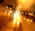
| 02/02/2006 06:20:45 PM |
Walking home alone in the rain.by theMilkManComment: Did you even _try_ to relate this image to the challenge topic? The word "alone" in the title is about as close as this seems to get. Even if the subject matter were dead on target this style of image probably wouldn't score too well here at DPC. You typically have to demonstrate that you know the rules before you can break them well; in a learning environment like this rule breaking tends to receive low marks even if done well.
That said, I find the image somewhat intriguing. If you'd have taken it from closer to the ground and given the figure some more head room I think that this would look better. The intersection and the lights provide a strong sense of perspective; this element could be used to great advantage. The bottom right of the image seems to be filled with purposeless dead space; give it a purpose or crop it out. |
| 02/02/2006 06:13:08 PM |
Pucker Up!by L1Comment: The odd placement and intensity of the light make this feel far too staged to work. |
| Photographer found comment helpful. |
| 02/02/2006 06:11:01 PM |
IT MUST BE LOVEby yoavbComment: Even if I were to believe that this image conveys "love", since the challenge topic was romance, this would still fail to qualify.
The color palate used in the image is interesting. I imagine that this is roughly what it looked like in person, but playing with the white balance might produce a more pleasing result. Shooting this with a shallower DoF and getting rid of the green trash can in the background (either by recomposing or cropping it out) would have improved the image. |
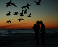
| 02/02/2006 06:05:04 PM |
Everlasting Loveby CutterComment: I don't see any clear connection between the silhouettes of the people and the gulls, nor any connection to the challenge topic. The exposure is good, I just can't see what you're trying to communicate here. |
| Photographer found comment helpful. |
| 02/02/2006 06:01:27 PM |
Passionate Kissesby holdingtimeComment: The light is a little flat and the colors are rather subdued. If you were going for a softer look, softer focus would have helped to further emphasize the theme. |
| Photographer found comment helpful. |
| 02/02/2006 05:59:54 PM |
Sweet Expectationsby trmastersComment: The lighting looks a little flat. Boosting the contrast would have helped this image a lot. Adding a light from behind to separate them from the backdrop a little would have also been a nice touch. |
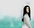
| 01/25/2006 08:02:00 PM |
One Fleeting Moment... by librodoComment: This looks like one of librodo's shots. The symbolic connotations of the girl's pose really add a lot to this already strong image. The texture of the lace and wings make the image look slightly over-sharpened. The high-key lighting has washed out a lot of the tonal detail on her face (the symbolic differences between the lighting techniques would have been interesting too; making the light fade from light on one side to dark on the other would have been interesting as well, regardless of which side was lighter). Personally I'd have rather seen a lower-key version with more detail in her face. The lighting is a touch flatter than I'd like. Having said that, this is still my top pick for the ribbon in this challenge. Nicely done. |
| Photographer found comment helpful. |
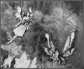
| 01/25/2006 07:53:59 PM |
Cottingley Fairies Revisitedby enashComment: This looks more like composite line art than photography. Since this is a photography challenge I'd like this better if the composition emphasized the photography rather than the drawing. |
| 01/25/2006 07:52:06 PM |
The Dream of Niagara beside my Cityby lsmartComment: If not for the red light I wouldn't have noticed that this is a long exposure of a skyline. Nice idea, but without the title it doesn't seem to relate very strongly to the challenge topic. |
| Photographer found comment helpful. |
Home -
Challenges -
Community -
League -
Photos -
Cameras -
Lenses -
Learn -
Help -
Terms of Use -
Privacy -
Top ^
DPChallenge, and website content and design, Copyright © 2001-2025 Challenging Technologies, LLC.
All digital photo copyrights belong to the photographers and may not be used without permission.
Current Server Time: 04/07/2025 06:19:06 AM EDT.