| Image |
Comment |
| 02/02/2006 08:06:34 PM |
we are so romantic !by jayitaComment: If you have to use the title to explain how we should interpret the content of your image, you should probably try to refine your image. The shadow on the left is the only one that's identifiable as a person. Having at least one of the figures in an unambiguous pose (e.g. kissing the other's hand) would be a much clearer way to visually communicate the concept of romance. |
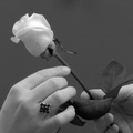
| 02/02/2006 08:00:51 PM |
Candy Surpriseby annahComment: I think that this would have been a stronger presentation if you hadn't blown out the edges of the paper. On my monitor the text almost appears to be written on the background; only the shadow remains to indicate otherwise. The exposure meter in your camera will assume that on a properly exposed image, averaging the brightness of the entire frame will produce a uniform grey image; usually this heuristic works, but it is dead wrong when shooting a small object against a white background. With a shot like this you'll need to adjust your exposure to compensate for your camera's assumptions. |
 Photographer found comment helpful. Photographer found comment helpful. |
| 02/02/2006 07:53:46 PM |
Restrained Romanceby angela_packardComment: I doubt that this will score well, but kudos for having the guts to submit it anyway. This would be a much clearer representation of the theme if the model looked more like a willing participant. The hair over her face makes her expression hard to read, but her pose looks a little more defiant than I'd expect for an entry in a romance-themed challenge.
The strongly directional light from your single flash isn't especially flattering. If you only had one light to work with, bouncing it off of something light colored would have helped to diffuse the light. I'm not sure that a shot like this should have soft light, but the sharp shadow looks a little amateurish in this context. The brick background does add to the feel of the image, but something about it just feels off. Perhaps it feels too much like a weather-sealed basement where a dungeon atmosphere seems more appropriate. |
| Photographer found comment helpful. |
| 02/02/2006 07:41:28 PM |
Keeping Love Aliveby skewsmeComment: My first reaction was to rate this as an average shot and move on, but for some reason the wife's birth year caught my attention. That combined with your title and the still vacant space to the right of the hyphen mad me pause to wonder for a moment. Is this woman still alive? Does she still have strong feelings for this man? Has she remarried? Would she still like to be buried with Alfred (presumably her first husband)?
I like the selective desat on the flower. If the grass was green I think that leaving a hint of that color might have been nice; if it was dead then this was definitely the way to go. I like the noise that you added to the image, even though it turned a little too blocky when you saved it to DPC size requirements. The streaks on the bottom of the headstone drew my attention almost immediately, and I've got mixed feelings about them. If they're going to be there, the image would certainly be stronger if they somehow visibly tied into the thematic content of the image. The legible name on the tombstone in the background is somewhat distracting; recomposing the shot to have only illegible writing in the background would probably have been an improvement.
I almost gave this an average score. Thanks for making me stop and think. It's not often that images here at DPC make me do that. I wonder, does that say more about me or the images here? |
| Photographer found comment helpful. |
| 02/02/2006 07:27:56 PM |
Lovers spotby jaaadComment: It looks like you went to a lot of trouble to create a sense of atmosphere. I think that a warmer color cast and perhaps a slightly darker exposure would have served you better in following through with the effort. I particularly like the wine glasses and the compositional elements immediately surrounding them; after orchestrating this photo you probably don't want to hear this, but I think that I would have scored a closely cropped shot of those a few points higher than the shot as a whole. |
| Photographer found comment helpful. |
| 02/02/2006 07:22:32 PM |
The Girl With Golden Hairby unicumComment: This is a well done portrait that has a nice intimate feel to it, but I can't quite see romance. I would have preferred to see a little more headroom for the girl, at least in front of her forehead. |
| 02/02/2006 07:20:35 PM |
For Youby Travis99Comment: Very nicely done. A catchlight in her eyes would have added an extra bit of icing to the cake. |
| 02/02/2006 07:16:21 PM |
expressionby hopperComment: B&W is often used to highlight the textures in an image, but you appear to have used NeatImage or something similar to scrub all of the detail off. I think that this would have been a stronger entry by either leaving it in color or not using NI on a B&W image. The position of the hands is well done. Somehow the background feels too empty; some nice bokeh might have added a little kick to the visual impact. |
| Photographer found comment helpful. |
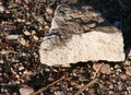
| 02/02/2006 07:11:59 PM |
My Heartby littlegettComment: The foreground is too cluttered to allow the larger rock to be a clear focal point. Even if the rock did strongly resemble a heart (either anatomically or ironically) this is still exceptionally far removed from the challenge topic of "romance". |
| Photographer found comment helpful. |
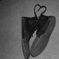
| 02/02/2006 07:09:17 PM |
old school loveby vanhaggarComment: The debris on the bottom of the shoe is distracting. Even if I could read love into this image, it's still a far cry from romance. |
Home -
Challenges -
Community -
League -
Photos -
Cameras -
Lenses -
Learn -
Help -
Terms of Use -
Privacy -
Top ^
DPChallenge, and website content and design, Copyright © 2001-2025 Challenging Technologies, LLC.
All digital photo copyrights belong to the photographers and may not be used without permission.
Current Server Time: 04/07/2025 06:23:51 AM EDT.