| Image |
Comment |
| 12/21/2002 07:49:07 PM |
Serving Hot Curryby 'PongComment: Very good --lovely movement and great colours--far better blurred than clear--very clever |
 Photographer found comment helpful. Photographer found comment helpful. |
| 12/21/2002 07:47:43 PM |
Wallpaper Hangerby daysezComment: I like this--the concentration on the face -the motion of the hand--a good portrait--well done |
| Photographer found comment helpful. |
| 12/21/2002 08:20:28 AM |
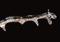
Neon Twigby kandyjComment: The Critique Club
The idea behind your shot is great but somehow I feel that you have fallen down in the post processing of your image. I am not sure whether it is in focus or out of focus�what colour it is�there seem to be so many colours in evidence on that twig that it could be multi reflections of something�in fact it is such a weird image that the imagination can run wild�and this is the fascination with your image�as you can see from peoples reaction to it. Your post processing has turned an image of an icy twig into an abstract shape.
Andrew
|
| Photographer found comment helpful. |
| 12/21/2002 07:57:02 AM |
Leading the Choirby crabappl3Comment: The Critique Club
You have caught the expression of a choir mistress perfectly�we have all seen the grimacing and shooting of eyebrows�and the exaggerated lip movements of the choir mistress as she coaxes the choir to do its best! She is the main subject of you photo but you kept a member of the choir in to tell us what was happening and to show the result of her efforts.
The colour is correct and the contrast of the dress with the dark background is good and emphasises your subject. Your use of the noise reduction seems to have taken some of the detail out of the textures in your subject�it has given her an oddly artificial look as if moulded in plastic. The look is quite interesting and I would love to see the photo before and after the noise reduction. A good portrait with a good amount of humour and humanity.
Andrew
|
| Photographer found comment helpful. |
| 12/18/2002 07:38:36 AM |
pinwheel requiemby kenboComment: The Critique Club
Hi Kenbo�I have been assigned your photo for my crit again this week! First let me say what I like about the photo. The contrast in the colours between the pinwheels and the grey gravel or shale surface is good�they are a wonderful bright colour really contrasting with the neutral gravel. I don�t know what shrine this is or the customs but it seems to be a fascinating ritual. Your focus is not good�I am not sure what you were trying to focus on but most of the photo is out of focus and the processing seems to have exaggerated the gravel chips. However there is a nice blur on the pinwheel which could be even more blurred with movement
I think your cropping could have been better�perhaps the top is distracting. The composition of the photo is problematic�this is one of your random views and as such, normal rules of composition do not apply. Having said that I did mention last time that few people appreciate such photos and dismiss them as snapshots�but this could be a relevant artistic statement and as you can see uberfish has taken this seriously. Having said that , you should not expect high scores with this type of photo. On a personal note I would be very interested in the ceremony taking place here�I think that you should try to explain what is happening in this sort of photo�and also please put the exif information of aperture ISO and shutter speed�this helps in a crit such as this.
Best of luck
Andrew
|
| 12/17/2002 08:23:45 AM |
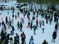
Ice-flowby catpixelComment: The Critique Club
I think this is a great shot that reminds me of Breugel and those mass village green scenes. It is very busy with a lot for the eye to follow and take in. I see a lot of people have compared it to Where�s Waldo well I think it has the same fascination. A photograph on snow or ice is always tricky and I think you have reached a good compromise. Maybe if you had brightened it up a bit with levels it may have been more contrasty but if the snow had been blinding white it would have hurt your picture. I see no digital artefacts and the clarity is good.
I think people when they judged the photo wanted more evidence of movement and that is why I think Karen�s comment may have worked for you. A slightly longer exposure would have given you movement on the outside skaters while leaving the still of inner skaters and characters around the edge un-blurred. Your camera was almost fully open so you could have stopped down or even turned down the ISO.Your composition is straightforward and effective for this "full of drama" shot.
Andrew
|
| Photographer found comment helpful. |
| 12/17/2002 07:54:30 AM |
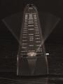
The Flow Of Timeby JamieWillmottComment: The Critique Club
The clarity of your focus is very good and your exposure is good, in that it emphasises the details of the metronome with a dark background and captures some of the grain in the wood. My monitor shows a slight warm cast to this image rather than pure black and white but this could just be my settings. You have captured well the swing of the arm with a faint streak from side to side and more pronounced at the ends of the swing. Movement captured-and contrasted with the stillness of the machine. There seem to be no digital artefacts and the picture is pretty grain free.
My only quibble is the composition of your shot. I think if you are trying to be symmetrical you must be exactly symmetrical and if you are to be off centre then you must be totally off centre. Your shot confuses the viewer who doesn�t know whether it is a symmetrical shot gone wrong or what! I also feel you should have experimented with other views. Often just changing the angle to something unexpected can do wonders and invigorate the picture. You chose a straight on view that one would see normally so there are no surprises�how about from above or a very side angle�I think you should have experimented with this.
Andrew
|
| Photographer found comment helpful. |
| 12/16/2002 08:36:45 AM |
Flag Was Still Thereby hardwaybetsComment: The Critique Club
I am probably the wrong person to critique your photo being a South African�with no attachments to America�however this does mean that I have no emotional ties to the patriotism evident in your photo!
The subject fills the frame of your photo and creates a very powerful image of red white and blue and you have captured all the detail of the movement of the flag with no blurring�you have frozen all movement. That notwithstanding your photo has a powerful sense of movement with the lines of the flag pulling the eyes around your image. One can almost hear the crack of the material as the wind whips the flag.The clarity of your focus is excellent one can see the fraying of the cloth and the small details of the manufacture os the flag I like the composition I don�t think there is any need for the flag pole�or even for all of the flag�the drama of the composition is intense and fills the frame.
I have a problem with the digital artefacts in your image. The sky is grainy-and perhaps under exposed and there is a halo between the flag and the sky and between the colours. Perhaps you oversharpened or oversaturated�sometimes putting this sort of problem through Neat helps�you should try this because these problems distract from your image.
Andrew
|
| 12/16/2002 08:12:14 AM |
accelerationby magnetic9999Comment: Sorry about the Question marks -I am trying out the Opera Browser and it is reacting to something--!! Help us all from software!! |
| 12/16/2002 08:06:56 AM |
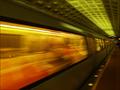
accelerationby magnetic9999Comment: The Critique Club
Your photo captures the movement of a subway train very well. One can almost hear the thunder of the wheels. Inevitably the issue of the blurring of the still parts of the photo comes up?I agree that it would be best if they had been perfectly sharp and if that had happened I am sure your photo would have finished even higher than it did?so why didn?t people mark you down more? I am sure it is because in each of us we can feel the train ?hear the noise and feel the rush of air as the train goes past. You captured more than movement you captured the feeling of the subway?the lights?and the movement.
It is hard to criticise the technicalities of the shot?because even if they could be improved one has to bear in mind the circumstances. Exposure is correct for this genre- you have managed to capture details in the compartment?the colours are saturated and strong. Your composition is excellent with the train rushing past with a good view along the side of the train to the end when it disappears into the tunnel. The large window is deep orange and warm with the contrast of the green lighting in the station. The lights on the platform disappear into the distance. Everything emphasises the movement and perspective of a subway train huge and engulfing close to us and disappearing into the distance.The lines of blurring and movement are strong and dominant.
A very good entry.Well done.
Andrew Message edited by author 2002-12-16 13:10:41. |
| Photographer found comment helpful. |
Home -
Challenges -
Community -
League -
Photos -
Cameras -
Lenses -
Learn -
Help -
Terms of Use -
Privacy -
Top ^
DPChallenge, and website content and design, Copyright © 2001-2025 Challenging Technologies, LLC.
All digital photo copyrights belong to the photographers and may not be used without permission.
Current Server Time: 04/09/2025 04:55:07 AM EDT.