| Image |
Comment |
| 05/27/2021 12:45:00 PM |
Up Against Daylightby BJokerudComment: Originally posted by willem:
Great how you converted this blue sky daytime image into a strong b&w. Red filter? |
thanks! no red filter. just astonishing dynamic range in the sony camera |
| 02/24/2021 12:17:48 PM |
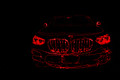
Carby GolferDDSComment: Using light painting as a graphical element. Who knew that would be a thing.. You did! Cool stuff! And a nice looking car as well. |
 Photographer found comment helpful. Photographer found comment helpful. |
| 02/24/2021 12:11:30 PM |
Let the game begin!by glad2badadComment: 1...c5 from me. The "black" pieces suits this technique better. all eht hightligs in the white pieces makes the photo a bit messy for my taste. It could potentially look cleaner if you had desaturated the reds and yellows a bit, removing the yellow color cast from the white pieces. Then the white hightligs would blend in better on the whiter white pieces. Desaturating the green sider could also make the glass look "glassier". |
| Photographer found comment helpful. |
| 02/24/2021 12:07:38 PM |
|
| Photographer found comment helpful. |
| 02/24/2021 12:07:00 PM |
|
| Photographer found comment helpful. |
| 02/24/2021 12:06:25 PM |
chrysanthemumby TiberiusComment: I like this. Only thing I would change is that the yellow in the background is so mush brighter than your motive, and that draws the attention away. |
| Photographer found comment helpful. |
| 02/14/2021 05:24:19 AM |
The Swing of the Pendulumby BenstedComment: The BW is stunning. I think you could've played with the composition some more thoug. To me it doesnt look like it's swinging as much as it's haning off centre. Maybe f the chain had come from the corher and the pendelum had been more towards the opposite corner, with a bend to the chain to indicate movement. |
| Photographer found comment helpful. |
| 02/14/2021 05:20:47 AM |
digital car parkby willemComment: Clever title to the abstract. This idea has great potential, sadly I feel there's something with the technical side to the photo that doesnt compliment the idea. I think the overall photo is to bright, especially the red, and it looks slightly unsharp (but that could be because of the brightness). One stop down, possibly two, and more contrast would do wonders I think. |
| Photographer found comment helpful. |
| 02/14/2021 05:16:33 AM |
Bubbly by DCrest01Comment: I don't like the crop here. I think you could've not cropped it, and leave more room for the black background, and include more off the bubble. Apoart from that, this is gorgeous |
| Photographer found comment helpful. |
| 02/14/2021 05:12:44 AM |
From the Bookshelfby ElaineComment: I find the lighting a bit boring, or maybe it's lack of contrast. Maybe you even could go closer? It would still show that it's a beautiful and old book, and with some more drama in the light and/or more contrast in your software, I think this would be more interesting. |
| Photographer found comment helpful. |