| Image |
Comment |
| 05/29/2003 11:57:07 AM |
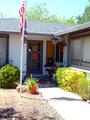
Homeby EJComment by eloise: 5. Fits the theme well enough, and there are no blatant 'you suck!' flaws to it, but neither does it really grab me for any reason at all. For reasons of composition, cropping, or subject choice, it's just a photo, and doesn't do especially much for me, aesthetically.
The lighting pulls the eye away from the door, but there's nothing in the well-lit parts to hold the eye either. |
 Photographer found comment helpful. Photographer found comment helpful. |
| 05/29/2003 12:10:19 AM |
Homeby EJComment by KING: The light is too harsh. Next time try to take the picture at another time; early morning or during sunset. Your photo will improve greatly that way. |
| Photographer found comment helpful. |
| 05/28/2003 11:03:44 AM |
|
| Photographer found comment helpful. |
| 05/28/2003 10:20:09 AM |
|
| Photographer found comment helpful. |
| 05/28/2003 05:23:47 AM |
Homeby EJComment by MattW: i like the angle that you took this image at..the flag adds to the picture a lot |
| Photographer found comment helpful. |
| 05/27/2003 06:29:57 PM |
|
| Photographer found comment helpful. |
| 05/27/2003 09:35:25 AM |
|
| Photographer found comment helpful. |
| 05/27/2003 09:31:17 AM |
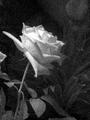
Rose an artistic interpretationby EJComment by moodville: I normally like grain in some images when used for impact, but I think the grain in this image is a little too excessive. I think this may have been better with a more plain background, or a textured one, but some of the leaves are little distracting - mostly the top right and on the left near the flower. More contrast and less grain on the petals would have really enhanced it more too. |
| Photographer found comment helpful. |
| 05/27/2003 05:40:21 AM |
Rose an artistic interpretationby EJComment by qachyk: I like the grainy look of this photo, although I'm curious why given that you didn't choose to go with sepia. It looks good in B&W, mind you; it's a nice shot, the flower stands out well from the background and it's a good angle. But I associate grainy with old, and therefore am more inclined to think sepia. |
| Photographer found comment helpful. |
| 05/26/2003 09:02:58 PM |
Rose an artistic interpretationby EJComment by dacrazyrn: Interesting. The top area of the rose is a bit blown, which would not help with me prefering to see a bit more light on the rest of the shot, to bring out more lines and depth to the shot |
| Photographer found comment helpful. |
Home -
Challenges -
Community -
League -
Photos -
Cameras -
Lenses -
Learn -
Help -
Terms of Use -
Privacy -
Top ^
DPChallenge, and website content and design, Copyright © 2001-2025 Challenging Technologies, LLC.
All digital photo copyrights belong to the photographers and may not be used without permission.
Current Server Time: 04/09/2025 05:26:43 AM EDT.