| Author | Thread |
Comments Made During the Challenge  |
|
|
06/01/2003 07:06:43 PM |
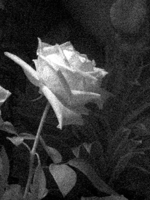
| the graininess is on purpose I am going to venture. :) I like the shapes and shadows it creates in the bg. :) |
|
|
|
06/01/2003 04:50:33 AM |
| What a lovely Impressionist effect |
|
 Photographer found comment helpful. Photographer found comment helpful. |
|
|
05/30/2003 12:27:01 PM |
| I'm afraid that the grain and the choice of toning just don't work well for me. Neither effect seems to do justice for the potential beauty of the subject matter. |
|
| Photographer found comment helpful. |
|
|
05/29/2003 06:05:06 PM |
| This has a good depth to the image. The rose seems to stand out. |
|
| Photographer found comment helpful. |
|
|
05/28/2003 11:03:44 AM |
| I like the texture on this rose |
|
| Photographer found comment helpful. |
|
|
05/27/2003 06:29:57 PM |
| Interesting treatment! I found the background distracting, though. |
|
| Photographer found comment helpful. |
|
|
05/27/2003 09:31:17 AM |
| I normally like grain in some images when used for impact, but I think the grain in this image is a little too excessive. I think this may have been better with a more plain background, or a textured one, but some of the leaves are little distracting - mostly the top right and on the left near the flower. More contrast and less grain on the petals would have really enhanced it more too. |
|
| Photographer found comment helpful. |
|
|
05/27/2003 05:40:21 AM |
| I like the grainy look of this photo, although I'm curious why given that you didn't choose to go with sepia. It looks good in B&W, mind you; it's a nice shot, the flower stands out well from the background and it's a good angle. But I associate grainy with old, and therefore am more inclined to think sepia. |
|
| Photographer found comment helpful. |
|
|
05/26/2003 09:02:58 PM |
| Interesting. The top area of the rose is a bit blown, which would not help with me prefering to see a bit more light on the rest of the shot, to bring out more lines and depth to the shot |
|
| Photographer found comment helpful. |
|
|
05/26/2003 12:21:15 PM |
| Very grainy... if you were going for that look I'm unclear as to why and this image doesn't work for me. |
|
| Photographer found comment helpful. |
|
|
05/26/2003 12:17:03 PM |
| Interesting effect. The grain works well in B&W. Good luck Jacko. |
|
| Photographer found comment helpful. |
|
|
05/26/2003 09:40:16 AM |
|
| Photographer found comment helpful. |
|
|
05/26/2003 09:25:43 AM |
| I love the grainy effect because it really does give the photo a dreamy look from another era. Lovely. |
|
| Photographer found comment helpful. |
|
|
05/25/2003 08:50:12 PM |
| You may get flogged for this one, but I for one love the grain! |
|
| Photographer found comment helpful. |
Home -
Challenges -
Community -
League -
Photos -
Cameras -
Lenses -
Learn -
Help -
Terms of Use -
Privacy -
Top ^
DPChallenge, and website content and design, Copyright © 2001-2025 Challenging Technologies, LLC.
All digital photo copyrights belong to the photographers and may not be used without permission.
Current Server Time: 04/07/2025 12:50:56 PM EDT.